vue中的slot封装组件弹窗
目录
- slot封装组件弹窗
- vue组件slot入门---弹窗组件
- 插槽的基础使用
- 弹窗组件
slot封装组件弹窗
<template>
  <el-dialog :title="title" :visible.sync="dialogVisible" :width="width" center>
    <slot name="content"></slot>
  </el-dialog>
</template>
<script>
export default {
  props: ["title", "width", "dialogVisible"],
  data() {
    return {};
  }
};
</script>
<style lang="less">
.el-dialog__header {
  padding: 20px 20px 10px;
  display: none;
}
.el-dialog__body {
  padding: 0px !important;
}
</style>
 <!-- 弹窗 -->
        <DialogModal :width="'552px'" :title="'加入黑名单'" :dialogVisible="centerDialogVisible">
          <div slot="content" class="popup">
            <div class="head">
              加入黑名单
              <i class="el-icon-close" @click="handelCloseModal()"></i>
            </div>
            <p class="isAdd">确定要讲客户王佳琛加入甄别黑名单?</p>
            <div class="confirm">
              <el-button type="primary">确定</el-button>
              <el-button plain>取消</el-button>
            </div>
          </div>
        </DialogModal>

        <!-- 弹窗 -->
vue组件slot入门---弹窗组件
slot 即插槽,相当于在子组件的 DOM 中留一个位置,父组件如果有需要,就可以在插槽里添加内容。
插槽的基础使用
这里是一个插槽的简单用法。
1.在子组件 Modal.vue 中用 slot 标签预留一个位置,slot 标签中的内容是后备内容,也可以为空:
<div class="modal-content">
  <slot>这是个弹框</slot>
  <div class="footer">
    <button @click="close">close</button>
    <button @click="confirm">confirm</button>
  </div>
</div>
后备内容:当父组件不在插槽里添加内容时,插槽显示的内容。
2.在父组件中使用子组件
在父组件中使用子组件,但不向自定义组件的插槽 slot 中添加内容:
<Modal :visible.sync="visible"></Modal>
此时如果打开弹框,弹框中显示的是后备内容“这是个弹框”:

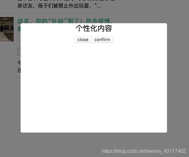
在父组件中使用子组件,并给插槽加入个性化内容:
<Modal :visible.sync="visible">个性化内容</Modal>
此时如果打开弹框,弹框中显示的是“个性化内容”:
弹窗组件
父App.vue
<template>
  <div id="app">
    <button @click="visible = true" class="btn">打开“留言”弹框</button>
    <button @click="visibleApply = true" class="btn">打开“成为大牛”弹框</button>
    <!-- “留言”弹框 -->
    <Modal
      customClassName="textarea-modal"
      title="留言"
      :visible.sync="visible"
      @confirm="confirm"
    >
      <template>
        <div class="txt">留下你想告诉我们的话...</div>
        <textarea
          name=""
          id=""
          cols="30"
          rows="10"
          placeholder="请写下您的宝贵意见"
        ></textarea>
      </template>
    </Modal>
    <!-- “成为大牛”弹框 -->
    <Modal
      customClassName="apply-modal"
      title="成为大牛"
      :visible.sync="visibleApply"
      @confirm="confirm"
    >
      <template>
        <div class="txt">留下联系方式,立即成为大牛</div>
        <div class="mobile">
          <input type="text" placeholder="请输入您的手机号码" />
        </div>
        <div class="code">
          <input type="text" placeholder="请输入验证码" />
          <button class="btn-code">获取验证码</button>
        </div>
      </template>
    </Modal>
  </div>
</template>
<script>
// 引入组件
import Modal from './components/Modal.vue';
export default {
  name: 'app',
  // 注册组件
  components: {
    Modal
  },
  data: function() {
    return {
      // 控制“留言”弹框
      visible: false,
      // 控制“成为大牛”弹框
      visibleApply: false
    };
  },
  methods: {
    // 自定义函数 confirm
    confirm() {
      // todo
    }
  }
};
</script>
<style lang="scss">
#app {
  font-family: 'Avenir', Helvetica, Arial, sans-serif;
  -webkit-font-smoothing: antialiased;
  -moz-osx-font-smoothing: grayscale;
  text-align: center;
  color: #2c3e50;
  margin-top: 60px;
}
.btn {
  width: fit-content;
  height: 40px;
  font-size: 15px;
  line-height: 40px;
  box-sizing: border-box;
  cursor: pointer;
  border: none;
  background: #ffffff;
  border: 1px solid #ebebeb;
  color: #1b1b1b;
  padding: 0 20px;
  margin-right: 20px;
  &:focus {
    outline: none;
  }
}
.textarea-modal {
  .txt {
    text-align: left;
    padding-top: 20px;
    font-size: 16px;
    line-height: 22px;
    color: #000000;
  }
  textarea {
    width: 355px;
    height: 110px;
    border: 1px solid #e6e6e6;
    font-size: 16px;
    line-height: 22px;
    color: #000000;
    padding: 14px 20px;
    box-sizing: border-box;
    margin-top: 18px;
    &::placeholder {
      color: rgba(0, 0, 0, 0.2);
    }
    &:focus {
      outline: none;
    }
  }
}
.apply-modal {
  .txt {
    text-align: left;
    padding-top: 20px;
    font-size: 16px;
    line-height: 22px;
    color: #000000;
    margin-bottom: 18px;
  }
  .mobile input,
  .code input {
    width: 355px;
    height: 50px;
    background: #ffffff;
    border: 1px solid #eeeeee;
    font-size: 16px;
    color: #000000;
    padding: 14px 20px;
    box-sizing: border-box;
    &::placeholder {
      color: rgba(0, 0, 0, 0.2);
    }
    &:focus {
      outline: none;
    }
  }
  .code {
    margin-top: 20px;
    position: relative;
    input {
      padding-right: 120px;
    }
    .btn-code {
      height: 50px;
      padding: 0 20px;
      font-size: 14px;
      line-height: 50px;
      color: #2c3744;
      background: none;
      border: none;
      position: absolute;
      top: 0;
      right: 0;
      &:focus {
        outline: none;
      }
      &::before {
        content: '';
        display: block;
        width: 1px;
        height: 20px;
        background: #e5e5e5;
        position: absolute;
        left: 0;
        top: 15px;
      }
    }
  }
}
</style>
子Modal.vue
<template>
  <div :class="['modal', customClassName]" v-if="visible">
    <div class="modal-content">
      <div class="modal-header">
        <div class="title">{{title}}</div>
        <button class="btn-close" @click="close"></button>
      </div>
      <div class="modal-body">
        <slot></slot>
      </div>
      <div class="modal-footer">
        <button class="btn-close" @click="close">取消</button>
        <button class="btn-confirm" @click="confirm">提交</button>
      </div>
    </div>
  </div>
</template>
<script>
export default {
  name: 'Modal',
  // customClassName 为自定义类名
  // title 为弹框标题
  props: ['visible', 'title', 'customClassName'],
  methods: {
    close() {
      this.$emit('update:visible', false);
    },
    confirm() {
      console.log('confirm');
      this.close();
    }
  }
};
</script>
<style lang="scss" scoped>
.modal {
  position: fixed;
  top: 0;
  bottom: 0;
  left: 0;
  right: 0;
  background: rgba(#000, 0.5);
  display: flex;
  align-items: center;
  justify-content: center;
  .modal-content {
    width: 415px;
    background: #fff;
    border-radius: 12px;
    text-align: center;
    .modal-header {
      height: 65px;
      position: relative;
      font-weight: 500;
      font-size: 18px;
      line-height: 65px;
      color: #000000;
      border-bottom: 1px solid #f2f2f2;
      .btn-close {
        width: 16px;
        height: 16px;
        background: url(https://qgt-document.oss-cn-beijing.aliyuncs.com/P3-5-Vue/5/5-1-1.png)
          no-repeat center / contain;
        position: absolute;
        top: 23px;
        right: 30px;
        border: none;
        cursor: pointer;
        &:focus {
          outline: none;
        }
      }
    }
    .modal-body {
      padding: 0 30px;
      font-size: 0;
    }
    .modal-footer {
      padding: 30px;
      display: flex;
      justify-content: space-between;
      .btn-close,
      .btn-confirm {
        width: 125px;
        height: 40px;
        font-size: 15px;
        line-height: 40px;
        box-sizing: border-box;
        cursor: pointer;
        border: none;
        &:focus {
          outline: none;
        }
      }
      .btn-close {
        background: #ffffff;
        border: 1px solid #ebebeb;
        color: #1b1b1b;
      }
      .btn-confirm {
        background: #3ab599;
        color: #fff;
      }
    }
  }
}
</style>
以上为个人经验,希望能给大家一个参考,也希望大家多多支持我们。
相关推荐
-
vue弹窗消息组件的使用方法
本文实例为大家分享了vue弹窗消息组件的具体代码,供大家参考,具体内容如下 本来打算写一个那种提示完了自动消失的弹窗的,但是没有想好淡入淡出的效果.所以暂时算是半成品. 练习代码如下: <!DOCTYPE html> <html lang="en"> <head> <meta charset="UTF-8"> <title>ys-alert-component</title> <style
-
vue如何使用vue slot封装公共组件
目录 使用vue slot封装公共组件 使用slot插槽封装 使用vue slot封装公共组件 公用子组件:publicSlot <div> <div class="top"> <h1 class="title">{{title}}</h1> <slot name="headerRight"> 可以根据你slot nam
-
vue弹窗组件使用方法
本文实例为大家分享了vue弹窗组件的具体代码,供大家参考,具体内容如下 弹窗是一个项目必备的复用利器,所以封装起来,保证项目ui一致,是很有必要的.学了一段时间vue,想想还是用vue写一下吧.用的很小白,但是会写出来了,说明我也有进步一丢丢了.继续加油-. 代码贴图如下,样式比较丑,不要介意- <!DOCTYPE html> <html lang="en"> <head> <meta charset="UTF-8">
-

vue中的slot封装组件弹窗
目录 slot封装组件弹窗 vue组件slot入门---弹窗组件 插槽的基础使用 弹窗组件 slot封装组件弹窗 <template> <el-dialog :title="title" :visible.sync="dialogVisible" :width="width" center> <slot name="content"></slot> </el
-
Vue中的transition封装组件的实现方法
vue版本信息:2.5.2 问题起源于使用Vue做网站时涉及到的一个小部件显示动画,阅读了Vue的文档后结合网上各位的经验,花了点时间研究了下. 最终的效果如上图所示,当鼠标移入灰色方块时弹出层会至上而下显示出来,类似于 拉链式窗帘(?). 实例 实现上图所示的效果代码如下: <!DOCTYPE html> <html lang="en"> <head> <meta charset="UTF-8"> <meta
-
vue中使用svg封装全局消息提示组件
本文实例为大家分享了vue中使用svg封装全局消息提示组件的具体代码,供大家参考,具体内容如下 先看效果图 一.首先安装下载需要用到的svg相关依赖 npm install svg-sprite-loader --save-dev 二.针对没有vue.config.js文件的vue项目,直接在webpack.base.conf.js中进行如下两个配置 1.找到图片相关配置位置,添加款选出的代码 2.在图片配置后添加如下代码 三.根据添加的代码我们去src下创建一个icons文件夹,icons下面
-
Vue中添加手机验证码组件功能操作方法
什么是组件: 组件是Vue.js最强大的功能之一.组件可以扩展HTML元素,封装可重用的代码.在较高层面上,组件是自定义的元素,Vue.js的编译器为它添加特殊功能.在有些情况下,组件也可以是原生HTML元素的形式,以is特性扩展. 写在前面: 今天要实现的功能是在 完善个人信息页面(vue)中添加手机验证码组件,当用户点击 手机选项时,弹出获取验证码组件,完成验证手机的功能: 这里考虑到功能的复用,我把当前弹出手机验证码的操作放在了单独的组件中: <template > <div>
-
Vue中axios的封装(报错、鉴权、跳转、拦截、提示)
统一捕获接口报错 弹窗提示 报错重定向 基础鉴权 表单序列化 实现的功能 统一捕获接口报错 : 用的axios内置的拦截器 弹窗提示: 引入 Element UI 的 Message 组件 报错重定向: 路由钩子 基础鉴权: 服务端过期时间戳和token,还有借助路由的钩子 表单序列化: 我这边直接用 qs (npm模块),你有时间也可以自己写 用法及封装 用法 // 服务层 , import默认会找该目录下index.js的文件,这个可能有小伙伴不知道 // 可以去了解npm的引入和es6引入
-
Vue中插槽slot的使用方法
目录 1.什么是插槽 2.插槽的使用 3.v-slot指令 4.具名插槽 5.具名插槽的简写形式 6.作用域插槽 7.解构插槽 Prop 1.什么是插槽 插槽(slot)是 vue 为组件的封装者提供的能力.允许开发者在封装组件时,把不确定的.希望由用户 指定的部分定义为插槽. 2.插槽的使用 在封装组件时,可以通过 元素定义插槽,从而为用户预留内容占位符. // 子组件 <template> <div class="left-container"> <h
-
深入理解vue中的slot与slot-scope
写在前面 vue中关于插槽的文档说明很短,语言又写的很凝练,再加上其和methods,data,computed等常用选项使用频率.使用先后上的差别,这就有可能造成初次接触插槽的开发者容易产生"算了吧,回头再学,反正已经可以写基础组件了",于是就关闭了vue说明文档. 实际上,插槽的概念很简单,下面通过分三部分来讲.这个部分也是按照vue说明文档的顺序来写的. 进入三部分之前,先让还没接触过插槽的同学对什么是插槽有一个简单的概念:插槽,也就是slot,是组件的一块HTML模板,这块模板
-
vue中利用Promise封装jsonp并调取数据
Promise就是一个给一步操作提供的容器,在这个容器里,有两个阶段无法改变的阶段,第一个阶段就是Pending(进行),第二个阶段就是结果阶段,包含Fulfilled(成功).Rejected(失败)两个结果. 这两个结果不会改变.然后结果结束后就会用then来执行相应的结果. new Promise((resolve,reject)=>{ 相应操作 if(异步操作成功){ resolve(value) }else{ reject(error) } }).then(value=>{ // 成
-
vue中axios的封装问题(简易版拦截,get,post)
第一步还是先下载axios npm install axios --save 第二步/src/utils/目录下建立一个htttp.js import axios from 'axios'; axios.defaults.timeout = 5000; axios.defaults.baseURL =''; //http request 拦截器 axios.interceptors.request.use( config => { // const token = getCookie('名称')
-
vue中的 $slot 获取插槽的节点实例
vue 中的 $slot 以前一直不知到这个东西,后来发现 vue api 中 藏着很多的 很神奇的 api,比如这个 具名插槽很好理解,但是那个 default 就有点难了, 写了一个炒鸡简单的 demo father: <template> <div> <button @click="getSlot">getSlot</button> <try ref="try"> <div class=&quo