matplotlib quiver箭图绘制案例
quiver绘制表示梯度变化非常有用,下面是学习过程中给出的两个例子,可以很好理解quiver的用法
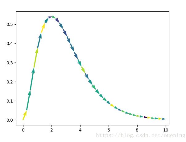
from pylab import *
close()

## example 1

x = linspace(0,10,40)
y = x**2*exp(-x)

u = array([x[i+1]-x[i] for i in range(len(x)-1)])
v = array([y[i+1]-y[i] for i in range(len(x)-1)])

x = x[:len(u)] # 使得维数和u,v一致
y = y[:len(v)]

c = randn(len(u)) # arrow颜色

figure()
quiver(x,y,u,v,c, angles='xy', scale_units='xy', scale=1) # 注意参数的赋值

## example 2

x = linspace(0,20,30)
y = sin(x)

u = array([x[i+1]-x[i] for i in range(len(x)-1)])
v = array([y[i+1]-y[i] for i in range(len(x)-1)])

x = x[:len(u)] # 使得维数和u,v一致
y = y[:len(v)]

c = randn(len(u)) # arrow颜色

figure()
quiver(x,y,u,v,c, angles='xy', scale_units='xy', scale=1) # 注意参数的赋值
show()
结果如下:

补充知识:Matlab矢量图图例函数quiverkey
Matlab自带函数中不包含构造 quiver 函数注释过程,本文参照 matplotlib 中 quiverkey 函数,构造类似函数为 Matlab 中 quiver 矢量场进行标注。
quiverkey函数
首先看 matplotlib 中 quiverkey 如何定义的
quiverkey(*args, **kw)
Add a key to a quiver plot.

Call signature::

 quiverkey(Q, X, Y, U, label, **kw)

Arguments:

 *Q*:
 The Quiver instance returned by a call to quiver.

 *X*, *Y*:
 The location of the key; additional explanation follows.

 *U*:
 The length of the key

 *label*:
 A string with the length and units of the key

Keyword arguments:

 *coordinates* = [ 'axes' | 'figure' | 'data' | 'inches' ]
 Coordinate system and units for *X*, *Y*: 'axes' and 'figure' are
 normalized coordinate systems with 0,0 in the lower left and 1,1
 in the upper right; 'data' are the axes data coordinates (used for
 the locations of the vectors in the quiver plot itself); 'inches'
 is position in the figure in inches, with 0,0 at the lower left
 corner.

 *color*:
 overrides face and edge colors from *Q*.

 *labelpos* = [ 'N' | 'S' | 'E' | 'W' ]
 Position the label above, below, to the right, to the left of the
 arrow, respectively.

 *labelsep*:
 Distance in inches between the arrow and the label. Default is
 0.1

 *labelcolor*:
 defaults to default :class:`~matplotlib.text.Text` color.

 *fontproperties*:
 A dictionary with keyword arguments accepted by the
 :class:`~matplotlib.font_manager.FontProperties` initializer:
 *family*, *style*, *variant*, *size*, *weight*

Any additional keyword arguments are used to override vector
properties taken from *Q*.

The positioning of the key depends on *X*, *Y*, *coordinates*, and
*labelpos*. If *labelpos* is 'N' or 'S', *X*, *Y* give the position
of the middle of the key arrow. If *labelpos* is 'E', *X*, *Y*
positions the head, and if *labelpos* is 'W', *X*, *Y* positions the
tail; in either of these two cases, *X*, *Y* is somewhere in the
middle of the arrow+label key object.

Additional kwargs: hold = [True|False] overrides default hold state
可以看到主要参数有这么些个
quiver绘图指针
图例位置 X, Y
标注大小 U
标注单位字符
其他参数
1). 输入坐标 X, Y 单位
2). (文字)标注在图例哪个位置
3). 标注与图例相对距离
4). 标注字体颜色
使用方法:
对应Matlab函数也应该使用这么个流程
使用quiver绘图
将quiver返回指针与图例位置坐标和大小等作为参数传入
示例
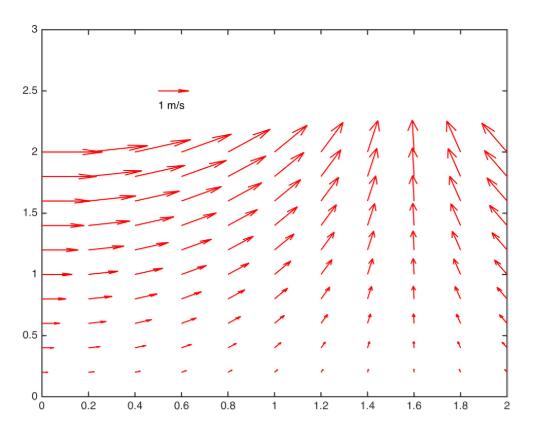
[x,y] = meshgrid(0:0.2:2,0:0.2:2);
u = cos(x).*y;
v = sin(x).*y;

figure;
Qh = quiver(x,y,u,v);

quiverkey(Qh, 0.5, 2.5, 1, 'm/s', 'Color', 'r', 'Coordinates', 'data')
最终效果图
代码
function Q = quiverkey(Q, X, Y, U, label, varargin)
%QUIVERKEY legend for quiver
%
% QUIVERKEY(Q, X, Y, U, label)
%
% Arguments:
%  Q :  The quiver handle returned by a call to quiver
%  X,Y : The location of the legend
%  U :  The unit length. If U<0, the arrow will be reversed
%  label : The string with the length and units of the key
%
% Addition arguments:
%  Coordinates = [ 'axes' | 'data'(default) ]
%
%   'axes' & 'figure' : 'axes' and 'figure' are normalized
%      coordinate systems with 0,0 in the lower left
%      and 1,1 in the upper right;
%   'data' : use the axes data coordinates
%
%  LabelDistance : Distance in 'coordinates' between the arrow and the
%     label. Deauft is 0.1 (units 'axes').
%
%  Color : overrides face and edge colors from Q.
%
%  LabelPosition = [ 'N' | 'S'(default) | 'E' | 'W' ]
%
%    Position the label above, below, to the right,
%    to the left of the arrow, respectively.
%
%  LabelColor : defaults to black
%
% Examples:
%
% [x,y] = meshgrid(0:0.2:2,0:0.2:2);
% u = cos(x).*y;
% v = sin(x).*y;
% figure; Qh = quiver(x,y,u,v);
% quiverkey(Qh, 0.5, 2.5, 1, 'm/s', 'Color', 'r', 'Coordinates', 'data')
%
% Author:
% li12242 - Department of Civil Engineering in Tianjin University
% Email:
% li12242@tju.edu.cn
%

%% get input argument
if nargin < 5
 error('Input arguments" Number incorrect!')
end

if isempty(varargin) && mod(length(varargin), 2) ~= 0
 error('Input arguments donot pairs!')
else
 [CoorUnit, LabelDist, Color, LabelPosition, LabelColor] = getInput(varargin);
end

%% add legend arrow

% get original data
xData = get(Q, 'XData'); yData = get(Q, 'YData');
uData = get(Q, 'UData'); vData = get(Q, 'VData');

% get axes properties
haxes = get(Q, 'Parent');
xLim = get(haxes, 'XLim'); yLim = get(haxes, 'YLim');
NextPlot = get(haxes, 'NextPlot');

% set axes properties
set(haxes, 'NextPlot', 'add')

if strcmp(CoorUnit, 'axes')
 % position of legend arrow
 xa = xLim(1) + X*(xLim(2) - xLim(1));
 ya = yLim(1) + Y*(yLim(2) - yLim(1));
else
 xa = X; ya = Y;
end

% add legend arrow into data vector
xData = [xData(:); xa]; yData = [yData(:); ya];
uData = [uData(:); U]; vData = [vData(:); 0];

% reset data
set(Q, 'XData', xData, 'YData', yData, 'UData', uData, 'VData', vData);
set(Q, 'Color', Color)

%% add text
dx = LabelDist*(xLim(2) - xLim(1));
dy = LabelDist*(yLim(2) - yLim(1));

% set position of label
switch LabelPosition
 case 'N'
  xl = xa; yl = ya + dy;
 case 'S'
  xl = xa; yl = ya - dy;
 case 'E'
  xl = xa + dx; yl = ya;
 case 'W'
  xl = xa - dx; yl = ya;
end% switch

th = text(xl, yl, [num2str(U), ' ', label]);
set(th, 'Color', LabelColor);

% turn axes properties to original
set(haxes, 'NextPlot', NextPlot)

end% func

%% sub function

function [CoorUnit, LabelDist, Color, LabelPosition, LabelColor] = getInput(varcell)
% Input:
% varcell - cell variable
% Output:
%
nargin = numel(varcell);

%% set default arguments

CoorUnit = 'data';
LabelDist = 0.05; % units 'axes'
Color = 'k';
LabelPosition = 'S';
LabelColor = 'k';

%% get input arguments
contour = 1;
while contour < nargin
 switch varcell{contour}
  case 'Coordinates'
   CoorUnit = varcell{contour+ 1};
  case 'LabelDistance'
   LabelDist = varcell{contour+ 1};
  case 'Color'
   Color = varcell{contour+ 1};
  case 'LabelPosition'
   LabelPosition = varcell{contour+ 1};
  case 'LabelColor'
   LabelColor = varcell{contour+ 1};
  otherwise
   error('Unknown input argument.')
 end% switch
 contour = contour + 2;
end% while

end% fun
以上这篇matplotlib quiver箭图绘制案例就是小编分享给大家的全部内容了,希望能给大家一个参考,也希望大家多多支持我们。
相关推荐
-

Python matplotlib绘制图形实例(包括点,曲线,注释和箭头)
Python的matplotlib模块绘制图形功能很强大,今天就用pyplot绘制一个简单的图形,图形中包括曲线.曲线上的点.注释和指向点的箭头. 1. 结果预览: 2. 代码如下: from matplotlib import pyplot as plt import numpy as np # 绘制曲线 x = np.linspace(2, 21, 20) # 取闭区间[2, 21]之间的等差数列,列表长度20 y = np.log10(x) + 0.5 plt.figure() # 添加一
-
matplotlib 曲线图 和 折线图 plt.plot()实例
我就废话不多说了,大家还是直接看代码吧! 绘制曲线: import time import numpy as np import matplotlib.pyplot as plt x = np.linspace(0, 10, 1000) y = np.sin(x) plt.figure(figsize=(6,4)) plt.plot(x,y,color="red",linewidth=1 ) plt.xlabel("x") #xlabel.ylabel:分别设置X.
-
在Matplotlib图中插入LaTex公式实例
Matplotlib可以无缝的处理LaTex字体,在图中加入数学公式 from matplotlib.patches import Polygon import matplotlib.pyplot as plt import numpy as np # 定义一个求积分的函数 def func(x): return 0.3* (x**2) + (0.1*x) + 1 # 定义积分区间 a, b = 1,2 x = np.linspace(0,3) y = func(x) # 绘制曲线 fig, a
-
使用python matplotlib 画图导入到word中如何保证分辨率
在写论文时,如果是菜鸟级别,可能不会花太多时间去学latex,直接用word去写,但是这有一个问题,当我们用其他工具画完实验彩色图时,放到word中会有比较模糊,这有两个原因导致的. 原因一:图片导入word中,word会对图片进行压缩,导致图片分辨率变小.可以在word中指定word的属性.过程如下: 选中图片 选择格式菜单栏 点击压缩图片按钮(上面圈出来的地方),在弹出来的对话框选择(220ppi),如下图所示: 原因二:用matplotlib产生的图片太大,如果在word中显示就需要缩小,
-
使用Matplotlib绘制不同颜色的带箭头的线实例
周五的时候计算出来一条线路,但是计算出来的只是类似与 0->10->19->2->..0 这样的线路只有写代码的人才能看的懂无法直观的表达出来,让其它同事看的不清晰,所以考虑怎样直观的把线路图画出来. &esp; 当然是考虑用matplotlib了, 导入相关的库 import matplotlib.pyplot as plt import numpy import matplotlib.colors as colors import matplotlib.cm as cm
-
基于matplotlib xticks用法详解
这个坐标轴变名用法,我真服气了,我在网上看大家写的教程,看的头晕,也没看懂他们写xtick到底怎么用的,最后找到官方教程,看了一个例子,over xticks到底有什么用,其实就是想把坐标轴变成自己想要的样子 import matplotlib.pyplot as plt x = [1, 2, 3, 4] y = [1, 4, 9, 6] labels = ['Frogs', 'Hogs', 'Bogs', 'Slogs'] plt.plot(x, y) # You can specify a
-
matplotlib quiver箭图绘制案例
quiver绘制表示梯度变化非常有用,下面是学习过程中给出的两个例子,可以很好理解quiver的用法 from pylab import * close() ## example 1 x = linspace(0,10,40) y = x**2*exp(-x) u = array([x[i+1]-x[i] for i in range(len(x)-1)]) v = array([y[i+1]-y[i] for i in range(len(x)-1)]) x = x[:len(u)] # 使得
-
Python matplotlib数据可视化图绘制
目录 前言 1.折线图 2.直方图 3.箱线图 4.柱状图 5.饼图 6.散点图 前言 导入绘图库: import matplotlib.pyplot as plt import numpy as np import pandas as pd import os 读取数据(数据来源是一个EXCLE表格,这里演示的是如何将数据可视化出来) os.chdir(r'E:\jupyter\数据挖掘\数据与代码') df = pd.read_csv('air_data.csv',na_values= '-
-
Python利用matplotlib模块数据可视化绘制3D图
目录 前言 1 matplotlib绘制3D图形 2 绘制3D画面图 2.1 源码 2.2 效果图 3 绘制散点图 3.1 源码 3.2 效果图 4 绘制多边形 4.1 源码 4.2 效果图 5 三个方向有等高线的3D图 5.1 源码 5.2 效果图 6 三维柱状图 6.1 源码 6.2 效果图 7 补充图 7.1 源码 7.2 效果图 总结 前言 matplotlib实际上是一套面向对象的绘图库,它所绘制的图表中的每个绘图元素,例如线条Line2D.文字Text.刻度等在内存中都有一个对象与之
-
Python+matplotlib实现堆叠图的绘制
目录 一.水平堆叠图 二.波浪形堆叠图 三.加上数据标签 注:本文的所有数据请移步—— 参考数据 一.水平堆叠图 堆叠图其实就是柱状图的一种特殊形式 from matplotlib import pyplot as plt plt.style.use('seaborn') plt.figure(figsize=(15,9)) plt.rcParams.update({'font.family': "Microsoft YaHei"}) plt.title("中国票房2021T
-
Python matplotlib实现折线图的绘制
目录 一.版本 二.图表主题设置 三.一次函数 四.多个一次函数 五.填充折线图 官网: https://matplotlib.org 一.版本 # 01 matplotlib安装情况 import matplotlib matplotlib.__version__ 二.图表主题设置 请点击:图表主题设置 三.一次函数 import numpy as np from matplotlib import pyplot as plt # 如何使用中文标题 plt.rcParams['font.san
-
Python数据分析之 Matplotlib 折线图绘制
目录 一.Matplotlib 绘图 简单示例 二.折线图绘制 一.Matplotlib 绘图 在数据分析中,数据可视化也非常重要,通过直观的展示过程.结果数据,可以帮助我们清晰的理解数据,进而更好的进行分析.接下来就说一下Python数据分析中的数据可视化工具 Matplotlib 库. Matplotlib 是一个非常强大的Python 2D绘图库,使用它,我们可以通过图表的形式更直观的展现数据,实现数据可视化,使用起来也非常方便,而且支持绘制折线图.柱状图.饼图.直方图.散点图等. 可以使
-
Python进阶Matplotlib库图绘制
目录 1.基本使用 1.1.线条样式 & 颜色 1.2.轴&标题 1.3.marker设置 1.4.注释文本 1.5.设置图形样式 2.条形图 2.1.横向条形图 范例 2.2.分组条形图 2.3.堆叠条形图 3.直方图 3.1.直方图 3.2.频率直方图 3.3.直方图 4.散点图 5.饼图 6.箱线图 7.雷达图 中文字体设置: # 字体设置 plt.rcParams['font.sans-serif'] = ["SimHei"] plt.rcParams[&quo
-
Python中使用matplotlib模块errorbar函数绘制误差棒图实例代码
目录 1.基本参数 2.代码实现 3.结果显示 4.更多参数请参考matplotlib官网 总结 Python的matplotlib模块中的errorbar函数可以绘制误差棒图,本次主要绘制不带折线的误差棒图. 1.基本参数 errorbar函数的基本参数主要有: x,y:主要定于二维数据的横纵坐标值 yerr :定义y轴方向的误差棒的大小,可以是一个数,也可以是二维数组(分别传递平均值与最小值的差和最大值与平均值的差). xerr:定义y轴方向的误差棒的大小,同样也可以是一个数,也可以是二维数
-
Matplotlib实现各种条形图绘制
目录 1. 条形图的绘制 2. 横向条形图 3. 分组条形图 4. 堆叠条形图 5. 条形图应用场景 1. 条形图的绘制 plt.bar 方法有以下常用参数: x :一个数组或者列表,代表需要绘制的条形图的x轴的坐标点. height :一个数组或者列表,代表需要绘制的条形图y轴的坐标点. width :每一个条形图的宽度,默认是0.8的宽度. bottom : y 轴的基线,默认是0,也就是距离底部为0. align :对齐方式,默认是 center ,也就是跟指定的 x 坐标居中对齐,还有为
-
matplotlib在python上绘制3D散点图实例详解
大家可以先参考官方演示文档: 效果图: ''' ============== 3D scatterplot ============== Demonstration of a basic scatterplot in 3D. ''' from mpl_toolkits.mplot3d import Axes3D import matplotlib.pyplot as plt import numpy as np def randrange(n, vmin, vmax): ''' Helper f