微信小程序封装自定义弹窗的实现代码
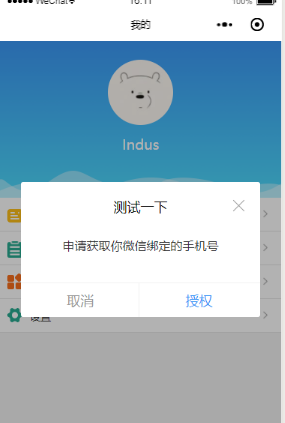
最近在做小程序的登录,需要同时获取用户手机号和头像昵称等信息,但是小程序又不支持单个接口同时获取两种数据,因此想到自定义一个弹窗,通过弹窗按钮触发获取手机号事件。记录一下。
具体代码如下:
业务代码中:
在业务代码中引入dialog组件即可
<dialog visible="{{dialogVisible}}" showFooter="{{footerVisible}}" title="测试一下">
    <view class='dialog-body' slot="dialog-body">
      <view class='dialog-content'>申请获取你微信绑定的手机号</view>
      <view class='dialog-footer' slot="dialog-footer">
        <button class='cancel-btn' bindtap="close">取消</button>
        <button open-type="getPhoneNumber" bindgetphonenumber="getPhoneNumber" class='confirm-btn'>授权</button>
      </view>
    </view>
  </dialog>
dialog组件:
component下面新建dialog。注意是 component 不是 page ,因为要作为组件引入到页面中
dialog.wxml:
需要传入四个属性
visible:是否显示弹窗
title :标题
showClose:是否显示右上角关闭按钮
showFooter:是否显示底部按钮
<!--components/dialog/dialog.wxml-->
<view class='dialog-custom' wx:if="{{visible}}">
  <view class='dialog-mask' bindtap="clickMask"></view>
    <view class="dialog-main">
      <view class="dialog-container">
        <view class='dialog-container__title' wx:if="{{title.length>0}}">
          <view class='title-label'>{{ title }}</view>
          <view class='title-icon'>
            <image wx:if="{{showClose}}" bindtap='close' src='/images/close-btn.png'></image>
          </view>
        </view>
      <view class='dialog-container__body'>
        <slot name="dialog-body"></slot>
      </view>
      <view class='dialog-container__footer' wx:if="{{showFooter}}">
        <view class='dialog-container__footer__cancel' bindtap="close">取消</view>
        <view class='dialog-container__footer__confirm' bindtap='confirm'>确定</view>
      </view>
    </view>
  </view>
</view>
dialog.js
Component({
/**
* 组件的属性列表
*/
properties: {
  visible: {
    type: Boolean,
    value: false
  },
  width: {
    type: Number,
    value: 85
  },
  position: {
    type: String,
    value: 'center'
  },
  title: {
    type: String,
    value: ''
  },
  showClose: {
    type: Boolean,
    value: true
  },
  showFooter: {
    type: Boolean,
    value: false
  },
},
/**
* 组件的初始数据
*/
data: {
},
options:{
  multipleSlots: true
},
/**
* 组件的方法列表
*/
methods: {
  clickMask() {
    this.setData({ visible: false });
  },
  close(){
    this.setData({ visible: false });
  },
  cancel() {
    this.setData({ visible: false });
    this.triggerEvent('cancel');
  },
  confirm() {
    this.setData({ visible: false });
    this.triggerEvent('confirm');
  }
}
})
dialog.json:声明是组件就行
{
  "component": true,
  "usingComponents": {}
}
dialog.wxss
css可以根据自己喜好的样式调整,注意mask遮罩层的z-index高一点,确保在最上层
/* components/dialog/dialog.wxss */
.dialog-custom {
  width: 100vw;
  height: 100%;
  position: absolute;
  left: 0;
  top: 0;
  z-index: 9999;
}
.dialog-mask {
  position: fixed;
  top: 0;
  left: 0;
  right: 0;
  bottom: 0;
  z-index: 10000;
  width: 100vw;
  height: 100%;
  background: rgba(0, 0, 0, 0.3);
}
.dialog-main {
  position: fixed;
  z-index: 10001;
  top: 50%;
  left: 0;
  right: 0;
  width: 85vw;
  height: auto;
  margin: auto;
  transform: translateY(-50%);
}
.dialog-container {
  margin: 0 auto;
  background: #fff;
  z-index: 10001;
  border-radius: 3px;
  box-sizing: border-box;
  padding: 40rpx;
}
.dialog-container__title {
  width: 100%;
  height: 50rpx;
  line-height: 50rpx;
  margin-bottom: 20rpx;
  position: relative;
}
.dialog-container__title .title-label{
  display: inline-block;
  width: 100%;
  height: 50rpx;
  line-height: 50rpx;
  font-size: 36rpx;
  color: #000;
  text-align: center;
}
.dialog-container__title .title-icon{
  width: 34rpx;
  height: 50rpx;
  position: absolute;
  top: 0;
  right: 0;
}
.dialog-container__title .title-icon image{
  width: 34rpx;
  height: 34rpx;
}

.dialog-container__body {
  padding-top: 10rpx;
  font-size: 32rpx;
  line-height: 50rpx;
}

.dialog-container__footer {
  height: 76rpx;
  line-height: 76rpx;
  font-size: 32rpx;
  text-align: center;
  border-top: 1px solid #f1f1f1;
  position: absolute;
  bottom: 0;
  left: 0;
  right: 0;
}

.dialog-container__footer .dialog-container__footer__cancel {
  width: 50%;
  color: #999;
  display: inline-block;
}
.dialog-container__footer .dialog-container__footer__cancel::after{
  position: absolute;
  right: 50%;
  bottom: 0;
  content: '';
  width: 2rpx;
  height: 76rpx;
  background: #f1f1f1;
}
.dialog-container__footer .dialog-container__footer__confirm {
  color: #3B98F7;
  width: 50%;
  display: inline-block;
  text-align: center;
}
/* components/dialog/dialog.wxss */
.dialog-custom {
width: 100vw;
height: 100%;
position: absolute;
left: 0;
top: 0;
z-index: 9999;
}
.dialog-mask {
position: fixed;
top: 0;
left: 0;
right: 0;
bottom: 0;
z-index: 10000;
width: 100vw;
height: 100%;
background: rgba(0, 0, 0, 0.3);
}
.dialog-main {
position: fixed;
z-index: 10001;
top: 50%;
left: 0;
right: 0;
width: 85vw;
height: auto;
margin: auto;
transform: translateY(-50%);
}
.dialog-container {
margin: 0 auto;
background: #fff;
z-index: 10001;
border-radius: 3px;
box-sizing: border-box;
padding: 40rpx;
}
.dialog-container__title {
width: 100%;
height: 50rpx;
line-height: 50rpx;
margin-bottom: 20rpx;
position: relative;
}
.dialog-container__title .title-label{
display: inline-block;
width: 100%;
height: 50rpx;
line-height: 50rpx;
font-size: 36rpx;
color: #000;
text-align: center;
}
.dialog-container__title .title-icon{
width: 34rpx;
height: 50rpx;
position: absolute;
top: 0;
right: 0;
}
.dialog-container__title .title-icon image{
width: 34rpx;
height: 34rpx;
}
.dialog-container__body {
 padding-top: 10rpx;
 font-size: 32rpx;
 line-height: 50rpx;
}
.dialog-container__footer {
 height: 76rpx;
 line-height: 76rpx;
 font-size: 32rpx;
 text-align: center;
 border-top: 1px solid #f1f1f1;
 position: absolute;
 bottom: 0;
 left: 0;
 right: 0;
}
.dialog-container__footer .dialog-container__footer__cancel {
 width: 50%;
 color: #999;
 display: inline-block;
}
.dialog-container__footer .dialog-container__footer__cancel::after{
 position: absolute;
 right: 50%;
 bottom: 0;
 content: '';
 width: 2rpx;
 height: 76rpx;
 background: #f1f1f1;
}
.dialog-container__footer .dialog-container__footer__confirm {
 color: #3B98F7;
 width: 50%;
 display: inline-block;
 text-align: center;
}
总结
以上所述是小编给大家介绍的微信小程序封装自定义弹窗的实现代码,希望对大家有所帮助,如果大家有任何疑问请给我留言,小编会及时回复大家的。在此也非常感谢大家对我们网站的支持!
如果你觉得本文对你有帮助,欢迎转载,烦请注明出处,谢谢!
相关推荐
-
微信小程序自定义toast弹窗效果的实现代码
微信小程序里面的自带弹窗icon只有两种,success和loading.有时候用户输入错误的时候想加入一个提醒图标,也可以使用wx.showToast中的image来添加图片达到使用自定义图标的目的:但是如果图标是字体,或者提醒的内容有很长捏(小程序中提醒的内容最多只能设置7个字,多了会被隐藏),那就只有自定义toast弹窗了: 第一步:新建一个wxml文件用来装模板,方便以后使用,比如 然后在这里面添加模板代码 <template name="toast"> //nam
-
微信小程序 弹窗自定义实例代码
微信小程序 弹窗 首先wxml代码: <view class="myToast" hidden="{{nullHouse}}">暂无有关信息</view> <view bindtap="clickArea">点击此处</view> 注:hidden属性用于切换比较频繁的地方. wxss代码设置弹窗样式: .myToast{ width:240rpx; height:130rpx; line-heig
-

微信小程序实战之自定义模态弹窗(8)
首先看看官方提供的模态弹窗,供大家参考,具体内容如下 api如下: 示例: 这样的模态弹窗,充其量只能做个alert,提示一下信息. 但是并不能使用它来处理复杂性的弹窗业务,因此写了Michael从新自定义了一个,采用了仿原生的样式写法 wxml: <!--button--> <view class="btn" bindtap="powerDrawer" data-statu="open">button</view&
-
微信小程序实现自定义modal弹窗封装的方法
前言 小程序官方提供了 wx.showModal 方法,但样式比较固定,不能满足多元化需求,自定义势在必行~ 老规矩先上图 点击某个按钮,弹出 modal框,里面的内容可以自定义,可以是简单的文字提示,也可以输入框等复杂布局.操作完点击取消或确定关闭 modal. 如何使用 将下面的 modal.wxml .modal.wxss .modal.js .modal.json 四个文件复制到对应位置即可. 封装完之后调用起来也很简单,看看调用的代码吧 <modal show="{{showMo
-
微信小程序自定义弹窗wcPop插件
微信小程序自定义组件弹窗wcPop|小程序消息提示框|toast自定义模板弹窗 平时在开发小程序的时候,弹窗应用场景还是蛮广泛的,但是微信官方提供的弹窗比较有局限性,不能自定义修改.这个时候首先想到的是自定义组件化开发,就是把弹出框封装成一个组件,然后多处调用. 解决了小程序开发自定义弹窗出现后,遮罩层下的页面仍可以滚动的方法: 给遮罩层的最外层view中加入catchtouchmove="preventTouchMove" 即可解决该遮罩层点透问题. 根据需要还可以自定义多个按钮及事
-
微信小程序使用component自定义toast弹窗效果
前言 微信小程序自带的消息提示框有字数限制,而且图标仅仅只有"success","loading","none".当我们在实际开发过程中,面对UI给的设计图稿和微信小程序默认提供的消息提示框具有很大差别的时候,自然就不能再使用微信小程序的消息提示框,而应当使用component自定义消息提示框组件. 效果图 Step1:初始化组件 新建一个components文件夹,这个文件夹用来存放我们以后要开发的所有自定义组件. 然后在components文
-
微信小程序实现自定义picker选择器弹窗内容
微信小程序中定义好的几种picker选择器,不管是日期选择器还是地区选择器,或是其他的都有定死的样式和内容. 例如: 但是大多数开发程序的情况下还是需要自己写样式的,或是内容的. 例如: wxml <view class="free-btns" style="margin-top: 10vh;background:none;"> <button class="free-btn" bindtap="toggleDialo
-
微信小程序封装自定义弹窗的实现代码
最近在做小程序的登录,需要同时获取用户手机号和头像昵称等信息,但是小程序又不支持单个接口同时获取两种数据,因此想到自定义一个弹窗,通过弹窗按钮触发获取手机号事件.记录一下. 具体代码如下: 业务代码中: 在业务代码中引入dialog组件即可 <dialog visible="{{dialogVisible}}" showFooter="{{footerVisible}}" title="测试一下"> <view class='d
-
微信小程序实现自定义弹窗组件的示例代码
目录 编写组件代码 Dialog.wxml Dialog.js Dialog.wxss 调用自定义组件 上一篇中说的是小程序自带的弹窗组件,今天,我们来试试小程序的自定义组件,我们自定义一个带确定取消的弹窗组件. 首先,放一下,最终的效果图: 这是我们最后要实现的效果 那么,首先,我们创建一个组件 新建component文件夹存放我们的组件,里边存放的就是我们所用的组件,我们今天要做的事弹出框,新建文件夹popup存放我们的组件模板,点击右键选择新建component,就会自动生成组件的模板wx
-
微信小程序tabBar自定义弹窗遮挡不住解决技巧
目录 背景 方法一:自定义tabbar 方法二:套用原生提供的tabbar自定义功能,嵌套自己的tabbar组件 总结 成果 背景 最近开发微信小程序发现一个问题,就是微信小程序官方自带的tabbar层级很高,自定义modal盖不住tabbar的问题:翻阅官方的社区,很多同学说 设置z-index:99999:可以解决这个问题,我实践下来是有问题的:ios是解决不了问题:经过反复实践有两种方法可以解决问题: 方法一:自定义tabbar 这个方法就是完全放弃微信官方的tabbar:自己用SPA的方
-
微信小程序之自定义组件的实现代码(附源码)
最近在项目开发中,遇到好多雷同的页面样式,就想着可以将常用的功能模块封装成组件,方便在项目中使用和修改,下面就参照微信小程序的文档分步骤写一个微信小程序的组件. 附上效果图: step1:创建文件并申明 与创建微信小程序的页面一样,一个自定义组件也需要json,wxml,wxss,js四个文件. 在项目根目录中创建文件夹,取名为:component,在该目录下继续创建文件夹successModal. 可以在开发工具中右键创建,选择component,默认自动会创建四个文件.如图: 在succes
-
微信小程序原生自定义弹窗效果
背景 微信小程序原生的在弹出层wx.showModal中可以通过配置项editable配置输入框,但是对于微信的版本有限制,微信版本过低无法显示,所以需要实现弹出层的效果 如下图 代码 index.wxml <!-- 遮罩层 --> <view wx:if="{{isShow}}" class='cover'> <!-- 可在此按需求自定义遮罩 --> <view style="position: relative
-
微信小程序实现签到弹窗动画
本文实例为大家分享了微信小程序实现签到弹窗的具体代码,供大家参考,具体内容如下 效果图如下所示 图片素材: .wxml <button bindtap="popup">签到</button> <view class="load" style="{{sign?'':'top:calc((100vh - 750rpx)/2);opacity: 0;z-index:-1;'}}"> <image class=&
-
微信小程序 封装http请求实例详解
微信小程序 封装http请求 最近看了一下微信小程序,大致翻了一下,发现跟angular很相似的,但是比angular简单的很多具体可参考官方文档 https://mp.weixin.qq.com/debug/wxadoc/dev/framework/app-service/page.html?t=2017112 下面将封装http请求服务部分的服务以及引用部分 // 本服务用于封装请求 // 返回的是一个promisepromise var sendRrquest = function (ur
-
微信小程序封装http访问网络库实例代码
微信小程序封装http访问网络库实例代码 之前都是使用LeanCloud为存储,现在用传统API调用时做如下封装 文档出处:https://mp.weixin.qq.com/debug/wxadoc/dev/api/network-request.html 代码如下: var HOST = 'http://localhost/lendoo/public/index.php/'; // 网站请求接口,统一为post function post(req) { //发起网络请求 wx.request(
-
微信小程序 Toast自定义实例详解
微信小程序 Toast自定义实例详解 实现类似于Android的Toast提示 index.js: var timer; var inputinfo = ""; var app = getApp() Page({ data: { animationData:"", showModalStatus:false }, onLoad: function () { }, showModal: function () { // 显示遮罩层 var animation = wx