小程序开发基础之view视图容器
本文介绍了小程序开发基础之view视图容器,分享给大家,具体如下:
视图容器
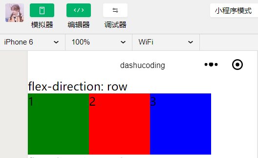
// wxml
<view class="section">
 <view class="section__title">flex-direction: row</view>
 <view class="flex-wrp_one">
  <view class="flex-item bc_green">1</view>
  <view class="flex-item bc_red">2</view>
  <view class="flex-item bc_blue">3</view>
 </view>
</view>
// wxss
.flex-wrp_one{
 display: flex;
 flex-direction: row;
}
.flex-item{
 width: 100px;
 height: 100px;
}

.bc_green{
 background: green;
}

.bc_red{
 background: red;
}

.bc_blue{
 background: blue;
}
图片
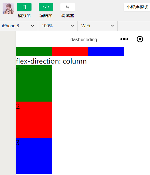
// wxml
<view class="section">
 <view class="section__title">flex-direction: column</view>
 <view class="flex-wrp_two">
  <view class="flex-item bc_green">1</view>
  <view class="flex-item bc_red">2</view>
  <view class="flex-item bc_blue">3</view>
 </view>
</view>
// wxss
.flex-wrp_two{
 display: flex;
 flex-direction: column;
}
.flex-item{
 width: 100px;
 height: 100px;
}

.bc_green{
 background: green;
}

.bc_red{
 background: red;
}

.bc_blue{
 background: blue;
}
图片
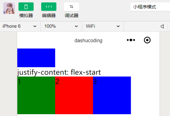
// wxml
<view class="section">
 <view class="section__title">justify-content: flex-start</view>
 <view class="flex-wrp_three">
  <view class="flex-item bc_green">1</view>
  <view class="flex-item bc_red">2</view>
  <view class="flex-item bc_blue">3</view>
 </view>
</view>
// wxss
.flex-wrp_three{
 display: flex;
 justify-content: flex-start;
}
.flex-item{
 width: 100px;
 height: 100px;
}

.bc_green{
 background: green;
}

.bc_red{
 background: red;
}

.bc_blue{
 background: blue;
}
view
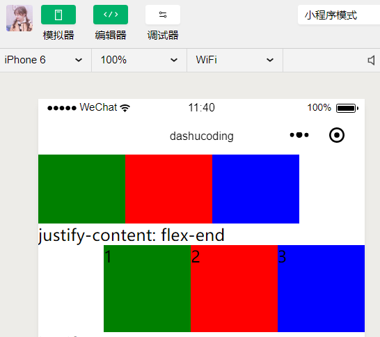
// wxml
<view class="section">
 <view class="section__title">justify-content: flex-end</view>
 <view class="flex-wrp_four">
  <view class="flex-item bc_green">1</view>
  <view class="flex-item bc_red">2</view>
  <view class="flex-item bc_blue">3</view>
 </view>
</view>
// wxss
.flex-wrp_four{
 display: flex;
 justify-content: flex-end;
}
.flex-item{
 width: 100px;
 height: 100px;
}

.bc_green{
 background: green;
}

.bc_red{
 background: red;
}

.bc_blue{
 background: blue;
}
view
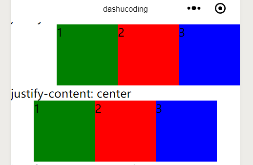
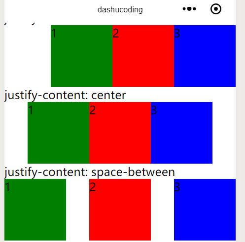
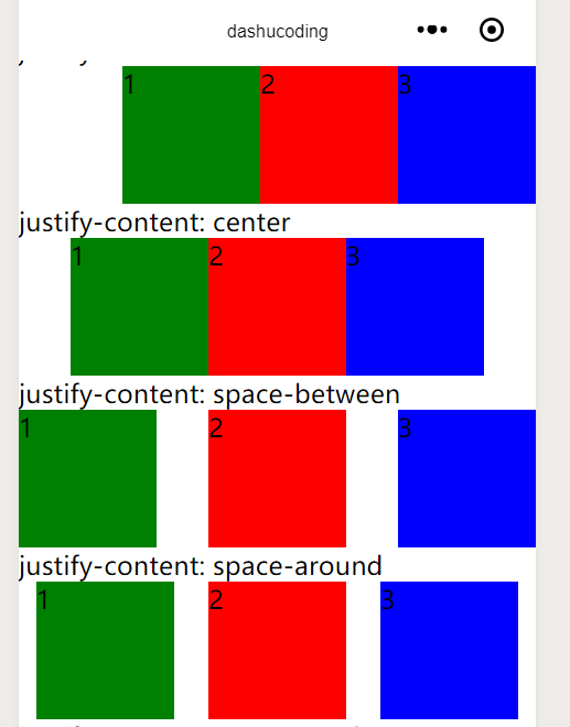
// wxml
<view class="section">
 <view class="section__title">justify-content: center</view>
 <view class="flex-wrp_five">
  <view class="flex-item bc_green">1</view>
  <view class="flex-item bc_red">2</view>
  <view class="flex-item bc_blue">3</view>
 </view>
</view>
// wxss
.flex-wrp_five{
 display: flex;
 justify-content: center;
}
.flex-item{
 width: 100px;
 height: 100px;
}

.bc_green{
 background: green;
}

.bc_red{
 background: red;
}

.bc_blue{
 background: blue;
}
view
// wxml
<view class="section">
 <view class="section__title">justify-content: space-between</view>
 <view class="flex-wrp_six">
  <view class="flex-item bc_green">1</view>
  <view class="flex-item bc_red">2</view>
  <view class="flex-item bc_blue">3</view>
 </view>
</view>
// wxss
.flex-wrp_six{
 display: flex;
 justify-content: space-between;
}
.flex-item{
 width: 100px;
 height: 100px;
}

.bc_green{
 background: green;
}

.bc_red{
 background: red;
}

.bc_blue{
 background: blue;
}
view
// wxml
<view class="section">
 <view class="section__title">justify-content: space-around</view>
 <view class="flex-wrp_seven">
  <view class="flex-item bc_green">1</view>
  <view class="flex-item bc_red">2</view>
  <view class="flex-item bc_blue">3</view>
 </view>
</view>
// wxss
.flex-wrp_seven{
 display: flex;
 justify-content: space-around;
}
.flex-item{
 width: 100px;
 height: 100px;
}

.bc_green{
 background: green;
}

.bc_red{
 background: red;
}

.bc_blue{
 background: blue;
}
view
// wxml
<view class="section">
 <view class="section__title">justify-content: space-evenly</view>
 <view class="flex-wrp_eight">
  <view class="flex-item bc_green">1</view>
  <view class="flex-item bc_red">2</view>
  <view class="flex-item bc_blue">3</view>
 </view>
</view>
// wxss
.flex-wrp_eight{
 display: flex;
 justify-content: space-evenly;
}
.flex-item{
 width: 100px;
 height: 100px;
}

.bc_green{
 background: green;
}

.bc_red{
 background: red;
}

.bc_blue{
 background: blue;
}
view
属性
| 排列方式(flex-direction) | 描述 |
|---|---|
| row | 横向排列 |
| column | 纵向排列 |
| 项目内容对齐(justify-content) | 描述 |
|---|---|
| flex-start | 向行头紧挨 |
| flex-end | 向行尾紧挨 |
| center | 居中紧挨 |
| space-between | 平均分布 |
| space-around | 平均分布 ,两边留有一半间隔 |
| space-evenly | 两边间隔与中间相同 |
源码
// wxml
<view class="section">
 <view class="section__title">flex-direction: row</view>
 <view class="flex-wrp_one">
  <view class="flex-item bc_green">1</view>
  <view class="flex-item bc_red">2</view>
  <view class="flex-item bc_blue">3</view>
 </view>
</view>

<view class="section">
 <view class="section__title">flex-direction: column</view>
 <view class="flex-wrp_two">
  <view class="flex-item bc_green">1</view>
  <view class="flex-item bc_red">2</view>
  <view class="flex-item bc_blue">3</view>
 </view>
</view>

<view class="section">
 <view class="section__title">justify-content: flex-start</view>
 <view class="flex-wrp_three">
  <view class="flex-item bc_green">1</view>
  <view class="flex-item bc_red">2</view>
  <view class="flex-item bc_blue">3</view>
 </view>
</view>

<view class="section">
 <view class="section__title">justify-content: flex-end</view>
 <view class="flex-wrp_four">
  <view class="flex-item bc_green">1</view>
  <view class="flex-item bc_red">2</view>
  <view class="flex-item bc_blue">3</view>
 </view>
</view>

<view class="section">
 <view class="section__title">justify-content: center</view>
 <view class="flex-wrp_five">
  <view class="flex-item bc_green">1</view>
  <view class="flex-item bc_red">2</view>
  <view class="flex-item bc_blue">3</view>
 </view>
</view>

<view class="section">
 <view class="section__title">justify-content: space-between</view>
 <view class="flex-wrp_six">
  <view class="flex-item bc_green">1</view>
  <view class="flex-item bc_red">2</view>
  <view class="flex-item bc_blue">3</view>
 </view>
</view>

<view class="section">
 <view class="section__title">justify-content: space-around</view>
 <view class="flex-wrp_seven">
  <view class="flex-item bc_green">1</view>
  <view class="flex-item bc_red">2</view>
  <view class="flex-item bc_blue">3</view>
 </view>
</view>

<view class="section">
 <view class="section__title">justify-content: space-evenly</view>
 <view class="flex-wrp_eight">
  <view class="flex-item bc_green">1</view>
  <view class="flex-item bc_red">2</view>
  <view class="flex-item bc_blue">3</view>
 </view>
</view>
// wxss
.flex-wrp_one{
 display: flex;
 flex-direction: row;
}

.flex-wrp_two{
 display: flex;
 flex-direction: column;
}

.flex-wrp_three{
 display: flex;
 justify-content: flex-start;
}

.flex-wrp_four{
 display: flex;
 justify-content: flex-end;
}

.flex-wrp_five{
 display: flex;
 justify-content: center;
}

.flex-wrp_six{
 display: flex;
 justify-content: space-between;
}

.flex-wrp_seven{
 display: flex;
 justify-content: space-around;
}

.flex-wrp_eight{
 display: flex;
 justify-content: space-evenly;
}

.flex-item{
 width: 100px;
 height: 100px;
}

.bc_green{
 background: green;
}

.bc_red{
 background: red;
}

.bc_blue{
 background: blue;
}
开源github分享
以上就是本文的全部内容,希望对大家的学习有所帮助,也希望大家多多支持我们。
相关推荐
-

微信小程序 教程之wxapp视图容器 scroll-view
相关文章: 微信小程序 教程之wxapp视图容器 swiper 微信小程序 教程之wxapp视图容器 scroll-view 微信小程序 教程之wxapp 视图容器 view scroll-view 可滚动视图区域. 属性名 类型 默认值 说明 scroll-x Boolean false 允许横向滚动 scroll-y Boolean false 允许纵向滚动 upper-threshold Number 50 距顶部/左边多远时(单位px),触发 scrolltoupper 事件 lower
-
微信小程序 wxapp视图容器 view详解
微信小程序 view 视图容器. 示例: <view class="section"> <view class="section__title">flex-direction: row</view> <view class="flex-wrp" style="flex-direction:row;"> <view class="flex-item bc_green
-
微信小程序 教程之wxapp 视图容器 view
相关文章: 微信小程序 教程之wxapp视图容器 swiper 微信小程序 教程之wxapp视图容器 scroll-view 微信小程序 教程之wxapp 视图容器 view View 视图容器. 示例: <view class="section"> <view class="section__title">flex-direction: row</view> <view class="flex-wrp"
-
小程序开发基础之view视图容器
本文介绍了小程序开发基础之view视图容器,分享给大家,具体如下: 视图容器 // wxml <view class="section"> <view class="section__title">flex-direction: row</view> <view class="flex-wrp_one"> <view class="flex-item bc_green"&g
-
微信小程序 开发之滑块视图容器(swiper)详解及实例代码
微信小程序 开发之滑块视图容器详解 实现效果图: 实现起来特别简单,看看代码是怎么写的呢: <swiper class="swiper" indicator-dots="{{indcatorDots}}" autoplay="{{autoPlay}}" interval="{{interval}}" duration="{{duration}}"> <block wx:for="
-
微信小程序开发入门基础教程
微信小程序开发入门基础教程 本文档将带你一步步创建完成一个微信小程序,并可以在手机上体验该小程序的实际效果. 开发准备工作获取微信小程序的 AppID 登录 https://mp.weixin.qq.com ,就可以在网站的"设置"-"开发者设置"中,查看到微信小程序的 AppID 了,注意不可直接使用服务号或订阅号的 AppID . 下载开发工具 下载地址:https://mp.weixin.qq.com/debug/wxadoc/dev/devtools/dow
-
微信小程序开发数据缓存基础知识辨析及运用实例详解
提示:这里可以添加本文要记录的大概内容: 例如:随着人工智能的不断发展,机器学习这门技术也越来越重要,很多人都开启了学习机器学习,本文就介绍了机器学习的基础内容. 提示:以下是本篇文章正文内容,下面案例可供参考 一.微信数据缓存是什么? 在实际开发中,在用到一个数据时,我们需要调用api接口去得到,然后渲染在页面中,但是对于一些数据,是经常需要使用的,如果每次使用时都需要调用api接口,会十分麻烦.数据缓存就解决了这个问题,我们可以在初次调用某api得到数据的同时将数据缓存,那么在之后的使用过程
-
小程序开发 page-container 页面容器弹出对话框功能的实现
目录 前言 效果图 代码 .js .wxml .wxss 前言 小程序弹窗对话框实现 效果图 代码 .js // pages/demo2/demo2.js Page({ data: { show:false }, exitBtn:function(e) { this.setData({ show:false }) }, showDialogBtn:function (e) { this.setData({ show:true }) } }) .wxml <!--pages/demo2/demo2
-
微信小程序开发之左右分栏效果的实例代码
本文以一个简单的小例子,简述在微信小程序开发中左右分栏功能的实现方式,主要涉及scroll-view ,列表数据绑定,及简单样式等内容,属于初级入门内容,仅供学习分享使用. 概述 在微信小程序开发中,左右分栏(左边显示分类,右边显示明细,然后进行联动)是一种常见的布局方式,多应用于点餐,冷饮店,外卖,以及其他类似的商城. 布局分析 布局分析图示如下: 涉及知识点 •scroll-view 可滚动视图区域.使用竖向滚动时,需要给<scroll-view>一个固定高度,通过 WXSS 设置 hei
-
使用微信小程序开发前端【快速入门】
前言 2016年9月22日凌晨,微信官方通过"微信公开课"公众号发布了关于微信小程序(微信应用号)的内测通知.整个朋友圈瞬间便像炸开了锅似的,各种揣测.介绍性文章在一夜里诞生.而真正收到内测邀请的公众号据说只有200个. 虽然内测名额十分稀少,但依赖中国广大开发者的破解和分享精神,在网络上很快出现了开发工具的破解版本和API文档.然而可能是微信的妥协或者早已预料,9月24日微信官方发布了不需要破解就可以使用的微信小程序开发者工具和文档,对于费劲心思破解完的开发者来说应该瞬间整个人都不好
-
详解微信小程序开发(项目从零开始)
一.序 微信小程序,估计大家都不陌生,现在应用场景特别多.今天就系统的介绍一下小程序开发.注意,这里只从项目代码上做解析,不涉及小程序如何申请.打包.发布的东西.(这些跟着微信官方文档的流程走就好).好了废话不多说,看目录. 注: 小程序是一套特殊的东西,融合了原生和web端.他是一个不完整的浏览器对象,所以很多DOM . BOM 的东西无法使用,但是他又通过微信APP实现了多线程. 二.如何创建小程序 很简单,首先下载微信开发者工具,下载稳定版本的就好. 下载 然后,创建小程序,可以参考下述图
-
微信小程序开发篇之踩坑记录
最近参与开发了公司的第一款小程序,开发体验基本类似于基于webview的混合式开发,可以调用官方强大的api,但也有一些坑或者说不习惯的地方.这篇文章从实用性出发,记录了开发过程中的一些问题: 1. 样式优先级混乱 在使用button组件时,发现在class中设置width不生效,下面贴上代码: .my-button{ width: 140rpx; height: 60rpx; line-height: 60rpx; padding: 0; } 经过微信调试工具排查后,发现user agent的
-
微信小程序开发之表单验证WxValidate使用
微信小程序的开发框架个人感觉大体上跟VUE是差不多的,但是他的表单组件没有自带的验证功能,因此开发小程序的表单验证时候一般有两种方法,一是自己裸写验证规则,但是需要比较扎实的正则表达式基础,一种是利用官方社区开发的WxValidate插件进行表单验证. WxValidate插件是参考 jQuery Validate 封装的,为小程序表单提供了一套常用的验证规则,包括手机号码.电子邮件验证等等,同时提供了添加自定义校验方法,让表单验证变得更简单. 首先插件的下载地址和官方文档都在WxValidat