Python绘制股票移动均线的实例

1. 前沿

移动均线是股票最进本的指标,本文采用numpy.convolve计算股票的移动均线

2. numpy.convolve

numpy.convolve(a, v, mode='full')

Returns the discrete, linear convolution of two one-dimensional sequences.

The convolution operator is often seen in signal processing, where it models the effect of a linear time-invariant system on a signal [R17]. In probability theory, the sum of two independent random variables is distributed according to the convolution of their individual distributions.

If v is longer than a, the arrays are swapped before computation.

Parameters:

a : (N,) array_like

 First one-dimensional input array.

 v : (M,) array_like

 Second one-dimensional input array.

 mode : {‘full', ‘valid', ‘same'}, optional

 ‘full':

  By default, mode is ‘full'. This returns the convolution at each point of overlap, with an output shape of (N+M-1,). At the end-points of the convolution, the signals do not overlap completely, and boundary effects may be seen.
 ‘same':

  Mode same returns output of length max(M, N). Boundary effects are still visible.
 ‘valid':

  Mode valid returns output of length max(M, N) - min(M, N) + 1. The convolution product is only given for points where the signals overlap completely. Values outside the signal boundary have no effect.

Returns:

out : ndarray

 Discrete, linear convolution of a and v.

计算公式:

eg:

>>> import numpy as np
>>>
>>> np_list = np.array([1, 2, 3, 4, 5, 6, 7, 8, 9])
>>>
>>> np_list
array([1, 2, 3, 4, 5, 6, 7, 8, 9])
>>> x = np.convolve(np_list, 2)
>>> x
array([ 2, 4, 6, 8, 10, 12, 14, 16, 18])
>>> x = np.convolve(np_list, [0.5, 0.5])
>>> x
array([ 0.5, 1.5, 2.5, 3.5, 4.5, 5.5, 6.5, 7.5, 8.5, 4.5])

3. 移动均线计算

def moving_average(x, n, type='simple'):
 x = np.asarray(x)
 if type == 'simple':
  weights = np.ones(n)
 else:
  weights = np.exp(np.linspace(-1., 0., n))

 weights /= weights.sum()

 a = np.convolve(x, weights, mode='full')[:len(x)]
 a[:n] = a[n]
 return a
 ma10 = moving_average(close_data, 10, 'simple')
 ma20 = moving_average(close_data, 20, 'simple')

 ax1.plot(data['date'], ma10, color='c', lw=2, label='MA (10)')
 ax1.plot(data['date'], ma20, color='red', lw=2, label='MA (20)')

4. 效果图
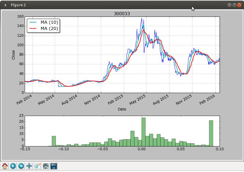
以上这篇Python绘制股票移动均线的实例就是小编分享给大家的全部内容了,希望能给大家一个参考,也希望大家多多支持我们。

(0)

相关推荐

  • 使用python的pandas为你的股票绘制趋势图

    前言 手里有一点点公司的股票, 拿不准在什么时机抛售, 程序员也没时间天天盯着看,不如动手写个小程序, 把股票趋势每天早上发到邮箱里,用 python 的 pandas, matplotlib 写起来很容易, 几十行代码搞定. 准备环境 python3 -m venv venv source ./venv/bin/activate pip install pandas pip install pandas_datareader pip install matplotlib 代码如下 绘制 201

  • 对python pandas 画移动平均线的方法详解

    数据文件 66001_.txt 内容格式: date,jz0,jz1,jz2,jz3,jz4,jz5 2012-12-28,0.9326,0.8835,1.0289,1.0027,1.1067,1.0023 2012-12-31,0.9435,0.8945,1.0435,1.0031,1.1229,1.0027 2013-01-04,0.9403,0.8898,1.0385,1.0032,1.1183,1.0030 ... ... pd_roll_mean1.py # -*- coding: u

  • 使用Python画股票的K线图的方法步骤

    导言 本文简单介绍了如何从网易财经获取某支股票的价格数据,并根据价格数据画出相应的日K线图.有助于新手了解并使用Python的相关功能.包括列表.自定义函数.for循环.if函数以及如何使用matplotlib进行作图等内容. 第一步:从网易财经获取股票的价格数据 我一般是在网易财经查看某支股票的价格和成交数据,网易财经可以查到任意沪深的股票,我们使用招商银行的数据作为参考. 1.构建爬虫获取股票价格数据 这里不对Python做介绍了,如果需要了解什么是Python,可以自行百度或者访问Pyth

  • Python绘制股票移动均线的实例

    1. 前沿 移动均线是股票最进本的指标,本文采用numpy.convolve计算股票的移动均线 2. numpy.convolve numpy.convolve(a, v, mode='full') Returns the discrete, linear convolution of two one-dimensional sequences. The convolution operator is often seen in signal processing, where it model

  • python绘制多个子图的实例

    绘制八个子图 import matplotlib.pyplot as plt fig = plt.figure() shape=['.','o','v','>','<','8','s','*'] for j in range(8): x=[i for i in range(6)] y=[i**2 for i in range(6)] ax = fig.add_subplot(241+j) ax.scatter(x,y,c='r',marker=shape[j]) ax.set_title('第

  • 使用python绘制二元函数图像的实例

    废话少说,直接上代码: #coding:utf-8 import numpy as np import matplotlib.pyplot as plt from mpl_toolkits.mplot3d import Axes3D def function_2(x,y): # 这里的函数可以任意定义 return np.sum(x**2) fig = plt.figure() ax = Axes3D(fig) x = np.arange(-3,-3,0.1) y = np.arange(-3,

  • Python绘制移动均线方法 含源代码

    目录 1.获取数据 2.计算移动均线 3.绘制K线及移动均线 上一篇< Python绘制专业的K线图>,讲解了数据获取.K线图绘制及成交量绘制等内容.本篇将在上一篇的基础上,继续讲解移动均线的绘制. 1.获取数据 我们从恒有数金融数据社区,获取股票市场历史行,情数据.我们获取2021年3月1号至2021年6月1号,恒生电子(600570.SH)的日行情数据,并做简单处理,代码及执行结果如下. 加载取数与绘图所需的函数包 import pandas as pd import datetime f

  • python绘制双柱形图代码实例

    图表是比干巴巴的表格更直观的表达,简洁.有力.工作中经常遇到的场景是,有一些数值需要定时的监控,比如服务器的连接数.活跃用户数.点击某个按钮的人数,并且通过邮件或者网页展示出来.当我们想关注比数值本身更多的信息(像数值的变化.对比或异常),图表就非常有用了.把数值转化为图片要依赖第三方库的帮忙,在Python之中最好的图表库叫matplotlib.(一直觉得,Python最大的优势就是丰富的第三方库,让你能轻易实现各种需求) matplotlib,顾名思义就是提供了一整套和matlab相似的AP

  • Python绘制3d螺旋曲线图实例代码

    Line plots Axes3D.plot(xs, ys, *args, **kwargs) 绘制2D或3D数据 参数 描述 xs, ys X轴,Y轴坐标定点 zs Z值,每一个点的值都是1 zdir 绘制2D集合时使用z的方向 其他的参数:plot() Python代码: import matplotlib as mpl from mpl_toolkits.mplot3d import Axes3D import numpy as np import matplotlib.pyplot as

  • python+pillow绘制矩阵盖尔圆简单实例

    本文主要研究的是使用Python+pillow绘制矩阵盖尔圆的一个实例,具体如下. 盖尔圆是矩阵特征值估计时常用的方法之一,其定义为: 与盖尔圆有关的两个定理为: 定理1:矩阵A的所有特征值均落在它的所有盖尔圆的并集之中. 定理2:将矩阵A的全体盖尔圆的并集按连通部分分成若干个子集,(一个子集由完全连通的盖尔圆组成,不同子集没有相连通的部分),对每个子集,若它恰好由K个盖尔圆组成,则该子集中恰好包含A的K个特征值. 与盖尔圆定理有关的几个推论为: 推论1:孤立盖尔圆中恰好包含一个特征值. 推论2

  • 利用python numpy+matplotlib绘制股票k线图的方法

    一.python numpy + matplotlib 画股票k线图 # -- coding: utf-8 -- import requests import numpy as np from matplotlib import pyplot as plt from matplotlib import animation fig = plt.figure(figsize=(8,6), dpi=72,facecolor="white") axes = plt.subplot(111) a

  • python绘制已知点的坐标的直线实例

    如下所示: import matplotlib.pyplot as plt import numpy as np x = [11422,11360,11312,11274,11233,11196,11160,11129,11098,11038, 10984,10944,10903,10863,10828,10789,10752,10715,10675,10639, 10654,10619,10587,10550,10510,10466,10425,10389,10350,10311, 10272

  • python绘制直方图和密度图的实例

    对于pandas的dataframe,绘制直方图方法如下: //pdf是pandas的dataframe, delta_time是其中一列 //xlim是x轴的范围,bins是分桶个数 pdf.delta_time.plot(kind='hist', xlim=(-50,300), bins=500) 对于pandas的dataframe,绘制概率密度图方法如下: //pdf是pandas的dataframe, delta_time是其中一列 pdf.delta_time.dropna().pl

随机推荐