swiper自定义分页器的样式
本文实例为大家分享了swiper自定义分页器的样式代码,供大家参考,具体内容如下
js主要代码
pagination: {
     // 自定义分页器的类名----必填项
    el: '.custom-pagination',

     // 是否可点击----必填项
     clickable: true,

     // 分页的类型是自定义的----必填项
    type: 'custom',

          // 自定义特殊类型分页器,当分页器类型设置为自定义时可用。
          renderCustom: function (swiper, current, total) {

            console.log(current);//1 2 3 4
          }
},
一、el
分页器容器的css选择器或HTML标签。分页器等组件可以置于container之外,不同Swiper的组件应该有所区分,如#pagination1,#pagination2。
二、分页器样式类型 可选
‘bullets' 圆点(默认)
‘fraction' 分式
‘progressbar' 进度条
‘custom' 自定义
三、renderCustom()
自定义特殊类型分页器,当分页器类型设置为自定义时可用。
四、slideToLoop()
在Loop模式下Swiper切换到指定slide。切换到的是slide索引是realIndex
源码
<!DOCTYPE html>
<html lang="en">
<head>
<meta charset="UTF-8">
<meta name="viewport" content="width=device-width, initial-scale=1.0">
<title>Document</title>
<!-- 1、CDN引入文件 -->
<link rel="stylesheet" href="https://unpkg.com/swiper/swiper-bundle.css">
<script src="https://unpkg.com/swiper/swiper-bundle.js"> </script>
<script src="https://ajax.aspnetcdn.com/ajax/jquery/jquery-3.2.1.min.js"></script>
<!--2、文件自己引入 -->
<!-- <script src="swiper.min.js"></script>
<link rel="stylesheet" href="swiper.min.css" rel="external nofollow" >
<script src="jquery.js"></script> -->
<style>
* {
margin: 0;
padding: 0;
}
ul {
list-style: none;
text-align: center;
overflow: hidden;
}
a {
text-decoration: none;
color: #000;
}
.swiper-content {
width: 80%;
overflow: hidden;
margin: 0 auto;
}
.swiper-content .title {
height: 100px;
display: flex;
align-items: center;
justify-content: space-around;
}
.swiper-content .nav-item {
float: left;
display: block;
margin-right: 30px;
width: 50px;
height: 30px;
line-height: 30px;
}
/* 点击的激活样式 */
.swiper-content .nav-item.active {
background-color: #378ee6;
}
/* 轮播图的样式 */
.swiper-content .swiper-container {
height: 300px;
background-color: pink;
}
</style>
</head>
<body>
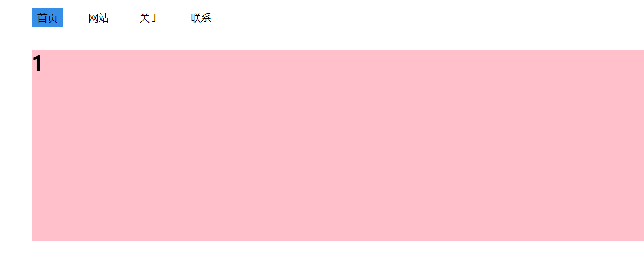
<div class="swiper-content">
<!-- 自定义导航 -->
<div class="title">
<!-- 给ul 添加自定义分页器类名 custom-pagination -->
<ul class="nav custom-pagination">
<li class="nav-item active">
<a href="javascript:;" rel="external nofollow" rel="external nofollow" rel="external nofollow" rel="external nofollow" >首页</a>
</li>
<li class="nav-item">
<a href="javascript:;" rel="external nofollow" rel="external nofollow" rel="external nofollow" rel="external nofollow" >网站</a>
</li>
<li class="nav-item">
<a href="javascript:;" rel="external nofollow" rel="external nofollow" rel="external nofollow" rel="external nofollow" >关于</a>
</li>
<li class="nav-item">
<a href="javascript:;" rel="external nofollow" rel="external nofollow" rel="external nofollow" rel="external nofollow" >联系</a>
</li>
</ul>
</div>
<!-- 轮播图 -->
<div class="swiper-container">
<div class="swiper-wrapper">
<div class="swiper-slide">
<h1>1</h1>
</div>
<div class="swiper-slide">
<h1>2</h1>
</div>
<div class="swiper-slide">
<h1>3</h1>
</div>
<div class="swiper-slide">
<h1>4</h1>
</div>
</div>
</div>
</div>
<script>
var mySwiper = new Swiper('.swiper-container',
{
// 循环模式
loop: true,
pagination: {
// 自定义分页器的类名----必填项
el: '.custom-pagination',
// 是否可点击----必填项
clickable: true,
// 分页的类型是自定义的----必填项
type: 'custom',
// 自定义特殊类型分页器,当分页器类型设置为自定义时可用。
renderCustom: function (swiper, current, total) {
// console.log(current);//1 2 3 4
// 1、分页器激活样式的改变---给自己添加激活样式并将兄弟的激活样式移出。
$('.custom-pagination').children().eq(current - 1).addClass('active').siblings().removeClass('active');
// 2、分页器点击的时候同时切换轮播图(事件委托)----循环模式slideToLoop--
$('.custom-pagination').on('click', 'li', function () {
mySwiper.slideToLoop($(this).index(), 1000, false)
})
}
},
})
</script>
</body>
</html>
以上就是本文的全部内容,希望对大家的学习有所帮助,也希望大家多多支持我们。
相关推荐
-
Swiper自定义分页器使用详解
Swiper自定义分页,供大家参考,具体内容如下 最终实现效果图: HTML DEMO(官网例子) <link rel="stylesheet" href="path/to/swiper.min.css"> <div class="swiper-container"> <div class="swiper-wrapper"> <div class="swiper-slide&
-
swiper自定义分页器使用方法详解
本文实例为大家分享了swiper自定义分页器使用的具体代码,供大家参考,具体内容如下 解决问题:不想使用swiper的自带的圆钮式的分页器,想使用自定义的分页器. 解决方案:利用swiper提供的paginationCustomRender()方法(自定义特殊类型分页器,当分页器类型设置为自定义时可用.) 下面的代码可以直接赋值粘贴到html文件里面然后作为项目在浏览器打开,但是图片需要你引用自己的本地图片并设置好路径,否则你是看不到轮播图片的.代码如下(参考注释很重要): <!DOCTYPE
-
Vue引用Swiper4插件无法重写分页器样式的解决方法
最近在尝试用nuxtjs来搭建新的站点,但是平时在jquery里面用惯的一些插件一到vue上面引用就各种不顺畅~本文记录一下在用Swiper插件来做轮播图的时候遇到的问题~至于怎么在vue里面引用插件就不累赘了,npm能告诉你~ Swiper的分页器是靠mounted()挂载到Vue组件上而不是直接写在template里,所以在style scoped中写的样式无法作用到分页器的点上.解决办法是把重写的样式写在scoped之外.(以下截图不完整,仅用做说明) template: script:
-

swiper自定义分页器的样式
本文实例为大家分享了swiper自定义分页器的样式代码,供大家参考,具体内容如下 js主要代码 pagination: { // 自定义分页器的类名----必填项 el: '.custom-pagination', // 是否可点击----必填项 clickable: true, // 分页的类型是自定义的----必填项 type: 'custom', // 自定义特殊类型分页器,当分页器类型设置为自定义时可用. renderCustom: function (swiper, current,
-
select自定义小三角样式代码(实用总结)
这段代码是网上大部分的解决办法,在这里总结一下: 让select透明,上面加一个span,来替换select框,可以自定义小三角样式,也可以做出select文字居中的效果. <div class="ui-select"> <span>使用加息券或现金券 <i class="icon-down lMar10"></i></span> <select name="" id="
-
Android开发自定义TextView省略号样式的方法
本文实例讲述了Android开发自定义TextView省略号样式的方法.分享给大家供大家参考,具体如下: 在布局xml中设置textView的字段 android:maxLines="2" android:ellipsize="end"字段之后,textview会自动压缩行数,并且对压缩掉的部分用...显示.如果不想用...而想用...或者... ...就需要自定义这个省略号的样式,不需要自定义控件,方法如下. 首先是布局文件 <TextView andro
-
jQuery基于函数重载实现自定义Alert函数样式的方法
本文实例讲述了jQuery基于函数重载实现自定义Alert函数样式的方法.分享给大家供大家参考,具体如下: (function(){ window.alert = function(text) { text=text.toString().replace(/\\/g,'\\').replace(/\n/g,'<br />').replace(/\r/g,'<br />'); //解析alert内容中的换行符 var alertdiv='<div id="alertd
-
jQuery插件Validate实现自定义校验结果样式
本文实例介绍了jQuery插件Validate实现自定义校验结果样式的详细代码,分享给大家供大家参考,具体内容如下 效果如下: 具体步骤: 1.引入依赖包 <script src="../../scripts/jquery-1.3.1.js" type="text/javascript"></script> <script src="lib/jquery.validate.js" type="text/ja
-
Android控件之RatingBar自定义星级评分样式
一.RatingBar简单介绍 RatingBar是基于SeekBar(拖动条)和ProgressBar(状态条)的扩展,用星形来显示等级评定,在使用默认RatingBar时,用户可以通过触摸/拖动/按键(比如遥控器)来设置评分, RatingBar自带有两种模式 ,一个小风格 ratingBarStyleSmall,大风格为ratingBarStyleIndicator,大的只适合做指示,不适用与用户交互. 效果图展示: 二.实例 1.布局文件 <?xml version="1.0&qu
-
Android中自定义加载样式图片的具体实现
先让大家看看效果图吧,相信很多Android初学者都想知道这中效果是怎么实现的,来上图: 想实现上面这张图中的自定义加载样式,其实很简单,首先我们需要的布局组件有ProcessBar和TextView,下面是布局文件的代码(只是加载的页面的布局): 复制代码 代码如下: <?xml version="1.0" encoding="utf-8"?> <LinearLayout xmlns:android="http://schemas.an
-
Android实现可使用自定义透明Dialog样式的Activity完整实例
本文实例讲述了Android实现可使用自定义透明Dialog样式的Activity.分享给大家供大家参考,具体如下: 有时你需要一个对话框,但同时对话框中的内容有更多控制和能控制其生命周期,这时你可以使用带有Dialog样式的Activity来应用你的项目中,想使Activity有对话框那样效果可以在Androidmanifest中添加 Android:style/Theme.Dialog 的主题特性 例如这样: <activity android:name="MyDialogActivi