全面解析Bootstrap表单样式的使用
本文主要给大家介绍了bootstrap表单样式的使用知识,非常不错,一起看看吧!
表单
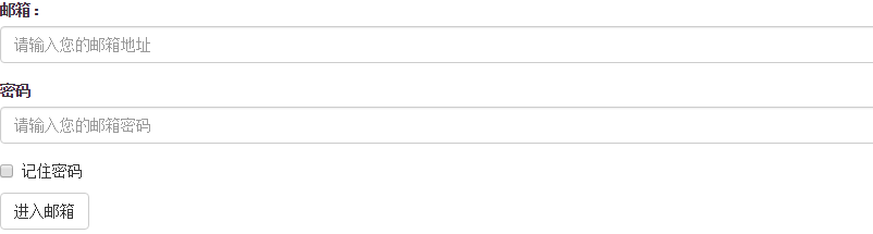
<form role="form">
<div class="form-group">
<label for="exampleInputEmail1">邮箱:</label>
<input type="email" class="form-control" id="exampleInputEmail1" placeholder="请输入您的邮箱地址">
</div>
<div class="form-group">
<label for="exampleInputPassword1">密码</label>
<input type="password" class="form-control" id="exampleInputPassword1" placeholder="请输入您的邮箱密码">
</div>
<div class="checkbox">
<label>
<input type="checkbox"> 记住密码
</label>
</div>
<button type="submit" class="btn btn-default">进入邮箱</button>
</form>
效果图:
class: form-control
1、宽度变成了100%,2、设置了一个浅灰色(#ccc)的边框,3、具有4px的圆角,4、设置阴影效果,并且元素得到焦点之时,阴影和边框效果会有所变化,5、设置了placeholder的颜色为#999
2、水平表单:
Bootstrap框架默认的表单是垂直显示风格,但很多时候我们需要的水平表单风格(标签居左,表单控件居右)
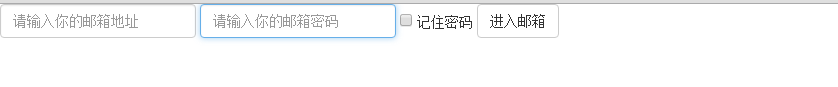
<form class="form-horizontal" role="form">
<div class="form-group">
<label for="inputEmail3" class="col-sm-2 control-label">邮箱</label>
<div class="col-sm-10">
<input type="email" class="form-control" id="inputEmail3" placeholder="请输入您的邮箱地址">
</div>
</div>
<div class="form-group">
<label for="inputPassword3" class="col-sm-2 control-label">密码</label>
<div class="col-sm-10">
<input type="password" class="form-control" id="inputPassword3" placeholder="请输入您的邮箱密码">
</div>
</div>
<div class="form-group">
<div class="col-sm-offset-2 col-sm-10">
<div class="checkbox">
<label>
<input type="checkbox"> 记住密码
</label>
</div>
</div>
</div>
<div class="form-group">
<div class="col-sm-offset-2 col-sm-10">
<button type="submit" class="btn btn-default">进入邮箱</button>
</div>
</div>
</form>
效果图:

在Bootstrap框架中要实现水平表单效果,必须满足以下两个条件:
1、在元素是使用类名“form-horizontal”。
2、配合Bootstrap框架的网格系统。
在元素上使用类名“form-horizontal”主要有以下几个作用:
- 设置表单控件padding和margin值。
- 改变“form-group”的表现形式,类似于网格系统的“row”。
3、水平表单:
在Bootstrap框架中实现这样的表单效果是轻而易举的,你只需要在元素中添加类名“form-inline”即可。
内联表单实现原理非常简单,欲将表单控件在一行显示,就需要将表单控件设置成内联块元素(display:inline-block)。
<form class="form-inline" role="form">
<div class="form-group">
<label class="sr-only" for="exampleInputEmail2">邮箱</label>
<input type="email" class="form-control" id="exampleInputEmail2" placeholder="请输入你的邮箱地址">
</div>
<div class="form-group">
<label class="sr-only" for="exampleInputPassword2">密码</label>
<input type="password" class="form-control" id="exampleInputPassword2" placeholder="请输入你的邮箱密码">
</div>
<div class="checkbox">
<label>
<input type="checkbox"> 记住密码
</label>
</div>
<button type="submit" class="btn btn-default">进入邮箱</button>
</form>
效果图:
4、输入框input
单行输入框,常见的文本输入框,也就是input的type属性值为text。在Bootstrap中使用input时也必须添加type类型,如果没有指定type类型,将无法得到正确的样式.
<form role="form">
<div class="form-group">
<input type="email" class="form-control" placeholder="Enter email">
</div>
<div class="form-group">
<input type="text" class="form-control" placeholder="请输入用户名"/>
</div>
</form>
效果图:

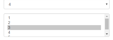
5、下拉选择框select
Bootstrap框架中的下拉选择框使用和原始的一致,多行选择设置multiple属性的值为multiple。Bootstrap框架会为这些元素提供统一的样式风格。
<form role="form">
<div class="form-group">
<select class="form-control">
<option>1</option>
<option>2</option>
<option>3</option>
<option>4</option>
<option>5</option>
</select>
</div>
<div class="form-group">
<select multiple class="form-control">
<option>1</option>
<option>2</option>
<option>3</option>
<option>4</option>
<option>5</option>
</select>
</div>
</form>
效果图:
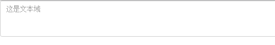
6、文本域textarea
文本域和原始使用方法一样,设置rows可定义其高度,设置cols可以设置其宽度。但如果textarea元素中添加了类名“form-control”类名,则无需设置cols属性。因为Bootstrap框架中的“form-control”样式的表单控件宽度为100%或auto。
<form role="form">
<div class="form-group">
<textarea class="form-control" rows="3"></textarea>
</div>
</form>
效果图:
7.复选框checkbox和单选择按钮radio
Bootstrap框架中checkbox和radio有点特殊,Bootstrap针对他们做了一些特殊化处理,主要是checkbox和radio与label标签配合使用会出现一些小问题(最头痛的是对齐问题)。使用Bootstrap框架,开发人员无需考虑太多,只需要按照下面的方法使用即可。
<form role="form">
<h3>案例1</h3>
<div class="checkbox">
<label>
<input type="checkbox" value="">
记住密码
</label>
</div>
<div class="radio">
<label>
<input type="radio" name="optionsRadios" id="optionsRadios1" value="love" checked>
喜欢
</label>
</div>
<div class="radio">
<label>
<input type="radio" name="optionsRadios" id="optionsRadios2" value="hate">
不喜欢
</label>
</div>
</form>
效果图:

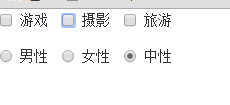
8.复选框和单选按钮水平排列
有时候,为了布局的需要,将复选框和单选按钮需要水平排列。Bootstrap框架也做了这方面的考虑:
1、如果checkbox需要水平排列,只需要在label标签上添加类名“checkbox-inline”
2、如果radio需要水平排列,只需要在label标签上添加类名“radio-inline”
<form role="form">
<div class="form-group">
<label class="checkbox-inline">
<input type="checkbox" value="option1">游戏
</label>
<label class="checkbox-inline">
<input type="checkbox" value="option2">摄影
</label>
<label class="checkbox-inline">
<input type="checkbox" value="option3">旅游
</label>
</div>
<div class="form-group">
<label class="radio-inline">
<input type="radio" value="option1" name="sex">男性
</label>
<label class="radio-inline">
<input type="radio" value="option2" name="sex">女性
</label>
<label class="radio-inline">
<input type="radio" value="option3" name="sex">中性
</label>
</div>
</form>
效果图:
9.按钮
在Bootstrap框架中的按钮都是采用来实现
<table class="table table-bordered table-striped">
<thead>
<tr>
<th>Button</th>
<th>class=""</th>
<th>Description</th>
</tr>
</thead>
<tbody>
<tr>
<td><button class="btn" href="#">Default</button></td>
<td><code>btn</code></td>
<td>Standard gray button with gradient</td>
</tr>
<tr>
<td><button class="btn btn-primary" href="#">Primary</button></td>
<td><code>btn btn-primary</code></td>
<td>Provides extra visual weight and identifies the primary action in a set of buttons</td>
</tr>
<tr>
<td><button class="btn btn-info" href="#">Info</button></td>
<td><code>btn btn-info</code></td>
<td>Used as an alternative to the default styles</td>
</tr>
<tr>
<td><button class="btn btn-success" href="#">Success</button></td>
<td><code>btn btn-success</code></td>
<td>Indicates a successful or positive action</td>
</tr>
<tr>
<td><button class="btn btn-warning" href="#">Warning</button></td>
<td><code>btn btn-warning</code></td>
<td>Indicates caution should be taken with this action</td>
</tr>
<tr>
<td><button class="btn btn-danger" href="#">Danger</button></td>
<td><code>btn btn-danger</code></td>
<td>Indicates a dangerous or potentially negative action</td>
</tr>
<tr>
<td><button class="btn btn-inverse" href="#">Inverse</button></td>
<td><code>btn btn-inverse</code></td>
<td>Alternate dark gray button, not tied to a semantic action or use</td>
</tr>
</tbody>
</table>
效果图:

10.表单控件大小
前面看到的表单控件都正常的大小。可以通过设置控件的height,line-height,padding和font-size等属性来实现控件的高度设置。不过Bootstrap框架还提供了两个不同的类名,用来控制表单控件的高度。这两个类名是:
1、input-sm:让控件比正常大小更小
2、input-lg:让控件比正常大小更大
这两个类适用于表单中的input,textarea和select控件.
<form role="form">
<div class="form-group">
<label class="control-label">控件变大</label>
<input class="form-control input-lg" type="text" placeholder="添加.input-lg,控件变大">
</div>
<div class="form-group">
<label class="control-label">正常大小</label>
<input class="form-control" type="text" placeholder="正常大小">
</div>
<div class="form-group">
<label class="control-label">控件变小</label>
<input class="form-control input-sm" type="text" placeholder="添加.input-sm,控件变小">
</div>
</form>
效果图:

11.表单控件状态(禁用状态)
Bootstrap框架的表单控件的禁用状态和普通的表单禁用状态实现方法是一样的,在相应的表单控件上添加属性“disabled”。具体的看下面的代码
禁用单个表单标签,只需要在标签的属性中加入disabled
<form role="form" class="form-horizontal">
<div class="form-group">
<div class="col-xs-6">
<input class="form-control input-lg" id="disabledInput" type="text" placeholder="表单已被禁用,不可输入" disabled>
</div>
</div>
</form>
效果图:

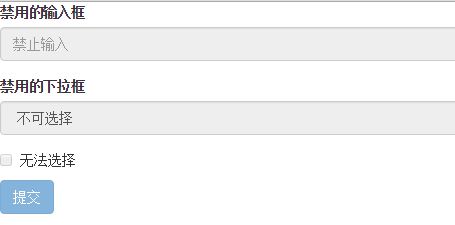
在Bootstrap框架中,如果fieldset设置了disabled属性,整个域都将处于被禁用状态。
<form role="form">
<fieldset disabled>
<div class="form-group">
<label for="disabledTextInput">禁用的输入框</label>
<input type="text" id="disabledTextInput" class="form-control" placeholder="禁止输入">
</div>
<div class="form-group">
<label for="disabledSelect">禁用的下拉框</label>
<select id="disabledSelect" class="form-control">
<option>不可选择</option>
</select>
</div>
<div class="checkbox">
<label>
<input type="checkbox"> 无法选择
</label>
</div>
<button type="submit" class="btn btn-primary">提交</button>
</fieldset>
</form>
效果图:
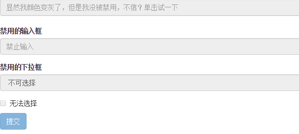
据说对于整个禁用的域中,如果legend中有输入框的话,这个输入框是无法被禁用的。
form role="form">
<fieldset disabled>
<legend><input type="text" class="form-control" placeholder="显然我颜色变灰了,但是我没被禁用,不信?单击试一下" /></legend>
<div class="form-group">
<label for="disabledTextInput">禁用的输入框</label>
<input type="text" id="disabledTextInput" class="form-control" placeholder="禁止输入">
</div>
<div class="form-group">
<label for="disabledSelect">禁用的下拉框</label>
<select id="disabledSelect" class="form-control">
<option>不可选择</option>
</select>
</div>
<div class="checkbox">
<label>
<input type="checkbox"> 无法选择
</label>
</div>
<button type="submit" class="btn btn-primary">提交</button>
</fieldset>
</form>
效果图:
表单验证状态
在制作表单时,不免要做表单验证。同样也需要提供验证状态样式,在Bootstrap框架中同样提供这几种效果。
1、.has-warning:警告状态(黄色)
2、.has-error:错误状态(红色)
3、.has-success:成功状态(绿色)
很多时候,在表单验证的时候,不同的状态会提供不同的 icon,比如成功是一个对号(√),错误是一个叉号(×)等。在Bootstrap框中也提供了这样的效果。如果你想让表单在对应的状态下显示 icon 出来,只需要在对应的状态下添加类名“has-feedback”。请注意,此类名要与“has-error”、“has-warning”和“has-success”在一起:
<form role="form">
<div class="form-group has-success">
<label class="control-label" for="inputSuccess1">成功状态</label>
<input type="text" class="form-control" id="inputSuccess1" placeholder="成功状态">
</div>
<div class="form-group has-warning">
<label class="control-label" for="inputWarning1">警告状态</label>
<input type="text" class="form-control" id="inputWarning1" placeholder="警告状态">
</div>
<div class="form-group has-error">
<label class="control-label" for="inputError1">错误状态</label>
<input type="text" class="form-control" id="inputError1" placeholder="错误状态">
</div>
</form>
<br>
<br>
<br>
<form role="form">
<div class="form-group has-success has-feedback">
<label class="control-label" for="inputSuccess1">成功状态</label>
<input type="text" class="form-control" id="inputSuccess1" placeholder="成功状态">
<span class="glyphicon glyphicon-ok form-control-feedback"></span>
</div>
<div class="form-group has-warning has-feedback">
<label class="control-label" for="inputWarning1">警告状态</label>
<input type="text" class="form-control" id="inputWarning1" placeholder="警告状态">
<span class="glyphicon glyphicon-warning-sign form-control-feedback"></span>
</div>
<div class="form-group has-error has-feedback">
<label class="control-label" for="inputError1">错误状态</label>
<input type="text" class="form-control" id="inputError1" placeholder="错误状态">
<span class="glyphicon glyphicon-remove form-control-feedback"></span>
</div>
</form>
效果图:

表单提示信息
平常在制作表单验证时,要提供不同的提示信息。在Bootstrap框架中也提供了这样的效果。使用了一个”help-block”样式,将提示信息以块状显示,并且显示在控件底部。
<form role="form">
<div class="form-group has-success has-feedback">
<label class="control-label" for="inputSuccess1">成功状态</label>
<input type="text" class="form-control" id="inputSuccess1" placeholder="成功状态">
<span class="help-block">你输入的信息是正确的</span>
<span class="glyphicon glyphicon-ok form-control-feedback"></span>
</div>
<div class="form-group has-warning has-feedback">
<label class="control-label" for="inputWarning1">警告状态</label>
<input type="text" class="form-control" id="inputWarning1" placeholder="警告状态">
<span class="help-block">请输入正确信息</span>
<span class="glyphicon glyphicon-warning-sign form-control-feedback"></span>
</div>
<div class="form-group has-error has-feedback">
<label class="control-label" for="inputError1">错误状态</label>
<input type="text" class="form-control" id="inputError1" placeholder="错误状态">
<span class="help-block">你输入的信息是错误的</span>
<span class="glyphicon glyphicon-remove form-control-feedback"></span>
</div>
</form>
效果图:

以上所述是小编给大家介绍的Bootstrap表单样式的使用,希望对大家有所帮助,如果大家有任何疑问请给我留言,小编会及时回复大家的。在此也非常感谢大家对我们网站的支持!
相关推荐
-

Bootstrap实现登录校验表单(带验证码)
这个登陆窗口是双登陆窗口的,对IE8及早期版本不支持,可以根据自己的开发语言更换,我这个是asp的,其中的引用文件可以在网络上自行下载,如找不到可以留下邮箱~! 关键代码如下所示: <!DOCTYPE html> <html> <head> <meta http-equiv="Content-Type" content="text/html; charset=utf-8" /> <title>scm登陆界面
-
Bootstrap实现水平排列的表单
通过为表单添加 .form-horizontal 类,并联合使用 Bootstrap 预置的栅格类,可以将 label 标签和控件组水平并排布局.这样做将改变 .form-group 的行为,使其表现为栅格系统中的行(row),因此就无需再额外添加 .row 了. 水平表单与其他表单不仅标记的数量上不同,而且表单的呈现形式也不同.如需创建一个水平布局的表单,请按下面的几个步骤进行: 1.向父 <form> 元素添加 class .form-horizontal. 2.把标签和控件放在一个带有
-
Bootstrap三种表单布局的使用方法
Bootstrap提供了三种表单布局:垂直表单,内联表单和水平表单 创建垂直或基本表单: •·向父 <form> 元素添加 role="form". •·把标签和控件放在一个带有 class .form-group 的 <div> 中.这是获取最佳间距所必需的. •·向所有的文本元素 <input>.<textarea> 和 <select> 添加 class .form-control <form role=&
-
BootStrap智能表单实战系列(十一)级联下拉的支持
什么是 Bootstrap? Bootstrap 是一个用于快速开发 Web 应用程序和网站的前端框架.Bootstrap 是基于 HTML.CSS.JAVASCRIPT 的. 历史 Bootstrap 是由 Twitter 的 Mark Otto 和 Jacob Thornton 开发的.Bootstrap 是 2011 年八月在 GitHub 上发布的开源产品. Bootstrap 包的内容 基本结构:Bootstrap 提供了一个带有网格系统.链接样式.背景的基本结构.这将在 Bootst
-
基于jQuery.validate及Bootstrap的tooltip开发气泡样式的表单校验组件思路详解
表单校验是页面开发中非常常见的一类需求,相信每个前端开发人员都有这方面的经验.网上有很多成熟的表单校验框架,虽然按照它们默认的设计,用起来没有多大的问题,但是在实际工作中,表单校验有可能有比较复杂的个性化的需求,使得我们用这些插件的默认机制并不能完成这些功能,所以要根据自己的需要去改造它们(毕竟自己还不到那个写一个完美的校验框架的层次).我用过formValidation这个校验框架,虽然它跟bootstrap配合地很好,但是校验风格太死板,不太满足个性化的场景:后来我找到了jquery.val
-
Bootstrap中的表单验证插件bootstrapValidator使用方法整理(推荐)
本文给大家介绍如何判断表单验证的实例代码,在没给大家介绍正文之前,先给大家介绍下插件. 插件介绍 先上一个图: 下载地址:https://github.com/nghuuphuoc/bootstrapvalidator 使用提示 中文化: 下载插件后,将\js\bootstrapValidator\language\zh_CN.js 引入文件,即实现中文化 提交前验证表单: 更丰富一点的表单验证例子:http://www.jq22.com/yanshi522,直接上代码: <!DOCTYPE h
-
BootStrap 智能表单实战系列(十)自动完成组件的支持
web开发中,肯定遇到像百度.google这种搜索的功能吧,那智能表单中的自动完成可以做什么呢,下面来揭晓: 1.包含像google.百度等类似的简单搜索 2.复杂结构的支持,比如说 输入产品编号,需要将产品的编号.产品的名称.产品的单价.产品的备注信息等填写会表单中的某个位置 代码如下(页面地址:https://github.com/xiexingen/Bootstrap-SmartForm/blob/master/demo/form3-ele-autocomplete.html): 自动完成
-
BootStrap智能表单实战系列(九)表单图片上传的支持
什么是 Bootstrap? Bootstrap 是一个用于快速开发 Web 应用程序和网站的前端框架.Bootstrap 是基于 HTML.CSS.JAVASCRIPT 的. 历史 Bootstrap 是由 Twitter 的 Mark Otto 和 Jacob Thornton 开发的.Bootstrap 是 2011 年八月在 GitHub 上发布的开源产品. Bootstrap 包的内容 基本结构:Bootstrap 提供了一个带有网格系统.链接样式.背景的基本结构.这将在 Bootst
-
全面解析Bootstrap表单样式的使用
本文主要给大家介绍了bootstrap表单样式的使用知识,非常不错,一起看看吧! 表单 <form role="form"> <div class="form-group"> <label for="exampleInputEmail1">邮箱:</label> <input type="email" class="form-control" id=&q
-
全面解析Bootstrap表单使用方法(表单样式)
一.基础表单 <form > <div class="form-group"> <label>邮箱:</label> <input type="email" class="form-control" placeholder="请输入您的邮箱地址"> </div> <div class="form-group"> <la
-
全面解析Bootstrap表单使用方法(表单控件状态)
一.焦点状态 焦点状态是通过伪类":focus"来实现.Bootstrap框架中表单控件的焦点状态删除了outline的默认样式,重新添加阴影效果. <form role="form" class="form-horizontal"> <div class="form-group"> <div class="col-xs-6"> <input class="
-
全面解析Bootstrap表单使用方法(表单按钮)
一.多标签支持 一般制作按钮除了使用<button>标签元素之外,还可以使用<input type="submit">和<a>标签等. 同样,在Bootstrap框架中制作按钮时,除了刚才所说的这些标签元素之外,还可以使用在其他的标签元素上,唯一需要注意的是,要在制作按钮的标签元素上添加类名".btn". <button class="btn btn-default" type="button&
-
全面解析Bootstrap表单使用方法(表单控件)
一.输入框input 单行输入框,常见的文本输入框,也就是input的type属性值为text. 在Bootstrap中使用input时也必须添加type类型,如果没有指定type类型,将无法得到正确的样式,因为Bootstrap框架都是通过input[type="?"] (其中?号代表type类型,比如说text类型,对应的是input[type="text"])的形式来定义样式的. 为了让控件在各种表单风格中样式不出错,需要添加类名".form-con
-
BootStrap栅格系统、表单样式与按钮样式源码解析
栅格系统 1.栅格系统介绍 Bootstrap 提供了一套响应式.移动设备优先的流式栅格系统,随着屏幕或视口(viewport)尺寸的增加,系统会自动分为最多12列. Bootstrap的栅格系统,由一个行(.row)和多个列构成. 栅格系统用于通过一系列的行(row)与列(column)的组合来创建页面布局,你的内容就可以放入这些创建好的网页布局中.具体的数据(文字.图片等都可以)放入列当中. 注意:栅格系统,必须放在.container(固定宽度)或.container-fluid(100%
-
Bootstrap表单布局样式源代码
Bootstrap提供了三种表单布局:垂直表单,内联表单和水平表单 创建垂直或基本表单: •·向父 <form> 元素添加 role="form". •·把标签和控件放在一个带有 class .form-group 的 <div> 中.这是获取最佳间距所必需的. •·向所有的文本元素 <input>.<textarea> 和 <select> 添加 class .form-control 内联表单: 内联表单中所有元素都向左对
-
Bootstrap表单布局样式代码
废话不多说了,直接给大家贴代码了. <form class="form-horizontal" role="form"> <fieldset> <legend>配置数据源</legend> <div class="form-group"> <label class="col-sm-2 control-label" for="ds_host"&
-
Bootstrap表单Form全面解析
Bootstrap,来自 Twitter,是目前最受欢迎的前端框架.Bootstrap 是基于 HTML.CSS.JAVASCRIPT 的,它简洁灵活,使得 Web 开发更加快捷. 在进行自己的后台改版时,大体布局都使用了bootstrap,剩下的表单部分没理由不去使用它,对于表单的美化和布局,bootstrap做的也是很不错的,有大气的边框,多功能的按钮及宏观的表单布局,一切都是那么的完整与完美! 普通表单 我们需要将表单元素包裹到form-group类里,一般以<div class="
-
第四章之BootStrap表单与图片
Bootstrap,来自 Twitter,是目前最受欢迎的前端框架.Bootstrap 是基于 HTML.CSS.JAVASCRIPT 的,它简洁灵活,使得 Web 开发更加快捷. 学习要点: 1.表单 2.图片 本节课我们主要学习一下 Bootstrap 表单和图片功能,通过内置的 CSS 定义,显示各种丰富的效果. 一.表单 Bootstrap 提供了一些丰富的表单样式供开发者使用. 1.基本格式 //实现基本的表单样式 <form> <div class="form-gr