微信小程序switch组件使用详解
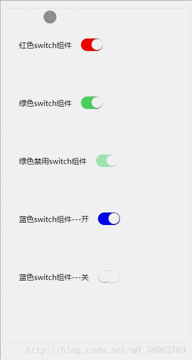
本文实例为大家分享了微信小程序switch组件的实现代码,供大家参考,具体内容如下
效果图
HTML
<div class="switch-list">
 <span class="fui-fr">红色switch组件</span>
 <input class="fui-switch" style="color:rgb(255, 0, 0);" type="checkbox" checked>
</div>
<div class="switch-list">
 <span class="fui-fr">绿色switch组件</span>
 <input class="fui-switch" style="color:rgb(76, 216, 100);" type="checkbox" checked>
</div>
<div class="switch-list">
 <span class="fui-fr">绿色禁用switch组件</span>
 <input class="fui-switch" style="color:rgb(76, 216, 100);" type="checkbox" checked disabled>
</div>
<div class="switch-list">
 <span class="fui-fr">蓝色switch组件---开</span>
 <input class="fui-switch" style="color:blue" type="checkbox" checked>
</div>
<div class="switch-list">
 <span class="fui-fr">蓝色switch组件---关</span>
 <input class="fui-switch" style="color:blue" type="checkbox">
</div>
CSS
.switch-list{
 padding: .5rem;
}
.fui-switch{
 position: relative;
 width: .87rem;
 height: .5rem;
 z-index: 10;
 display: inline-block;
 outline: medium;
 border: 1px solid #dfdfdf;
 border-radius: .25rem;
 background-color: #dfdfdf;
 -webkit-appearance: none;
 -moz-appearance: none;
 vertical-align: middle;
}
.fui-switch:checked{
 border-color: currentColor;
 background-color: currentColor;
}
.fui-switch::after,.fui-switch::before{
 content: "";
 position: absolute;
 height: .44rem;
 top: 0;
 left: 0;
 border-radius: .25rem;
 -webkit-transition: -webkit-transform .3s;
 transition: -webkit-transform .3s;
 transition: transform .3s;
 transition: transform .3s,-webkit-transform .3s;
}
.fui-switch:before {
 width: .84rem;
 background-color: #fdfdfd;
}
.fui-switch:checked:before {
 -webkit-transform: scale(0);
 transform: scale(0);
}
.fui-switch:after {
 width: .44rem;
 background-color: #fff;
 box-shadow: 0 1px 3px rgba(0,0,0,.4);
}
.fui-switch:checked:after {
 -webkit-transform: translateX(.4rem);
 transform: translateX(.4rem);
}
.fui-switch[disabled] {
 opacity: .5;
}
.fui-fr{font-size: .3rem;vertical-align: middle;}
实现rem的JS
(function(win,factory){
 factory(win);
 window.addEventListener('resize',function(){factory(win)},false);
}(window,function(win){
 var width = document.documentElement.clientWidth;
 width = width > 750 ? 750 : width;
 document.documentElement.style.fontSize = width / 7.5 + 'px';
}));
注意
此处 1rem 在 750 的 psd 设计图代表 100px ;
switch 的切换动画是通过 CSS3 的 transition 属性实现;
主要是控制 switch 的 after 的移动,以及 before 的放大缩小动画。
以上就是本文的全部内容,希望对大家的学习有所帮助,也希望大家多多支持我们。
相关推荐
-

微信小程序使用slider设置数据值及switch开关组件功能【附源码下载】
本文实例讲述了微信小程序使用slider设置数据值及switch开关组件功能.分享给大家供大家参考,具体如下: 1.效果展示 2.关键代码 ① index.wxml <view>微信小程序组件:滑动选择器slider</view> <slider bindchange="sliderBindchange" min="{{min}}" max="{{max}}" show-value/> <view>
-
微信小程序switch开关选择器使用详解
本文为大家分享了微信小程序switch开关选择器使用方法,供大家参考,具体内容如下 效果图 WXML <view class="tui-list-box"> <view class="tui-menu-list"> <text>状态:{{isChecked1}}</text> <switch class="tui-fr" checked="{{isChecked1}}" b
-
微信小程序(二十一)switch组件详细介绍
switch开关组件使用主要属性: wxml <!--switch类型开关--> <view>switch类型开关</view> <switch type="switch" checked="true" bindchange="listenerSwitch"/> <!--checkbox类型开关--> <view>checkbox类型开关</view> <s
-
微信小程序 switch组件详解及简单实例
微信小程序switch 相关文章: 微信小程序 Button 微信小程序 radio 微信小程序 slider 微信小程序 switch 微信小程序 textarea 微信小程序 picker-view 微信小程序 picker 微信小程序 label 微信小程序 input 微信小程序 form 微信小程序 checkbox 实现效果图: 开关选择器 属性名 类型 默认值 说明 checked Boolean false 是否选中 disabled Boolean false 是否禁用 typ
-
微信小程序switch组件使用详解
本文实例为大家分享了微信小程序switch组件的实现代码,供大家参考,具体内容如下 效果图 HTML <div class="switch-list"> <span class="fui-fr">红色switch组件</span> <input class="fui-switch" style="color:rgb(255, 0, 0);" type="checkbox&qu
-
微信小程序日历组件calendar详解及实例
微信小程序日历组件calendar详解及实例 模版使用: src="../cal/calendar.wxml"> is="calendar" data="{{selected_value,days,month,years,lunar_years,lunar_month,lunar_days,selectDateType,l unar_selected_value}}"> JS代码使用: var Calendar = require('
-
微信小程序slider组件使用详解
本文为大家分享了微信小程序slider组件的使用方法,供大家参考,具体内容如下 效果图 WXML <view class="tui-content"> <view class="tui-slider-head">设置step,当前设置步伐为5,当前值:{{slider1}}</view> <view class="tui-slider-box"> <slider bindchange=&quo
-
微信小程序progress组件使用详解
本文为大家分享了微信小程序progress组件的使用方法,供大家参考,具体内容如下 效果图 WXML <view class="tui-content"> <view class="tui-menu-list"> <text>show-info在进度条右侧显示百分比</text> <progress percent="50" show-info /> </view> <
-
微信小程序radio组件使用详解
本文为大家分享了微信小程序radio组件的使用方法,供大家参考,具体内容如下 效果图 WXML <view class="tui-content"> <radio-group class="radio-group" bindchange="radioChange"> <label class="radio" wx:for="{{items}}"> <view cla
-
微信小程序checkbox组件使用详解
本文为大家分享了微信小程序checkbox组件的使用方法,供大家参考,具体内容如下 效果图 WXML <view class="tui-content"> <checkbox-group bindchange="checkboxChange"> <label class="checkbox" wx:for="{{items}}"> <view class="tui-menu-
-
微信小程序button组件使用详解
本文为大家分享了微信小程序button组件的使用方法,供大家参考,具体内容如下 展示效果图 button组件的常用属性 size:default.mini--default为块级按钮.mini为小按钮 type:primary.default.warn--primary提交成功.default默认灰色.warn警告色 plain:true.false--按钮是否镂空,背景色透明 disabled:true.false--是否禁用 loading:true.false--名称前是否带 loadin
-
微信小程序icon组件使用详解
微信小程序icon组件的实现,具体如下 原生的icon组件的属性 WXML <view class="icon-group"> <icon wx:for="{{typeList}}" type="{{item}}" size="40"></icon> </view> JS Page({ data: { typeList: ['success', 'success_no_circl
-
微信小程序弹窗组件使用详解
介绍 最近在开发小程序应用, 发现小程序当中有关于组件的介绍非常的少, 当前自己做的项目当中,有出现过这种情况, 所以自己就封装了一个小程序的弹窗组件, 现在把自己的心得分享给大家, 大家一起来学习吧 效果图 需求背景 项目需求是需要在页面上通过点击按钮, 然后弹出弹窗蒙层; 因为小小程序当中经常会用到弹窗, 因此这里我直接将弹窗封装成了一个组件, 下次使用的时候,直接调用就可以了. 实现步骤 1.在微信小程序当中, 在当前项目当中, 新建一个component文件夹, 这个文件夹专门用来存放我
-
微信小程序 Image组件实例详解
image组件也是一个程序不可缺少的,可以这样说一个app中image组件随处可以看到,一般 image有两种加载方式第一种是网络图片第二种是本地图片资源,都用src属性去指定. 重点属性: 三种缩放模式 九种剪切方式 wxml <!--3中是缩放模式 scaleToFill 不保持纵横比缩放图片,使图片的宽高完全拉伸至填满image元素 aspectFit 保持纵横比缩放图片,使图片的长边能完全显示出来.也就是说,可以完整地将图片显示出来. aspectFill 保持纵横比缩放图片,只保证图片