R语言实现各种数据可视化的超详细教程
目录
- 1 主成分分析可视化结果
- 1.1 查看莺尾花数据集(前五行,前四列)
- 1.2 使用莺尾花数据集进行主成分分析后可视化展示
- 2 圆环图绘制
- 3 马赛克图绘制
- 3.1 构造数据
- 3.2 ggplot2包的geom_rect()函数绘制马赛克图
- 3.3 vcd包的mosaic()函数绘制马赛克图
- 3.4 graphics包的mosaicplot()函数绘制马赛克图
- 4 棒棒糖图绘制
- 4.1 查看内置示例数据
- 4.2 绘制基础棒棒糖图(使用ggplot2)
- 4.2.1 更改点的大小,形状,颜色和透明度
- 4.2.2 更改辅助线段的大小,颜色和类型
- 4.2.3 对点进行排序,坐标轴翻转
- 4.3 绘制棒棒糖图(使用ggpubr)
- 4.3.1 使用ggdotchart函数绘制棒棒糖图
- 4.3.2 自定义一些参数
- 5 三相元图绘制
- 5.1 构建数据
- 5.1.1 R-ggtern包绘制三相元图
- 5.1.2 优化处理
- 6 华夫饼图绘制
- 6.1 数据准备
- 6.1.1 ggplot 包绘制
- 6.1.2 点状华夫饼图ggplot绘制
- 6.1.3 堆积型华夫饼图
- 6.1.4 waffle 包绘制(一个好用的包,专为华夫饼图做准备的)
- 7 三维散点图绘制
- 7.1 简单绘制
- 7.2 加入第四个变量,进行颜色分组
- 7.2.1 方法一
- 7.2.2 方法二
- 7.3 用rgl包的plot3d()进行绘制
- 总结
1 主成分分析可视化结果
1.1 查看莺尾花数据集(前五行,前四列)
iris[1:5,-5]
##   Sepal.Length Sepal.Width Petal.Length Petal.Width
## 1          5.1         3.5          1.4         0.2
## 2          4.9         3.0          1.4         0.2
## 3          4.7         3.2          1.3         0.2
## 4          4.6         3.1          1.5         0.2
## 5          5.0         3.6          1.4         0.2
1.2 使用莺尾花数据集进行主成分分析后可视化展示
library("ggplot2")
library("ggbiplot")
## 载入需要的程辑包:plyr
## 载入需要的程辑包:scales
## 载入需要的程辑包:grid
res.pca = prcomp(iris[,-5],scale=TRUE)
ggbiplot(res.pca,obs.scale=1,var.scale=1,ellipse=TRUE,circle=TRUE)

#添加组别颜色
ggbiplot(res.pca,obs.scale=1,var.scale=1,ellipse=TRUE,circle=TRUE,groups=iris$Species)

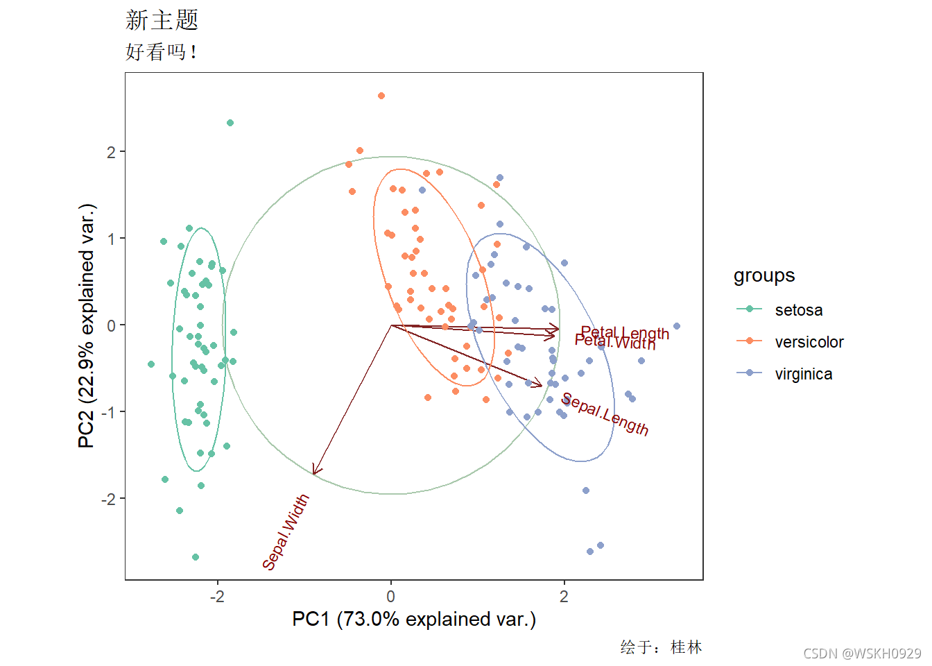
#更改绘制主题
ggbiplot(res.pca, obs.scale = 1, var.scale = 1, ellipse = TRUE,groups = iris$Species, circle = TRUE) +
  theme_bw() +
  theme(panel.grid = element_blank()) +
  scale_color_brewer(palette = "Set2") +
  labs(title = "新主题",subtitle = "好看吗!",caption ="绘于:桂林")
2 圆环图绘制
#构造数据
df <- data.frame(
  group = c("Male", "Female", "Child"),
  value = c(10, 20, 30))
#ggpubr包绘制圆环图
library("ggpubr")
##
## 载入程辑包:'ggpubr'
## The following object is masked from 'package:plyr':
##
##     mutate
ggdonutchart(df, "value",
             label = "group",
             fill = "group",
             color = "white",
             palette = c("#00AFBB", "#E7B800", "#FC4E07")
)

3 马赛克图绘制
3.1 构造数据
library(ggplot2)
library(RColorBrewer)
library(reshape2) #提供melt()函数
library(plyr) #提供ddply()函数,join()函数
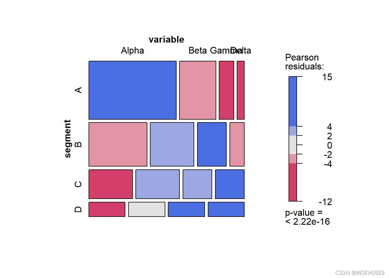
df <- data.frame(segment = c("A", "B", "C","D"),
Alpha = c(2400 ,1200, 600 ,250),
Beta = c(1000 ,900, 600, 250),
Gamma = c(400, 600 ,400, 250),
Delta = c(200, 300 ,400, 250))
melt_df<-melt(df,id="segment")
df
## segment Alpha Beta Gamma Delta
## 1 A 2400 1000 400 200
## 2 B 1200 900 600 300
## 3 C 600 600 400 400
## 4 D 250 250 250 250
#计算出每行的最大,最小值,并计算每行各数的百分比。ddply()对data.frame分组计算,并利用join()函数进行两个表格连接。
segpct<-rowSums(df[,2:ncol(df)])
for (i in 1:nrow(df)){
for (j in 2:ncol(df)){
df[i,j]<-df[i,j]/segpct[i]*100 #将数字转换成百分比
}
}
segpct<-segpct/sum(segpct)*100
df$xmax <- cumsum(segpct)
df$xmin <- (df$xmax - segpct)
dfm <- melt(df, id = c("segment", "xmin", "xmax"),value.name="percentage")
colnames(dfm)[ncol(dfm)]<-"percentage"
#ddply()函数使用自定义统计函数,对data.frame分组计算
dfm1 <- ddply(dfm, .(segment), transform, ymax = cumsum(percentage))
dfm1 <- ddply(dfm1, .(segment), transform,ymin = ymax - percentage)
dfm1$xtext <- with(dfm1, xmin + (xmax - xmin)/2)
dfm1$ytext <- with(dfm1, ymin + (ymax - ymin)/2)
#join()函数,连接两个表格data.frame
dfm2<-join(melt_df, dfm1, by = c("segment", "variable"), type = "left", match = "all")
dfm2
## segment variable value xmin xmax percentage ymax ymin xtext ytext
## 1 A Alpha 2400 0 40 60 60 0 20 30.0
## 2 B Alpha 1200 40 70 40 40 0 55 20.0
## 3 C Alpha 600 70 90 30 30 0 80 15.0
## 4 D Alpha 250 90 100 25 25 0 95 12.5
## 5 A Beta 1000 0 40 25 85 60 20 72.5
## 6 B Beta 900 40 70 30 70 40 55 55.0
## 7 C Beta 600 70 90 30 60 30 80 45.0
## 8 D Beta 250 90 100 25 50 25 95 37.5
## 9 A Gamma 400 0 40 10 95 85 20 90.0
## 10 B Gamma 600 40 70 20 90 70 55 80.0
## 11 C Gamma 400 70 90 20 80 60 80 70.0
## 12 D Gamma 250 90 100 25 75 50 95 62.5
## 13 A Delta 200 0 40 5 100 95 20 97.5
## 14 B Delta 300 40 70 10 100 90 55 95.0
## 15 C Delta 400 70 90 20 100 80 80 90.0
## 16 D Delta 250 90 100 25 100 75 95 87.5
3.2 ggplot2包的geom_rect()函数绘制马赛克图
ggplot()+
  geom_rect(aes(ymin = ymin, ymax = ymax, xmin = xmin, xmax = xmax, fill = variable),dfm2,colour = "black") +
  geom_text(aes(x = xtext, y = ytext,  label = value),dfm2 ,size = 4)+
  geom_text(aes(x = xtext, y = 103, label = paste("Seg ", segment)),dfm2 ,size = 4)+
  geom_text(aes(x = 102, y = seq(12.5,100,25), label = c("Alpha","Beta","Gamma","Delta")), size = 4,hjust = 0)+
  scale_x_continuous(breaks=seq(0,100,25),limits=c(0,110))+
  theme(panel.background=element_rect(fill="white",colour=NA),
        panel.grid.major = element_line(colour = "grey60",size=.25,linetype ="dotted" ),
        panel.grid.minor = element_line(colour = "grey60",size=.25,linetype ="dotted" ),
        text=element_text(size=15),
        legend.position="none")

3.3 vcd包的mosaic()函数绘制马赛克图
library(vcd)
table<-xtabs(value ~variable+segment, melt_df)
mosaic( ~segment+variable,table,shade=TRUE,legend=TRUE,color=TRUE)
包的mosaic()函数绘制马赛克图
library(vcd)
table<-xtabs(value ~variable+segment, melt_df)
mosaic( ~segment+variable,table,shade=TRUE,legend=TRUE,color=TRUE)
3.4 graphics包的mosaicplot()函数绘制马赛克图
library(graphics)
library(wesanderson) #颜色提取
mosaicplot( ~segment+variable,table, color = wes_palette("GrandBudapest1"),main = '')
4 棒棒糖图绘制
4.1 查看内置示例数据
library(ggplot2)
data("mtcars")
df <- mtcars
# 转换为因子
df$cyl <- as.factor(df$cyl)
df$name <- rownames(df)
head(df)
##                    mpg cyl disp  hp drat    wt  qsec vs am gear carb
## Mazda RX4         21.0   6  160 110 3.90 2.620 16.46  0  1    4    4
## Mazda RX4 Wag     21.0   6  160 110 3.90 2.875 17.02  0  1    4    4
## Datsun 710        22.8   4  108  93 3.85 2.320 18.61  1  1    4    1
## Hornet 4 Drive    21.4   6  258 110 3.08 3.215 19.44  1  0    3    1
## Hornet Sportabout 18.7   8  360 175 3.15 3.440 17.02  0  0    3    2
## Valiant           18.1   6  225 105 2.76 3.460 20.22  1  0    3    1
##                                name
## Mazda RX4                 Mazda RX4
## Mazda RX4 Wag         Mazda RX4 Wag
## Datsun 710               Datsun 710
## Hornet 4 Drive       Hornet 4 Drive
## Hornet Sportabout Hornet Sportabout
## Valiant                     Valiant
4.2 绘制基础棒棒糖图(使用ggplot2)
ggplot(df,aes(name,mpg)) +
  # 添加散点
  geom_point(size=5) +
  # 添加辅助线段
  geom_segment(aes(x=name,xend=name,y=0,yend=mpg))

4.2.1 更改点的大小,形状,颜色和透明度
ggplot(df,aes(name,mpg)) +
  # 添加散点
  geom_point(size=5, color="red", fill=alpha("orange", 0.3),
             alpha=0.7, shape=21, stroke=3) +
  # 添加辅助线段
  geom_segment(aes(x=name,xend=name,y=0,yend=mpg)) +
  theme_bw() +
  theme(axis.text.x = element_text(angle = 45,hjust = 1),
        panel.grid = element_blank())

4.2.2 更改辅助线段的大小,颜色和类型
ggplot(df,aes(name,mpg)) +
  # 添加散点
  geom_point(aes(size=cyl,color=cyl)) +
  # 添加辅助线段
  geom_segment(aes(x=name,xend=name,y=0,yend=mpg),
               size=1, color="blue", linetype="dotdash") +
  theme_classic() +
  theme(axis.text.x = element_text(angle = 45,hjust = 1),
        panel.grid = element_blank()) +
  scale_y_continuous(expand = c(0,0))
## Warning: Using size for a discrete variable is not advised.

4.2.3 对点进行排序,坐标轴翻转
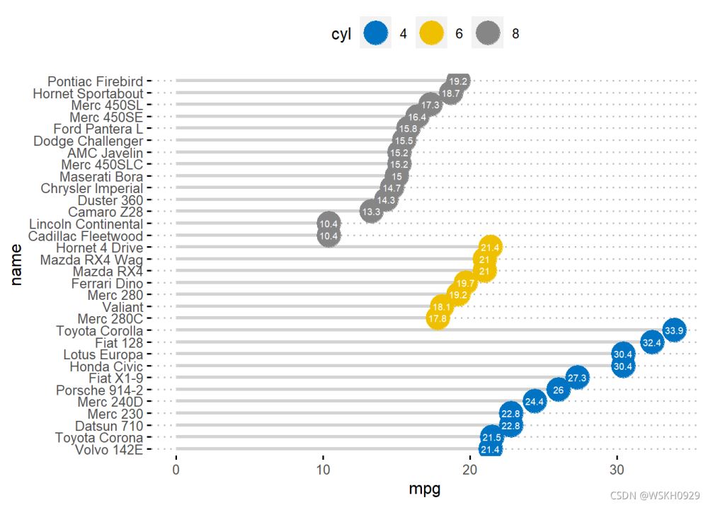
df <- df[order(df$mpg),]
# 设置因子进行排序
df$name <- factor(df$name,levels = df$name)

ggplot(df,aes(name,mpg)) +
  # 添加散点
  geom_point(aes(color=cyl),size=8) +
  # 添加辅助线段
  geom_segment(aes(x=name,xend=name,y=0,yend=mpg),
               size=1, color="gray") +
  theme_minimal() +
  theme(
    panel.grid.major.y = element_blank(),
    panel.border = element_blank(),
    axis.ticks.y = element_blank()
  ) +
  coord_flip()

4.3 绘制棒棒糖图(使用ggpubr)
library(ggpubr)
# 查看示例数据
head(df)
##                      mpg cyl disp  hp drat    wt  qsec vs am gear carb
## Cadillac Fleetwood  10.4   8  472 205 2.93 5.250 17.98  0  0    3    4
## Lincoln Continental 10.4   8  460 215 3.00 5.424 17.82  0  0    3    4
## Camaro Z28          13.3   8  350 245 3.73 3.840 15.41  0  0    3    4
## Duster 360          14.3   8  360 245 3.21 3.570 15.84  0  0    3    4
## Chrysler Imperial   14.7   8  440 230 3.23 5.345 17.42  0  0    3    4
## Maserati Bora       15.0   8  301 335 3.54 3.570 14.60  0  1    5    8
##                                    name
## Cadillac Fleetwood   Cadillac Fleetwood
## Lincoln Continental Lincoln Continental
## Camaro Z28                   Camaro Z28
## Duster 360                   Duster 360
## Chrysler Imperial     Chrysler Imperial
## Maserati Bora             Maserati Bora
4.3.1 使用ggdotchart函数绘制棒棒糖图
ggdotchart(df, x = "name", y = "mpg",
           color = "cyl", # 设置按照cyl填充颜色
           size = 6, # 设置点的大小
           palette = c("#00AFBB", "#E7B800", "#FC4E07"), # 修改颜色画板
           sorting = "ascending", # 设置升序排序
           add = "segments", # 添加辅助线段
           add.params = list(color = "lightgray", size = 1.5), # 设置辅助线段的大小和颜色
           ggtheme = theme_pubr(), # 设置主题
)

4.3.2 自定义一些参数
ggdotchart(df, x = "name", y = "mpg",
           color = "cyl", # 设置按照cyl填充颜色
           size = 8, # 设置点的大小
           palette = "jco", # 修改颜色画板
           sorting = "descending", # 设置降序排序
           add = "segments", # 添加辅助线段
           add.params = list(color = "lightgray", size = 1.2), # 设置辅助线段的大小和颜色
           rotate = TRUE, # 旋转坐标轴方向
           group = "cyl", # 设置按照cyl进行分组
           label = "mpg", # 按mpg添加label标签
           font.label = list(color = "white",
                             size = 7,
                             vjust = 0.5), # 设置label标签的字体颜色和大小
           ggtheme = theme_pubclean(), # 设置主题
)
5 三相元图绘制
5.1 构建数据
test_data = data.frame(x = runif(100),
                       y = runif(100),
                       z = runif(100))
head(test_data)
##            x         y          z
## 1 0.79555379 0.1121278 0.90667083
## 2 0.12816648 0.8980756 0.51703604
## 3 0.66631357 0.5757205 0.50830765
## 4 0.87326608 0.2336119 0.05895517
## 5 0.01087468 0.7611424 0.37542833
## 6 0.77126494 0.2682030 0.49992176
5.1.1 R-ggtern包绘制三相元图
library(tidyverse)
## -- Attaching packages --------------------------------------- tidyverse 1.3.1 --
## v tibble 3.1.3 v dplyr 1.0.7
## v tidyr 1.1.3 v stringr 1.4.0
## v readr 2.0.1 v forcats 0.5.1
## v purrr 0.3.4
## -- Conflicts ------------------------------------------ tidyverse_conflicts() --
## x dplyr::arrange() masks plyr::arrange()
## x readr::col_factor() masks scales::col_factor()
## x purrr::compact() masks plyr::compact()
## x dplyr::count() masks plyr::count()
## x purrr::discard() masks scales::discard()
## x dplyr::failwith() masks plyr::failwith()
## x dplyr::filter() masks stats::filter()
## x dplyr::id() masks plyr::id()
## x dplyr::lag() masks stats::lag()
## x dplyr::mutate() masks ggpubr::mutate(), plyr::mutate()
## x dplyr::rename() masks plyr::rename()
## x dplyr::summarise() masks plyr::summarise()
## x dplyr::summarize() masks plyr::summarize()
library(ggtern)
## Registered S3 methods overwritten by 'ggtern':
## method from
## grid.draw.ggplot ggplot2
## plot.ggplot ggplot2
## print.ggplot ggplot2
## --
## Remember to cite, run citation(package = 'ggtern') for further info.
## --
##
## 载入程辑包:'ggtern'
## The following objects are masked from 'package:ggplot2':
##
## aes, annotate, ggplot, ggplot_build, ggplot_gtable, ggplotGrob,
## ggsave, layer_data, theme_bw, theme_classic, theme_dark,
## theme_gray, theme_light, theme_linedraw, theme_minimal, theme_void
library(hrbrthemes)
## NOTE: Either Arial Narrow or Roboto Condensed fonts are required to use these themes.
## Please use hrbrthemes::import_roboto_condensed() to install Roboto Condensed and
## if Arial Narrow is not on your system, please see https://bit.ly/arialnarrow
library(ggtext)
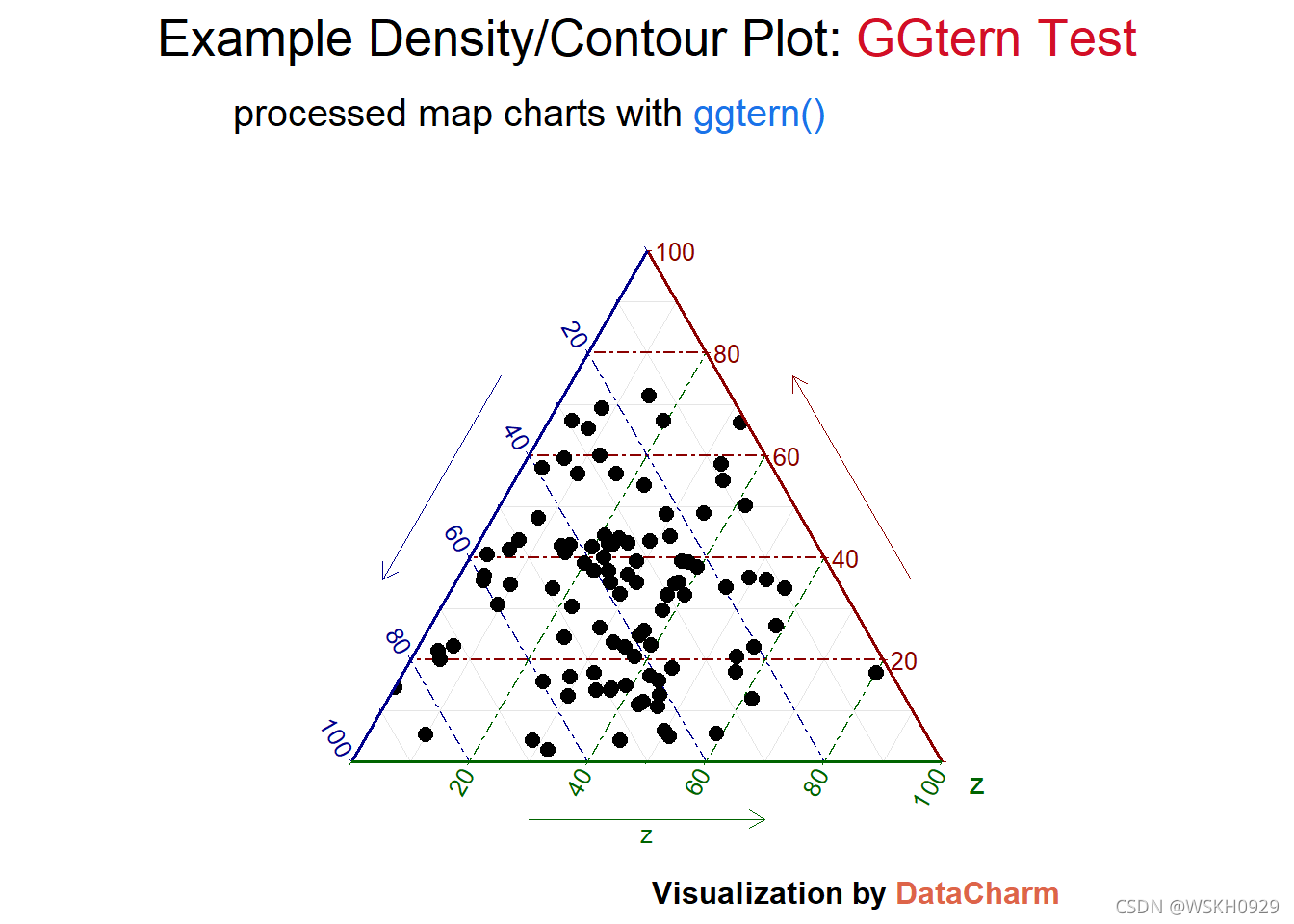
test_plot_pir <- ggtern(data = test_data,aes(x, y, z))+
geom_point(size=2.5)+
theme_rgbw(base_family = "") +
labs(x="",y="",
title = "Example Density/Contour Plot: <span style='color:#D20F26'>GGtern Test</span>",
subtitle = "processed map charts with <span style='color:#1A73E8'>ggtern()</span>",
caption = "Visualization by <span style='color:#DD6449'>DataCharm</span>") +
guides(color = "none", fill = "none", alpha = "none")+
theme(
plot.title = element_markdown(hjust = 0.5,vjust = .5,color = "black",
size = 20, margin = margin(t = 1, b = 12)),
plot.subtitle = element_markdown(hjust = 0,vjust = .5,size=15),
plot.caption = element_markdown(face = 'bold',size = 12),
)
test_plot_pir
5.1.2 优化处理
test_plot <- ggtern(data = test_data,aes(x, y, z),size=2)+
    stat_density_tern(geom = 'polygon',n = 300,
                      aes(fill  = ..level..,
                          alpha = ..level..))+
    geom_point(size=2.5)+
    theme_rgbw(base_family = "") +
    labs(x="",y="",
        title = "Example Density/Contour Plot: <span style='color:#D20F26'>GGtern Test</span>",
        subtitle = "processed map charts with <span style='color:#1A73E8'>ggtern()</span>",
        caption = "Visualization by <span style='color:#DD6449'>DataCharm</span>") +
    scale_fill_gradient(low = "blue",high = "red")  +
    #去除映射属性的图例
    guides(color = "none", fill = "none", alpha = "none")+
    theme(
        plot.title = element_markdown(hjust = 0.5,vjust = .5,color = "black",
                             size = 20, margin = margin(t = 1, b = 12)),
        plot.subtitle = element_markdown(hjust = 0,vjust = .5,size=15),
        plot.caption = element_markdown(face = 'bold',size = 12),
        )
test_plot
## Warning: stat_density_tern: You have not specified a below-detection-limit (bdl) value (Ref. 'bdl' and 'bdl.val' arguments in ?stat_density_tern). Presently you have 2x value/s below a detection limit of 0.010, which acounts for 2.000% of your data. Density values at fringes may appear abnormally high attributed to the mathematics of the ILR transformation.
## You can either:
## 1. Ignore this warning,
## 2. Set the bdl value appropriately so that fringe values are omitted from the ILR calculation, or
## 3. Accept the high density values if they exist, and manually set the 'breaks' argument
##    so that the countours at lower densities are represented appropriately.

6 华夫饼图绘制
6.1 数据准备
#相关包
library(ggplot2)
library(RColorBrewer)
library(reshape2)
#数据生成
nrows <- 10
categ_table <- round(table(mpg$class ) * ((nrows*nrows)/(length(mpg$class))))
sort_table<-sort(categ_table,index.return=TRUE,decreasing = FALSE)
Order<-sort(as.data.frame(categ_table)$Freq,index.return=TRUE,decreasing = FALSE)
df <- expand.grid(y = 1:nrows, x = 1:nrows)
df$category<-factor(rep(names(sort_table),sort_table), levels=names(sort_table))
Color<-brewer.pal(length(sort_table), "Set2")
head(df)
##   y x category
## 1 1 1  2seater
## 2 2 1  2seater
## 3 3 1  minivan
## 4 4 1  minivan
## 5 5 1  minivan
## 6 6 1  minivan
6.1.1 ggplot 包绘制
ggplot(df, aes(x = y, y = x, fill = category)) +
geom_tile(color = "white", size = 0.25) +
#geom_point(color = "black",shape=1,size=5) +
coord_fixed(ratio = 1)+ #x,y 轴尺寸固定, ratio=1 表示 x , y 轴长度相同
scale_x_continuous(trans = 'reverse') +#expand = c(0, 0),
scale_y_continuous(trans = 'reverse') +#expand = c(0, 0),
scale_fill_manual(name = "Category",
#labels = names(sort_table),
values = Color)+
theme(#panel.border = element_rect(fill=NA,size = 2),
panel.background = element_blank(),
plot.title = element_text(size = rel(1.2)),
axis.text = element_blank(),
axis.title = element_blank(),
axis.ticks = element_blank(),
legend.title = element_blank(),
legend.position = "right")
## Coordinate system already present. Adding new coordinate system, which will replace the existing one.

6.1.2 点状华夫饼图ggplot绘制
library(ggforce)
ggplot(df, aes(x0 = y, y0 = x, fill = category,r=0.5)) +
  geom_circle(color = "black", size = 0.25) +
  #geom_point(color = "black",shape=21,size=6) +
  coord_fixed(ratio = 1)+
  scale_x_continuous(trans = 'reverse') +#expand = c(0, 0),
  scale_y_continuous(trans = 'reverse') +#expand = c(0, 0),
  scale_fill_manual(name = "Category",
                    #labels = names(sort_table),
                    values = Color)+
  theme(#panel.border = element_rect(fill=NA,size = 2),
    panel.background  = element_blank(),
    plot.title = element_text(size = rel(1.2)),
    legend.position = "right")
## Coordinate system already present. Adding new coordinate system, which will replace the existing one.

6.1.3 堆积型华夫饼图
library(dplyr)
nrows <- 10
ndeep <- 10
unit<-100
df <- expand.grid(y = 1:nrows, x = 1:nrows)

categ_table <- as.data.frame(table(mpg$class) * (nrows*nrows))
colnames(categ_table)<-c("names","vals")
categ_table<-arrange(categ_table,desc(vals))
categ_table$vals<-categ_table$vals /unit

tb4waffles <- expand.grid(y = 1:ndeep,x = seq_len(ceiling(sum(categ_table$vals) / ndeep)))
regionvec <- as.character(rep(categ_table$names, categ_table$vals))
tb4waffles<-tb4waffles[1:length(regionvec),]

tb4waffles$names <- factor(regionvec,levels=categ_table$names)

Color<-brewer.pal(nrow(categ_table), "Set2")
ggplot(tb4waffles, aes(x = x, y = y, fill = names)) +
  #geom_tile(color = "white") + #
  geom_point(color = "black",shape=21,size=5) + #
  scale_fill_manual(name = "Category",
                    values = Color)+
  xlab("1 square = 100")+
  ylab("")+
  coord_fixed(ratio = 1)+
  theme(#panel.border = element_rect(fill=NA,size = 2),
         panel.background  = element_blank(),
        plot.title = element_text(size = rel(1.2)),
        #axis.text = element_blank(),
        #axis.title = element_blank(),
        #axis.ticks = element_blank(),
        # legend.title = element_blank(),
        legend.position = "right")
## Coordinate system already present. Adding new coordinate system, which will replace the existing one.

6.1.4 waffle 包绘制(一个好用的包,专为华夫饼图做准备的)
#waffle(parts, rows = 10, keep = TRUE, xlab = NULL, title = NULL, colors = NA, size = 2, flip = FALSE, reverse = FALSE, equal = TRUE, pad = 0, use_glyph = FALSE, glyph_size = 12, legend_pos = "right")
#parts 用于图表的值的命名向量
#rows 块的行数
#keep 保持因子水平(例如,在华夫饼图中获得一致的图例)
library("waffle")
parts <- c(One=80, Two=30, Three=20, Four=10)
chart <- waffle(parts, rows=8)
print(chart)

7 三维散点图绘制
7.1 简单绘制
library("plot3D")
#以Sepal.Length为x轴,Sepal.Width为y轴,Petal.Length为z轴。绘制箱子型box = TRUE;旋转角度为theta = 60, phi = 20;透视转换强度的值为3d=3;按照2D图绘制正常刻度ticktype = "detailed";散点图的颜色设置bg="#F57446"
pmar <- par(mar = c(5.1, 4.1, 4.1, 6.1)) #改版画布版式大小
with(iris, scatter3D(x = Sepal.Length, y = Sepal.Width, z = Petal.Length,
  pch = 21, cex = 1.5,col="black",bg="#F57446",
                   xlab = "Sepal.Length",
                   ylab = "Sepal.Width",
                   zlab = "Petal.Length",
                   ticktype = "detailed",bty = "f",box = TRUE,
                   theta = 60, phi = 20, d=3,
                   colkey = FALSE)
)

7.2 加入第四个变量,进行颜色分组
7.2.1 方法一
#可以将变量Petal.Width映射到数据点颜色中。该变量是连续性,如果想将数据按从小到大分成n类,则可以使用dplyr包中的ntile()函数,然后依次设置不同组的颜色bg=colormap[iris$quan],并根据映射的数值添加图例颜色条(colkey())。
library(tidyverse)
iris = iris %>% mutate(quan = ntile(Petal.Width,6))
colormap <- colorRampPalette(rev(brewer.pal(11,'RdYlGn')))(6)#legend颜色配置
pmar <- par(mar = c(5.1, 4.1, 4.1, 6.1))
# 绘图
with(iris, scatter3D(x = Sepal.Length, y = Sepal.Width, z = Petal.Length,pch = 21, cex = 1.5,col="black",bg=colormap[iris$quan],
     xlab = "Sepal.Length",
     ylab = "Sepal.Width",
     zlab = "Petal.Length",
     ticktype = "detailed",bty = "f",box = TRUE,
     theta = 60, phi = 20, d=3,
     colkey = FALSE)
)
colkey (col=colormap,clim=range(iris$quan),clab = "Petal.Width", add=TRUE, length=0.4,side = 4)

7.2.2 方法二
#将第四维数据映射到数据点的大小上(cex = rescale(iris$quan, c(.5, 4)))这里我还“得寸进尺”的将颜色也来反应第四维变量,当然也可以用颜色反应第五维变量。
pmar <- par(mar = c(5.1, 4.1, 4.1, 6.1))
with(iris, scatter3D(x = Sepal.Length, y = Sepal.Width, z = Petal.Length,pch = 21,
                     cex = rescale(iris$quan, c(.5, 4)),col="black",bg=colormap[iris$quan],
                     xlab = "Sepal.Length",
                     ylab = "Sepal.Width",
                     zlab = "Petal.Length",
                     ticktype = "detailed",bty = "f",box = TRUE,
                     theta = 30, phi = 15, d=2,
                     colkey = FALSE)
)
breaks =1:6
legend("right",title =  "Weight",legend=breaks,pch=21,
       pt.cex=rescale(breaks, c(.5, 4)),y.intersp=1.6,
       pt.bg = colormap[1:6],bg="white",bty="n")

7.3 用rgl包的plot3d()进行绘制
library(rgl)
#数据
mycolors <- c('royalblue1', 'darkcyan', 'oldlace')
iris$color <- mycolors[ as.numeric(iris$Species) ]
#绘制
plot3d(
  x=iris$`Sepal.Length`, y=iris$`Sepal.Width`, z=iris$`Petal.Length`,
  col = iris$color,
  type = 's',
  radius = .1,
  xlab="Sepal Length", ylab="Sepal Width", zlab="Petal Length")
总结
到此这篇关于R语言实现各种数据可视化的文章就介绍到这了,更多相关R语言实现数据可视化内容请搜索我们以前的文章或继续浏览下面的相关文章希望大家以后多多支持我们!
相关推荐
-
使用Python对网易云歌单数据分析及可视化
目录 项目概述 1.1项目来源 1.2需求描述 数据获取 2.1数据源的选取 2.2数据的获取 2.2.1 设计 2.2.2 实现 2.2.3 效果 数据预处理 3.1 设计 3.2 实现 3.3 效果 数据分析及可视化 4.1 歌单播放量Top10 4.1.1 实现 4.1.2 结果 4.1.3 可视化 4.2 歌单收藏量Top10 4.2.1 实现 4.2.2 结果 4.2.3 可视化 4.3 歌单评论数Top10 4.3.1 实现 4.3.2 结果 4.3.3 可视化 4.4 歌单歌曲收
-
使用Python进行数据可视化
目录 第一步:导入必要的库 第二步:加载数据 第三步:创建基本图表 第四步:添加更多细节 第五步:使用Seaborn库创建更复杂的图表 结论 数据可视化是一种将数据呈现为图形或图表的技术,它有助于理解和发现数据中的模式和趋势.Python是一种流行的编程语言,有很多库可以帮助我们进行数据可视化.在本文中,我们将介绍使用Python进行数据可视化的基本步骤. 第一步:导入必要的库 在开始之前,我们需要导入一些必要的库,例如Pandas.Matplotlib和Seaborn.这些库可以通过以下命令导
-

详解Python中四种关系图数据可视化的效果对比
python关系图的可视化主要就是用来分析一堆数据中,每一条数据的节点之间的连接关系从而更好的分析出人物或其他场景中存在的关联关系. 这里使用的是networkx的python非标准库来测试效果展示,通过模拟出一组DataFrame数据实现四种关系图可视化. 其余还包含了pandas的数据分析模块以及matplotlib的画图模块. 若是没有安装这三个相关的非标准库使用pip的方式安装一下即可. pip install pandas -i https://pypi.tuna.tsinghua.e
-
前端框架ECharts dataset对数据可视化的高级管理
目录 dataset 管理数据 dataset 管理数据 提供一份数据. 声明一个 X 轴,类目轴(category).默认情况下,类目轴对应到声明多个 bar 系列,默认情况下,每个系列会自动对应到 dataset 的每一列. option = { legend: {}, tooltip: {}, dataset: { // source: [ ['product', '2015', '2016', '2017'], ['Matcha Latte', 43.3, 85.8, 93.7], ['
-
Python Matplotlib数据可视化模块使用详解
目录 前言 1 matplotlib 开发环境搭建 2 绘制基础 2.1 绘制直线 2.2 绘制折线 2.3 设置标签文字和线条粗细 2.4 绘制一元二次方程的曲线 y=x^2 2.5 绘制正弦曲线和余弦曲线 3 绘制散点图 4 绘制柱状图 5 绘制饼状图 6 绘制直方图 7 绘制等高线图 8 绘制三维图 总结 本文主要介绍python 数据可视化模块 Matplotlib,并试图对其进行一个详尽的介绍. 通过阅读本文,你可以: 了解什么是 Matplotlib 掌握如何用 Matplotlib
-
Postman全局注册方法及对返回数据可视化处理
目录 1.全局方法注册及使用 1.1 注册 1.2全局方法使用 2. 可视化 1.全局方法注册及使用 1.1 注册 在collection最外层中Pre-request Script中编写全局方法 // 开发者本机ip const globalDevIp = 'http://172.16.65.46:9191' // 全局变量 pm.globals.set("variable_key", "variable_value"); var moment = require
-
MySQL数据更新操作的两种办法(数据可视化工具和SQL语句)
目录 数据更新有两种办法: 添加数据 插入数据 删除数据 修改数据 mysql千万级数据量更新操作 总结 数据更新有两种办法: 1:使用数据可视化工具操作 2:SQL语句 添加数据 前面的添加数据命令一次只能插入一条记录.如果想一次插入多条记录怎么办呢? 可以将子查询的结果,以集合的方式向表中添加数据. 格式:INSERT INTO <表名> 子查询 [例]创建一个新表‘清华大学出版图书表’并将清华大学出版社出版的图书添加到此表中. CREATE TABLE thboPRIMARY KEY,
-
R语言实现各种数据可视化的超详细教程
目录 1 主成分分析可视化结果 1.1 查看莺尾花数据集(前五行,前四列) 1.2 使用莺尾花数据集进行主成分分析后可视化展示 2 圆环图绘制 3 马赛克图绘制 3.1 构造数据 3.2 ggplot2包的geom_rect()函数绘制马赛克图 3.3 vcd包的mosaic()函数绘制马赛克图 3.4 graphics包的mosaicplot()函数绘制马赛克图 4 棒棒糖图绘制 4.1 查看内置示例数据 4.2 绘制基础棒棒糖图(使用ggplot2) 4.2.1 更改点的大小,形状,颜色和透
-
使用R语言绘制3D数据可视化scatter散点图实现步骤
目录 Step1. 绘图数据的准备 Step2. 绘图数据的读取 Step3.绘图所需package的调用 Step4.绘图 调整3D点的大小 调整透明度 注意事项 它来了它来了,它顺着网线走来了…哈哈,今天小仙给大家带来的是3D散点图. 强调一下啊,咱们这个教程里第一次出现了3D图,第一次出现了交互式图形(简单粗暴的理解, 用鼠标点击会动的图) 今天主要给大家介绍一下plotly这个R包,顺便分享下3D散点图的画法.plotly是一个在线的数据分析和可视化工具,图表类型丰富.可交互等等一堆优点
-
R语言3.6.3安装超详细教程附安装包
软件下载 R语言3.6.3 软件安装包下载: 链接: https://pan.baidu.com/s/1sufVf2lmoj9GYG_j5_fJKQ 提取码: tnqg R语言R-4.0.4 安装包下载地址: 链接: https://pan.baidu.com/s/1uzH49cJ0lnob54k19WWjOQ 提取码: kusa 软件介绍 R语言是一款非常专业的统计建模软件,R语言拥有数据存储和处理系统;数组运算工具(其向量.矩阵运算方面功能尤其强大),完整连贯的统计分析工具;优秀的统计制图等
-
R语言使用gganimate创建可视化动图
目录 前言 加载R包,数据 ggplot2绘制 gganimate 动态 参考资料 前言 介绍一个主要用于绘制动画的ggplot2的扩展包---gganimate包. Hans Rosling的关于“New Insights on Poverty”的TED演讲绝对是对我影响最大的几个TED之一,原来数据可以这样展示,,,可视化可以这样炫,,,故事可以这样讲... 下面尝试使用 gganimate 包和 gapminder 数据集,实现类似可视化过程. 加载R包,数据 #R包安装 install.
-
R语言导入导出数据的几种方法汇总
导出: 对于某一数据集导出文件的方法 导出例子:write.csv(data_1,file = "d:/1111111111.csv") 其中data_1是你的数据集,file是你的存储路径和要存储的名字 导入: 1 使用键盘输入数据 (1) 创建一个空数据框(或矩阵),其中变量名和变量的模式需与理想中的最终数据集一致: (2)针对这个数据对象调用文本编辑器,输入你的数据,并将结果保存回此数据对象中. 在下例中,你将创建一个名为mydata的数据框,它含有三个变量:age(数值型).
-
R语言中对数据框的列名重命名的实现
报错类型 Error: All arguments must be named plyr中的rename和dplyr中的rename用法是不同的. plyr::rename rename(data, c(old=new)) dplyr::rename rename(data, new = old) Example 比如, 默认的是plyr的rename, 运行下面命令, 会报错: d <- data.frame(old1=1:3, old2=4:6, old3=7:9) d library(ti
-
R语言读取excel数据的方法(两行命令)
安装库 安装xlsx install.packages("xlsx") 使用 library(xlsx) ray = read.xlsx('D:/Code/R/Data in Excel/Chapter 8/gamma-ray.xls',1) 后面的参数,第一个放地址,第二个放具体sheet页(这里除了可以放数值之外,还可以放对应的名字(字符串)).除此之外,还可以使用encoding="utf-8"的方式来定义使用中文数据. 效果: > a = read.x
-
R语言导入CSV数据的简单方法
第一.查看读取路径:getwd() ``` getwd() #获取文件存储位置 [1] "E:/R/meta-rbook-examples" #文件位置,如果是自己想要的存储位置可以直接将文件放到这里,如果不是更改路径. `` 第二.修改路径: setwd("E:/R")#设置新的路径`,将文件放入该文件夹中 第三.读取CSV文件: data1<-read.csv("dataset01.csv",as.is = TRUE)#读取文件名为:d
-
R语言删除/添加数据框中的某一行/列
假如数据是这样的,这是有一个数据框 > A <- data.frame(姓名 = c("张三", "李四", "王五"), 体重 = c(50, 70, 80), 视力 = c(5.0, 4.8, 5.2)) > A 姓名 体重 视力 1 张三 50 5.0 2 李四 70 4.8 3 王五 80 5.2 删除第一行"张三"的信息 > A <- A[-1,] > A 姓名 体重 视力 2 李
-
R语言-如何定义数据框的列名
1.在定义数据框时,定义列名: 例如: a<-c(2,23,45,6,7,1,6,7) b<-c(4,6,1,2,5,66,10,2) df<-data.frame(a,b) 此时数据框df中的列名分别是a.b 也可以如下: df<-data.frame(a1=a,b1=b) 此时的列名是a1.b1 2.修改数据框中列的名字 如果希望修改数据框中的列名,可以使用name函数进行修改 例如: names(df)<-c("a2","b2")