Python+matplotlib实现折线图的美化
目录
- 1. 导入包
- 2. 获得数据
- 3. 对数据做一些预处理
- 4. 画图
- 4.1 优化:添加点
- 4.2 优化:设置刻度
- 4.3 优化:设置填充
- 4.4 优化:设置填充颜色
- 5. 把功能打包成函数
- 6.测试函数
- 最后
大家好,今天分享一个非常有趣的 Python 教程,如何美化一个 matplotlib 折线图,喜欢记得收藏、关注、点赞。
1. 导入包
import pandas as pd
import matplotlib.pyplot as plt
import matplotlib.ticker as ticker
import matplotlib.gridspec as gridspec
2. 获得数据
file_id = '1yM_F93NY4QkxjlKL3GzdcCQEnBiA2ltB'
url = f'https://drive.google.com/uc?id={file_id}'
df = pd.read_csv(url, index_col=0)
df
数据长得是这样的:

3. 对数据做一些预处理
按照需要,对数据再做一些预处理,代码及效果如下:
home_df = df.copy()
home_df = home_df.melt(id_vars = ["date", "home_team_name", "away_team_name"])
home_df["venue"] = "H"
home_df.rename(columns = {"home_team_name":"team", "away_team_name":"opponent"}, inplace = True)
home_df.replace({"variable":{"home_team_xG":"xG_for", "away_team_xG":"xG_ag"}}, inplace = True)
away_df = df.copy()
away_df = away_df.melt(id_vars = ["date", "away_team_name", "home_team_name"])
away_df["venue"] = "A"
away_df.rename(columns = {"away_team_name":"team", "home_team_name":"opponent"}, inplace = True)
away_df.replace({"variable":{"away_team_xG":"xG_for", "home_team_xG":"xG_ag"}}, inplace = True)
df = pd.concat([home_df, away_df]).reset_index(drop = True)
df

4. 画图
# ---- Filter the data

Y_for = df[(df["team"] == "Lazio") & (df["variable"] == "xG_for")]["value"].reset_index(drop = True)
Y_ag = df[(df["team"] == "Lazio") & (df["variable"] == "xG_ag")]["value"].reset_index(drop = True)
X_ = pd.Series(range(len(Y_for)))

# ---- Compute rolling average

Y_for = Y_for.rolling(window = 5, min_periods = 0).mean() # min_periods is for partial avg.
Y_ag = Y_ag.rolling(window = 5, min_periods = 0).mean()
fig, ax = plt.subplots(figsize = (7,3), dpi = 200)

ax.plot(X_, Y_for)
ax.plot(X_, Y_ag)

使用matplotlib倒是可以快速把图画好了,但是太丑了。接下来进行优化。
4.1 优化:添加点
这里为每一个数据添加点
fig, ax = plt.subplots(figsize = (7,3), dpi = 200)

# --- Remove spines and add gridlines

ax.spines["left"].set_visible(False)
ax.spines["top"].set_visible(False)
ax.spines["right"].set_visible(False)

ax.grid(ls = "--", lw = 0.5, color = "#4E616C")

# --- The data

ax.plot(X_, Y_for, marker = "o")
ax.plot(X_, Y_ag, marker = "o")

4.2 优化:设置刻度
fig, ax = plt.subplots(figsize = (7,3), dpi = 200)

# --- Remove spines and add gridlines

ax.spines["left"].set_visible(False)
ax.spines["top"].set_visible(False)
ax.spines["right"].set_visible(False)

ax.grid(ls = "--", lw = 0.25, color = "#4E616C")

# --- The data

ax.plot(X_, Y_for, marker = "o", mfc = "white", ms = 5)
ax.plot(X_, Y_ag, marker = "o", mfc = "white", ms = 5)

# --- Adjust tickers and spine to match the style of our grid

ax.xaxis.set_major_locator(ticker.MultipleLocator(2)) # ticker every 2 matchdays
xticks_ = ax.xaxis.set_ticklabels([x - 1 for x in range(0, len(X_) + 3, 2)])
# This last line outputs
# [-1, 1, 3, 5, 7, 9, 11, 13, 15, 17, 19, 21, 23, 25, 27, 29, 31, 33, 35]
# and we mark the tickers every two positions.

ax.xaxis.set_tick_params(length = 2, color = "#4E616C", labelcolor = "#4E616C", labelsize = 6)
ax.yaxis.set_tick_params(length = 2, color = "#4E616C", labelcolor = "#4E616C", labelsize = 6)

ax.spines["bottom"].set_edgecolor("#4E616C")

4.3 优化:设置填充
fig, ax = plt.subplots(figsize = (7,3), dpi = 200)

# --- Remove spines and add gridlines

ax.spines["left"].set_visible(False)
ax.spines["top"].set_visible(False)
ax.spines["right"].set_visible(False)

ax.grid(ls = "--", lw = 0.25, color = "#4E616C")

# --- The data

ax.plot(X_, Y_for, marker = "o", mfc = "white", ms = 5)
ax.plot(X_, Y_ag, marker = "o", mfc = "white", ms = 5)

# --- Fill between

ax.fill_between(x = X_, y1 = Y_for, y2 = Y_ag, alpha = 0.5)

# --- Adjust tickers and spine to match the style of our grid

ax.xaxis.set_major_locator(ticker.MultipleLocator(2)) # ticker every 2 matchdays
xticks_ = ax.xaxis.set_ticklabels([x - 1 for x in range(0, len(X_) + 3, 2)])

ax.xaxis.set_tick_params(length = 2, color = "#4E616C", labelcolor = "#4E616C", labelsize = 6)
ax.yaxis.set_tick_params(length = 2, color = "#4E616C", labelcolor = "#4E616C", labelsize = 6)

ax.spines["bottom"].set_edgecolor("#4E616C")

4.4 优化:设置填充颜色
1.当橙色线更高时,希望填充为橙色。但是上面的还无法满足,这里再优化一下.
fig, ax = plt.subplots(figsize = (7,3), dpi = 200)

# --- Remove spines and add gridlines

ax.spines["left"].set_visible(False)
ax.spines["top"].set_visible(False)
ax.spines["right"].set_visible(False)

ax.grid(ls = "--", lw = 0.25, color = "#4E616C")

# --- The data

ax.plot(X_, Y_for, marker = "o", mfc = "white", ms = 5)
ax.plot(X_, Y_ag, marker = "o", mfc = "white", ms = 5)

# --- Fill between

# Identify points where Y_for > Y_ag

pos_for = (Y_for > Y_ag)
ax.fill_between(x = X_[pos_for], y1 = Y_for[pos_for], y2 = Y_ag[pos_for], alpha = 0.5)

pos_ag = (Y_for <= Y_ag)
ax.fill_between(x = X_[pos_ag], y1 = Y_for[pos_ag], y2 = Y_ag[pos_ag], alpha = 0.5)

# --- Adjust tickers and spine to match the style of our grid

ax.xaxis.set_major_locator(ticker.MultipleLocator(2)) # ticker every 2 matchdays
xticks_ = ax.xaxis.set_ticklabels([x - 1 for x in range(0, len(X_) + 3, 2)])

ax.xaxis.set_tick_params(length = 2, color = "#4E616C", labelcolor = "#4E616C", labelsize = 6)
ax.yaxis.set_tick_params(length = 2, color = "#4E616C", labelcolor = "#4E616C", labelsize = 6)

ax.spines["bottom"].set_edgecolor("#4E616C")

上面的图出现异常,再修改一下:
X_aux = X_.copy()
X_aux.index = X_aux.index * 10 # 9 aux points in between each match
last_idx = X_aux.index[-1] + 1
X_aux = X_aux.reindex(range(last_idx))
X_aux = X_aux.interpolate()

# --- Aux series for the xG created (Y_for)
Y_for_aux = Y_for.copy()
Y_for_aux.index = Y_for_aux.index * 10
last_idx = Y_for_aux.index[-1] + 1
Y_for_aux = Y_for_aux.reindex(range(last_idx))
Y_for_aux = Y_for_aux.interpolate()

# --- Aux series for the xG conceded (Y_ag)
Y_ag_aux = Y_ag.copy()
Y_ag_aux.index = Y_ag_aux.index * 10
last_idx = Y_ag_aux.index[-1] + 1
Y_ag_aux = Y_ag_aux.reindex(range(last_idx))
Y_ag_aux = Y_ag_aux.interpolate()

fig, ax = plt.subplots(figsize = (7,3), dpi = 200)

# --- Remove spines and add gridlines

ax.spines["left"].set_visible(False)
ax.spines["top"].set_visible(False)
ax.spines["right"].set_visible(False)

ax.grid(ls = "--", lw = 0.25, color = "#4E616C")

# --- The data

for_ = ax.plot(X_, Y_for, marker = "o", mfc = "white", ms = 5)
ag_ = ax.plot(X_, Y_ag, marker = "o", mfc = "white", ms = 5)

# --- Fill between

for index in range(len(X_aux) - 1):
    # Choose color based on which line's on top
    if Y_for_aux.iloc[index + 1] > Y_ag_aux.iloc[index + 1]:
        color = for_[0].get_color()
    else:
        color = ag_[0].get_color()

    # Fill between the current point and the next point in pur extended series.
    ax.fill_between([X_aux[index], X_aux[index+1]],
                    [Y_for_aux.iloc[index], Y_for_aux.iloc[index+1]],
                    [Y_ag_aux.iloc[index], Y_ag_aux.iloc[index+1]],
                    color=color, zorder = 2, alpha = 0.2, ec = None)

# --- Adjust tickers and spine to match the style of our grid

ax.xaxis.set_major_locator(ticker.MultipleLocator(2)) # ticker every 2 matchdays
xticks_ = ax.xaxis.set_ticklabels([x - 1 for x in range(0, len(X_) + 3, 2)])

ax.xaxis.set_tick_params(length = 2, color = "#4E616C", labelcolor = "#4E616C", labelsize = 6)
ax.yaxis.set_tick_params(length = 2, color = "#4E616C", labelcolor = "#4E616C", labelsize = 6)

ax.spines["bottom"].set_edgecolor("#4E616C")

5. 把功能打包成函数
上面的样子都还不错啦,接下来把这些东西都打包成一个函数。方便后面直接出图。
def plot_xG_rolling(team, ax, window = 5, color_for = "blue", color_ag = "orange", data = df):
  '''
  This function creates a rolling average xG plot for a given team and rolling
  window.

  team (str): The team's name
  ax (obj): a Matplotlib axes.
  window (int): The number of periods for our rolling average.
  color_for (str): A hex color code for xG created.
  color_af (str): A hex color code for xG conceded.
  data (DataFrame): our df with the xG data.
  '''

  # -- Prepping the data
  home_df = data.copy()
  home_df = home_df.melt(id_vars = ["date", "home_team_name", "away_team_name"])
  home_df["venue"] = "H"
  home_df.rename(columns = {"home_team_name":"team", "away_team_name":"opponent"}, inplace = True)
  home_df.replace({"variable":{"home_team_xG":"xG_for", "away_team_xG":"xG_ag"}}, inplace = True)

  away_df = data.copy()
  away_df = away_df.melt(id_vars = ["date", "away_team_name", "home_team_name"])
  away_df["venue"] = "A"
  away_df.rename(columns = {"away_team_name":"team", "home_team_name":"opponent"}, inplace = True)
  away_df.replace({"variable":{"away_team_xG":"xG_for", "home_team_xG":"xG_ag"}}, inplace = True)

  df = pd.concat([home_df, away_df]).reset_index(drop = True)

  # ---- Filter the data

  Y_for = df[(df["team"] == team) & (df["variable"] == "xG_for")]["value"].reset_index(drop = True)
  Y_ag = df[(df["team"] == team) & (df["variable"] == "xG_ag")]["value"].reset_index(drop = True)
  X_ = pd.Series(range(len(Y_for)))

  if Y_for.shape[0] == 0:
    raise ValueError(f"Team {team} is not present in the DataFrame")

  # ---- Compute rolling average

  Y_for = Y_for.rolling(window = 5, min_periods = 0).mean() # min_periods is for partial avg.
  Y_ag = Y_ag.rolling(window = 5, min_periods = 0).mean()

  # ---- Create auxiliary series for filling between curves

  X_aux = X_.copy()
  X_aux.index = X_aux.index * 10 # 9 aux points in between each match
  last_idx = X_aux.index[-1] + 1
  X_aux = X_aux.reindex(range(last_idx))
  X_aux = X_aux.interpolate()

  # --- Aux series for the xG created (Y_for)
  Y_for_aux = Y_for.copy()
  Y_for_aux.index = Y_for_aux.index * 10
  last_idx = Y_for_aux.index[-1] + 1
  Y_for_aux = Y_for_aux.reindex(range(last_idx))
  Y_for_aux = Y_for_aux.interpolate()

  # --- Aux series for the xG conceded (Y_ag)
  Y_ag_aux = Y_ag.copy()
  Y_ag_aux.index = Y_ag_aux.index * 10
  last_idx = Y_ag_aux.index[-1] + 1
  Y_ag_aux = Y_ag_aux.reindex(range(last_idx))
  Y_ag_aux = Y_ag_aux.interpolate()

  # --- Plotting our data

  # --- Remove spines and add gridlines

  ax.spines["left"].set_visible(False)
  ax.spines["top"].set_visible(False)
  ax.spines["right"].set_visible(False)

  ax.grid(ls = "--", lw = 0.25, color = "#4E616C")

  # --- The data

  for_ = ax.plot(X_, Y_for, marker = "o", mfc = "white", ms = 4, color = color_for)
  ag_ = ax.plot(X_, Y_ag, marker = "o", mfc = "white", ms = 4, color = color_ag)

  # --- Fill between

  for index in range(len(X_aux) - 1):
      # Choose color based on which line's on top
      if Y_for_aux.iloc[index + 1] > Y_ag_aux.iloc[index + 1]:
          color = for_[0].get_color()
      else:
          color = ag_[0].get_color()

      # Fill between the current point and the next point in pur extended series.
      ax.fill_between([X_aux[index], X_aux[index+1]],
                      [Y_for_aux.iloc[index], Y_for_aux.iloc[index+1]],
                      [Y_ag_aux.iloc[index], Y_ag_aux.iloc[index+1]],
                      color=color, zorder = 2, alpha = 0.2, ec = None)

  # --- Ensure minimum value of Y-axis is zero
  ax.set_ylim(0)

  # --- Adjust tickers and spine to match the style of our grid

  ax.xaxis.set_major_locator(ticker.MultipleLocator(2)) # ticker every 2 matchdays
  xticks_ = ax.xaxis.set_ticklabels([x - 1 for x in range(0, len(X_) + 3, 2)])

  ax.xaxis.set_tick_params(length = 2, color = "#4E616C", labelcolor = "#4E616C", labelsize = 6)
  ax.yaxis.set_tick_params(length = 2, color = "#4E616C", labelcolor = "#4E616C", labelsize = 6)

  ax.spines["bottom"].set_edgecolor("#4E616C")

  # --- Legend and team name

  Y_for_last = Y_for.iloc[-1]
  Y_ag_last = Y_ag.iloc[-1]

  # -- Add the team's name
  team_ = ax.text(
            x = 0, y = ax.get_ylim()[1] + ax.get_ylim()[1]/20,
            s = f'{team}',
            color = "#4E616C",
            va = 'center',
            ha = 'left',
            size = 7
          )

  # -- Add the xG created label
  for_label_ = ax.text(
            x = X_.iloc[-1] + 0.75, y = Y_for_last,
            s = f'{Y_for_last:,.1f} xGF',
            color = color_for,
            va = 'center',
            ha = 'left',
            size = 6.5
          )

  # -- Add the xG conceded label
  ag_label_ = ax.text(
            x = X_.iloc[-1] + 0.75, y = Y_ag_last,
            s = f'{Y_ag_last:,.1f} xGA',
            color = color_ag,
            va = 'center',
            ha = 'left',
            size = 6.5
          )
6.测试函数
file_id = '1yM_F93NY4QkxjlKL3GzdcCQEnBiA2ltB'
url = f'https://drive.google.com/uc?id={file_id}'
df = pd.read_csv(url, index_col=0)
fig = plt.figure(figsize=(5, 2), dpi = 200)
ax = plt.subplot(111)
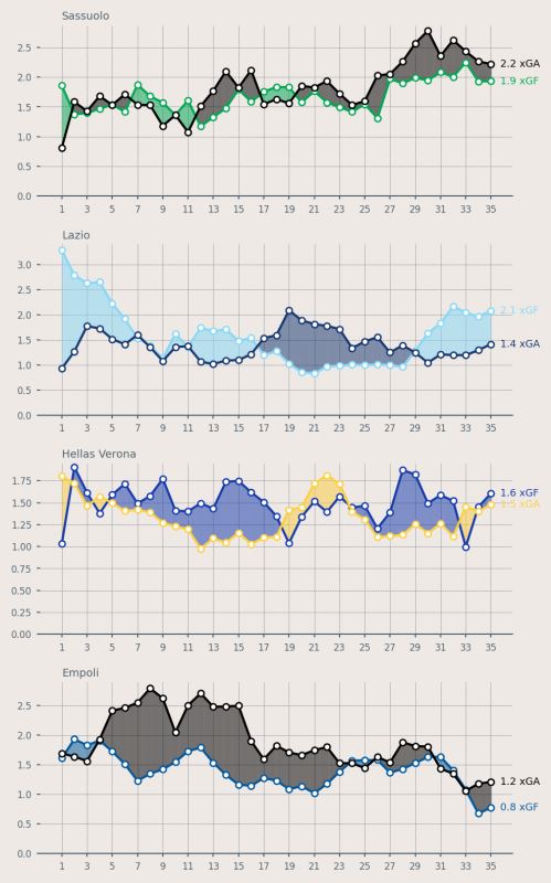
plot_xG_rolling("Sassuolo", ax, color_for = "#00A752", color_ag = "black", data = df)
plt.tight_layout()

再设置更加丰富的颜色:
fig = plt.figure(figsize=(5, 8), dpi = 200, facecolor = "#EFE9E6")

ax1 = plt.subplot(411, facecolor = "#EFE9E6")
ax2 = plt.subplot(412, facecolor = "#EFE9E6")
ax3 = plt.subplot(413, facecolor = "#EFE9E6")
ax4 = plt.subplot(414, facecolor = "#EFE9E6")

plot_xG_rolling("Sassuolo", ax1, color_for = "#00A752", color_ag = "black", data = df)
plot_xG_rolling("Lazio", ax2, color_for = "#87D8F7", color_ag = "#15366F", data = df)
plot_xG_rolling("Hellas Verona", ax3, color_for = "#153aab", color_ag = "#fdcf41", data = df)
plot_xG_rolling("Empoli", ax4, color_for = "#00579C", color_ag = "black", data = df)

plt.tight_layout()
最后
其实本文主要是对两个折线图做了一系列的优化和改进而已,主要是强调细节部分。
涉及到的matplotlib的知识,也主要是在ticks、背景颜色、fill_between部分。
以上就是Python+matplotlib实现折线图的美化的详细内容,更多关于Python matplotlib折线图的资料请关注我们其它相关文章!
相关推荐
-

使用python matplotlib画折线图实例代码
目录 matplotlib简介 1.画折线图[一条示例] 2.画折线图带数据标签 3.画多条折线图: 4.画多条折线图分别带数据标签: 总结 matplotlib简介 matplotlib 是python最著名的绘图库,它提供了一整套和matlab相似的命令API,十分适合交互式地行制图.而且也可以方便地将它作为绘图控件,嵌入GUI应用程序中. 它的文档相当完备,并且Gallery页面中有上百幅缩略图,打开之后都有源程序.因此如果你需要绘制某种类型的图,只需要在这个页面中浏览/复制/粘贴一下,基
-
python使用matplotlib绘制折线图
前言: 我的python学习也告一段落了.不过有些,方法还是打算总结一下和大家分享.我整理了使用matplotlib绘制折线图的一般步骤,按照这个步骤走绘制折线图一般都没啥问题.其实用matplotlib库绘制折线图的过程,其实就是类似于数学上描点,连线绘制图形的过程.所有,这个过程就可以简单的规划为获取图像点信息,描点连线,设置图线格式这三个部分. matplotlib库的安装以及程序引用的说明: 我使用的编程软件为pycharm,我就说一下pycharm安装matplotlib库的方法吧.在
-
python 用matplotlib绘制折线图详情
目录 1. 折线图概述 1.1什么是折线图? 1.2折线图使用场景 1.3绘制折线图步骤 1.4案例展示 2. 折线2D属性 2.1linestyle:折线样式 2.2color:折线颜色 2.3marker:坐标值标记 2.4fillstyle:标记填充方法 2.5linewidth(lw): 直线宽度 3. 坐标管理 3.1坐标轴名字设置 3.2坐标轴刻度设置 3.3坐标轴位置设置 3.4指定坐标值标注 4. 多条折线展示图 5. 图列管理 复习回顾: 众所周知,matplotlib 是一款
-
Python matplotlib实现折线图的绘制
目录 一.版本 二.图表主题设置 三.一次函数 四.多个一次函数 五.填充折线图 官网: https://matplotlib.org 一.版本 # 01 matplotlib安装情况 import matplotlib matplotlib.__version__ 二.图表主题设置 请点击:图表主题设置 三.一次函数 import numpy as np from matplotlib import pyplot as plt # 如何使用中文标题 plt.rcParams['font.san
-
python matplotlib折线图样式实现过程
这篇文章主要介绍了python matplotlib折线图样式实现过程,文中通过示例代码介绍的非常详细,对大家的学习或者工作具有一定的参考学习价值,需要的朋友可以参考下 一:简单的折线图 import matplotlib.pyplot as plt #支持中文显示 plt.rcParams["font.sans-serif"]=["SimHei"] #x,y数据 x_data = [1,2,3,4,5] y_data = [10,30,20,25,28] plt.
-
python使用matplotlib绘制折线图的示例代码
示例代码如下: #!/usr/bin/python #-*- coding: utf-8 -*- import matplotlib.pyplot as plt # figsize - 图像尺寸(figsize=(10,10)) # facecolor - 背景色(facecolor="blue") # dpi - 分辨率(dpi=72) fig = plt.figure(figsize=(10,10),facecolor="blue") #figsize默认为4,
-
Python可视化Matplotlib折线图plot用法详解
目录 1.完善原始折线图 - 给图形添加辅助功能 1.1 准备数据并画出初始折线图 1.2 添加自定义x,y刻度 1.3 中文显示问题解决 1.4 添加网格显示 1.5 添加描述信息 1.6 图像保存 2. 在一个坐标系中绘制多个图像 2.1 多次plot 2.2 显示图例 2.3 折线图的应用场景 折线图是数据分析中非常常用的图形.其中,折线图主要是以折线的上升或下降来表示统计数量的增减变化的统计图.用于分析自变量和因变量之间的趋势关系,最适合用于显示随着时间而变化的连续数据,同时还可以看出数
-
Python+matplotlib实现折线图的美化
目录 1. 导入包 2. 获得数据 3. 对数据做一些预处理 4. 画图 4.1 优化:添加点 4.2 优化:设置刻度 4.3 优化:设置填充 4.4 优化:设置填充颜色 5. 把功能打包成函数 6.测试函数 最后 大家好,今天分享一个非常有趣的 Python 教程,如何美化一个 matplotlib 折线图,喜欢记得收藏.关注.点赞. 1. 导入包 import pandas as pd import matplotlib.pyplot as plt import matplotlib.tic
-
Python matplotlib之折线图的各种样式与画法总结
目录 1. 折线形状 2. 数据点形状 3. 折线颜色 4. 添加网格 总结 上述图的完整代码如下: from numpy import * import numpy as np import pandas as pd import matplotlib.pyplot as plt import pylab as pl from mpl_toolkits.axes_grid1.inset_locator import inset_axes y1 = [0.92787363, 0.92436059
-
Python利用matplotlib绘制折线图的新手教程
前言 matplotlib是Python中的一个第三方库.主要用于开发2D图表,以渐进式.交互式的方式实现数据可视化,可以更直观的呈现数据,使数据更具说服力. 一.安装matplotlib pip install matplotlib -i https://pypi.tuna.tsinghua.edu.cn/simple 二.matplotlib图像简介 matplotlib的图像分为三层,容器层.辅助显示层和图像层. 1. 容器层主要由Canvas.Figure.Axes组成. Canvas位
-
Python数据分析之使用matplotlib绘制折线图、柱状图和柱线混合图
目录 matplotlib介绍 matplotlib绘制折线图 matplotlib绘制柱状图 matplotlib绘制柱线混合图 总结 matplotlib介绍 Matplotlib 是 Python 的绘图库. 它可与 NumPy 一起使用,提供了一种有效的 MatLab 开源替代方案. 它也可以和图形工具包一起使用,如 PyQt 和 wxPython. 安装Matplotlib库命令:在cmd命令窗口输入pip install matplotlib. matplotlib绘制折线图 1.绘
-
python数据可视化matplotlib绘制折线图示例
目录 plt.plot()函数各参数解析 各参数具体含义为: x,y color linestyle linewidth marker 关于marker的参数 plt.plot()函数各参数解析 plt.plot()函数的作用是绘制折线图,它的参数有很多,常用的函数参数如下: plt.plot(x,y,color,linestyle,linewidth,marker,markersize,markerfacecolor,markeredgewidth,markeredgecolor) 各参数具体
-
python使用matplotlib绘制折线图教程
matplotlib简介 matplotlib 是python最著名的绘图库,它提供了一整套和matlab相似的命令API,十分适合交互式地行制图.而且也可以方便地将它作为绘图控件,嵌入GUI应用程序中. 它的文档相当完备,并且Gallery页面中有上百幅缩略图,打开之后都有源程序.因此如果你需要绘制某种类型的图,只需要在这个页面中浏览/复制/粘贴一下,基本上都能搞定. 在Linux下比较著名的数据图工具还有gnuplot,这个是免费的,Python有一个包可以调用gnuplot,但是语法比较不