echarts几个公司内部数据可视化图表必收藏
目录
- 折线图
- 日负荷折线图
- 最大需求表
- 柱状图
- 日电量柱状图
- 分时电量
- 功率因数
- 三相温度
- 水球图
- 年月日负荷率图
- 散点图
- 三相平衡
最近公司有一个需求,要做一个数据可视化的页面,所有的图表都在下面,做这些都是本人自己写的,全部都是真是的项目中的代码,包含有柱状图、折线图、水球图以及散点图,这里直接打出来给大家练手,希望大家多多支持,如果这篇文章对您有用的话,记得收藏
数据:
链接: https://pan.baidu.com/s/1BSjLZkZ7dbsdiwPt4uPqOg
提取码: u1k9
️️️温馨提示:
1.大家尽量不要使用手机看哦!不然把手累抽筋了不要怪我哦= =
2.大家不需要关注charts等这些自定义组件,主需要关注图表的样式即可
3.此文章需要一定的vue基础才可以哦
折线图
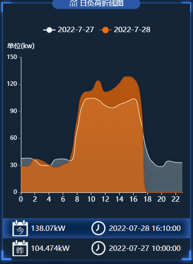
日负荷折线图
在这个图表中,大家可以学会如何使封闭的区域填充渐变色
.vue文件代码如下:
<template>
  <div class="dailyLoad">
    <charts :title="'日负荷折线图'" :iconClass="'icon-tongji'">
      <template slot="detail">
        <div id="dailyLoad" ref="dailyLoad"></div>
        <div class="detail">
          <div class="today">
            <div class="mount">
              <img
                src="@/assets/images/survey_images/survey/today.png"
                alt=""
              />
              <div v-if="allData">{{ allData.power.max_w_today }}</div>
            </div>
            <div class="time">
              <img src="@/assets/images/survey_images/survey/time.png" alt="" />
              <div>
                <span v-if="allData">{{ allData.power.time_today }}</span>
              </div>
            </div>
          </div>
          <div class="yesterday">
            <div class="mount">
              <img
                src="@/assets/images/survey_images/survey/yesterday.png"
                alt=""
              />
              <div v-if="allData">{{ allData.power.max_w_yesterday }}</div>
            </div>
            <div class="time">
              <img src="@/assets/images/survey_images/survey/time.png" alt="" />
              <div>
                <span v-if="allData">{{ allData.power.time_yesterday }}</span>
              </div>
            </div>
          </div>
        </div>
      </template>
    </charts>
  </div>
</template>
<script>
// import { getDailyLoad } from "@/api/survey/surgey";
export default {
  name: "dailyLoad",
  data() {
    return {
      chartInstance: null,
      allData: null, //从服务器中获取的所有的数据
    };
  },
  props: ["data1"],
  mounted() {
    this.initChart();
    // this.getData();
  },
  watch: {
    data1(newVal, oldVal) {
      if (newVal) {
        this.allData = newVal;
        this.updateChart();
      }
    },
  },
  methods: {
    // 初始化图表
    initChart() {
      this.chartInstance = this.$echarts.init(this.$refs.dailyLoad, "saibei");
      const initOption = {};
      this.chartInstance.setOption(initOption);
      window.addEventListener("resize", () => {
        this.chartInstance.resize();
      });
    },
    // 从服务器获取数据
    // async getData() {
    //   console.log(this.data1);
    // },
    //更新数据
    updateChart() {
      var option = {
        //   //最上方的图例指示器
        legend: {
          top: "8%",
          data: [],
          // data: ["2022-3-31", "2022-4-1"],
          textStyle: {
            color: "white",
            fontSize: "15",
          },
        },
        // 图表的位置
        grid: {
          left: "2%",
          top: "21%",
          right: "4%",
          bottom: "22%",
          containLabel: true,
        },
        //设置悬浮框
        tooltip: {
          trigger: "axis",
          //在这里设置鼠标放上去显示的y轴的样式
          axisPointer: {
            type: "line",
            lineStyle: {
              type: "solid",
            },
          },
          backgroundColor: "rgba(0,0,0,.4)",
          borderWidth: 0,
          textStyle: {
            color: "#fff",
          },
        },
        xAxis: [
          {
            type: "category",
            boundaryGap: false,
            // x轴更换数据
            data: [],
            axisLabel: {
              color: "white",
              fontSize: 14,
            },
            axisLine: {
              lineStyle: {
                color: "white",
              },
            },
          },
        ],
        yAxis: [
          {
            name: "单位(kw)",
            nameLocation: "end",
            nameTextStyle: {
              padding: [0, 10, 0, 0],
              align: "center",
            },
            type: "value",
            axisTick: { show: true },
            axisLine: {
              onZeor: true,
              show: true,
              lineStyle: {
                color: "white",
              },
            },
            nameTextStyle: {
              fontSize: 14,
            },
            // 去除分割线
            splitLine: {
              show: false,
            },
          },
        ],
        series: [
          {
            name: "",
            type: "line",
            smooth: true,
            // 单独修改当前线条的样式
            lineStyle: {
              color: "white",
              width: "1",
            },
            // 填充颜色设置
            areaStyle: {
              color: new this.$echarts.graphic.LinearGradient(
                0,
                0,
                0,
                1,
                [
                  {
                    offset: 0,
                    color: "rgba(226, 247, 250, 0.5)",
                  },
                  {
                    offset: 0.8,
                    color: "rgba(226, 247, 250, 0.4)",
                  },
                ],
                false
              ),
              shadowColor: "rgba(0, 0, 0, 0.5)",
              shadowBlur: 15,
            },
            // 设置拐点
            symbol: "circle",
            // 拐点大小
            symbolSize: 8,
            // 开始不显示拐点, 鼠标经过显示
            showSymbol: false,
            // 设置拐点颜色以及边框
            itemStyle: {
              color: "rgb(226, 247, 250 )",
              borderColor: "rgba(226, 247, 250, 0.1)",
              borderWidth: 12,
            },
            data: [],
          },
          {
            name: "",
            type: "line",
            smooth: true,
            lineStyle: {
              color: "rgb(174,83,17)",
              width: 2,
            },
            areaStyle: {
              color: new this.$echarts.graphic.LinearGradient(
                0,
                0,
                0,
                1,
                [
                  {
                    offset: 0,
                    color: "rgba(255, 108, 0, 1)",
                  },
                  {
                    offset: 0.8,
                    color: "rgba(255, 108, 0, 0.9)",
                  },
                ],
                false
              ),
              shadowColor: "rgba(0, 0, 0, 0.1)",
              shadowBlur: 15,
            },
            // 设置拐点 小圆点
            symbol: "circle",
            // 拐点大小
            symbolSize: 2,
            // 设置拐点颜色以及边框
            itemStyle: {
              color: "rgba(255, 108, 0)",
              borderColor: "rgba(255, 108, 0,1)",
              borderWidth: 12,
            },
            // 开始不显示拐点, 鼠标经过显示
            showSymbol: false,
            data: [],
          },
        ],
      };
      let currentDate = this.formateDate(new Date());
      let lastDate = this.formateDate(Date.now() - 1000 * 60 * 60 * 24);
      option.legend.data = [lastDate, currentDate];
      option.xAxis[0].data = this.allData.hours;
      option.series[0].name = lastDate;
      option.series[0].data = this.allData.load_yesterday;
      option.series[1].name = currentDate;
      option.series[1].data = this.allData.load_today;
      this.chartInstance.setOption(option);
    },
    formateDate(data) {
      let date = new Date(data);
      return `${date.getFullYear()}-${date.getMonth() + 1}-${date.getDate()}`;
    },
  },
};
</script>
<style lang="less" scoped>
.dailyLoad {
  background-color: rgb(20, 37, 55);
  height: 3.3684rem;
  #dailyLoad {
    width: 100%;
    height: 3.3684rem;
  }
  .detail {
    position: absolute;
    width: 100%;
    height: 0.5263rem;
    bottom: 0.0105rem;
    left: 0;
    font-size: 0.0947rem;
    color: white;
    background-color: rgb(20, 37, 55);
    margin-top: 0.0526rem;
    .today,
    .yesterday {
      font-size: 0.1rem;
      height: 0.2632rem;
      display: flex;
      padding: 0 5%;
      align-items: center;
      white-space: nowrap;
      text-align: center;
      justify-content: space-between;
      .mount {
        display: flex;
        align-items: center;
        justify-content: center;
        img {
          width: 0.2105rem;
          height: 0.2105rem;
          margin-right: 0.0333rem;
        }
      }
      .time {
        display: flex;
        align-items: center;
        justify-content: center;
        img {
          width: 0.2105rem;
          height: 0.2105rem;
          margin-right: 0.0333rem;
        }
      }
    }
    .today {
      background-color: #072951;
      box-shadow: -0.0526rem 0px 0.0789rem #2c58a6 inset,
        /*左边阴影*/ 0.0526rem 0px 0.0789rem #2c58a6 inset;
    }
  }
}
</style>
最大需求表
在这个图表中,大家可以学会如何自定义柱状图的形状

.vue文件代码如下:
<template>
  <div class="maximumDemand">
    <charts :title="'最大需求'" :iconClass="'icon-shuxingzujian'">
      <template slot="detail">
        <div id="maximumDemand" ref="maximumDemand"></div>
        <div class="detail">
          <div class="item">
            <img
              src="@/assets/images/survey_images/survey/month.png"
              alt="月"
            />
            <div v-if="allData" class="maxdemand_month">
              {{ allData.demand_max.maxdemand_month }}kW
            </div>
          </div>
          <div class="item">
            <img src="@/assets/images/survey_images/survey/year.png" alt="年" />
            <div v-if="allData" class="maxdemand_Year">
              {{ allData.demand_max.maxdemand_Year }}kW
            </div>
          </div>
        </div>
      </template>
    </charts>
  </div>
</template>
<script>
import { getMaximumDemand } from "@/api/surgey";
export default {
  name: "maximumDemand",
  data() {
    return {
      chartInstance: null,
      allData: null, //从服务器中获取的所有的数据
    };
  },
  mounted() {
    this.initChart();
    this.getData();
    this.timer = setInterval(() => {
      this.getData();
    }, 60000);
  },
  methods: {
    // 初始化图表
    initChart() {
      this.chartInstance = this.$echarts.init(
        this.$refs.maximumDemand,
        "saibei"
      );
      const initOption = {};
      this.chartInstance.setOption(initOption);
      // 让图表跟随屏幕自动的去适应
      window.addEventListener("resize", () => {
        this.chartInstance.resize();
      });
    },
    // 从服务器获取数据
    async getData() {
      let res = await getMaximumDemand({});
      if (res.code === 200) {
        this.allData = res.data.demand;
        this.updateChart();
      } else {
        this.$message({
          message: res.msg,
          type: "warning",
        });
      }
    },
    //更新数据
    updateChart() {
      var option = {
        //提示内容样式的设置
        tooltip: {
          trigger: "axis",
          // 纵轴的刻度线
          axisPointer: {
            type: "none",
          },
          backgroundColor: "rgba(0,0,0,.4)",
          borderWidth: 0,
          textStyle: {
            color: "#fff",
          },
        },
        // 图表的位置
        grid: {
          left: "2%",
          top: "21%",
          right: "4%",
          bottom: "22%",
          containLabel: true,
        },
        xAxis: [
          {
            type: "category",
            data: [],
            // data: [
            //   "2021-11",
            //   "2021-12",
            //   "2022-01",
            //   "2022-02",
            //   "2022-03",
            //   "2022-04",
            // ],
            position: "bottom",
            boundaryGap: true,
            axisTick: { show: true, lineStyle: { color: "#fff" } },
            axisLine: {
              show: true,
              lineStyle: { color: "#fff" },
            },
            axisLabel: {
              interval: 0,
              // textStyle: { color: "#fff" },
              color: "#fff",
            },
          },
        ],
        yAxis: [
          {
            type: "value",
            axisLine: {
              onZeor: true,
              show: true,
              lineStyle: {
                color: "white",
              },
            },
            //坐标轴刻度相关设置
            axisTick: {
              show: true,
              lineStyle: {
                color: "#fff",
              },
            },
          },
        ],
        series: [
          {
            name: "最大需求:",
            type: "pictorialBar",
            symbol: "triangle",
            // data: [120, 132, 101, 134, 90, 201],
            data: [
              {
                value: "",
              },
              {
                value: "",
                itemStyle: {
                  color: "#4f75e1",
                },
              },
              {
                value: "",
              },
              {
                value: "",
                itemStyle: {
                  color: "#4f75e1",
                },
              },
              {
                value: "",
              },
              {
                value: "",
                itemStyle: {
                  color: "#4f75e1",
                },
              },
            ],
            barWidth: 15,
            //设置柱状图和土里指示器的颜色
            itemStyle: {
              color: "#b3c6ff",
              opacity: 0.9,
            },
            // 高亮时的样式
            emphasis: {
              itemStyle: {
                opacity: 0.8,
              },
            },
            // 三角形的宽度
            barWidth: "200%",
          },
          {
            name: "平均需求:",
            type: "line",
            // data: [810, 592, 952, 285, 523, 299],
            symbolSize: 12,
            //线条的颜色
            lineStyle: {
              color: "rgb(99,46,255)",
              width: 2,
            },
            //拐点的样式
            itemStyle: {
              color: "white",
              shadowBlur: 5,
              shadowColor: "white",
              borderColor: "white",
              borderWidth: 2,
              borderType: "dotted",
            },
          },
        ],
      };
      for (var i = 0; i < this.allData.demand_demand.length; i++) {
        option.series[0]["data"][i].value = this.allData.demand_demand[i];
      }
      option.series[1]["data"] = this.allData.demand_avg;
      option.xAxis[0]["data"] = this.allData.demand_ym;
      this.chartInstance.setOption(option);
    },
  },
  beforeDestroy() {
    clearInterval(this.timer);
  },
};
</script>
<style lang="less" scoped>
#maximumDemand {
  width: 100%;
  height: 100%;
}
.detail {
  position: absolute;
  // height: 100px;
  height: 0.5263rem;
  bottom: 0.1133rem;
  left: 0;
  width: 100%;
  font-size: 0.1rem;
  color: white;
  background-color: rgb(20, 37, 55);
  .item {
    display: flex;
    align-items: center;
    justify-content: space-around;
    background-color: #072951;
    height: 0.3rem;
    &:nth-child(1) {
      box-shadow: -0.0526rem 0px 0.0789rem #2c58a6 inset,
        /*左边阴影*/ 0.0526rem 0px 0.0789rem #2c58a6 inset;
    }
    img {
      display: block;
      width: 0.3333rem;
      height: 0.3333rem;
    }
  }
}
</style>
柱状图
日电量柱状图
在这个图表中,大家可以学会如何自定义柱状图的渐变颜色

.vue文件代码如下:
<template>
  <div class="dailyElectricity">
    <charts :title="'日电量柱状图'" :iconClass="'icon-paihangbang'">
      <template slot="detail">
        <div id="dailyElectricity" ref="dailyElectricity"></div>
        <div class="detail">
          <div class="img">
            <img
              src="@/assets/images/survey_images/survey/today.png"
              alt="今天"
            />
            <img
              src="@/assets/images/survey_images/survey/yesterday.png"
              alt="昨天"
            />
            <img
              src="@/assets/images/survey_images/survey/ydqushi.png"
              alt="趋势"
            />
          </div>
          <div class="data">
            <div v-if="allData" class="today">
              {{ allData.dl_trend.dl_today }}
            </div>
            <div v-if="allData" class="yesterday">
              {{ allData.dl_trend.dl_yesterday }}
            </div>
            <div v-if="allData" class="sub">
              {{ allData.dl_trend.dl_trendval }}
            </div>
          </div>
        </div>
      </template>
    </charts>
  </div>
</template>
<script>
// import { getDailyElectricity } from "@/api/survey/surgey";
export default {
  name: "dailyElectricity",
  data() {
    return {
      chartInstance: null,
      allData: null, //从服务器中获取的所有的数据
    };
  },
  props: ["data1"],
  mounted() {
    this.initChart();
    // this.getData();
  },
  watch: {
    data1(newVal, oldVal) {
      if (newVal) {
        this.allData = newVal;
        this.updateChart();
      }
    },
  },
  methods: {
    // 初始化图表
    initChart() {
      this.chartInstance = this.$echarts.init(
        this.$refs.dailyElectricity,
        "saibei"
      );
      const initOption = {};
      this.chartInstance.setOption(initOption);
      // 让图表跟随屏幕自动的去适应
      window.addEventListener("resize", () => {
        this.chartInstance.resize();
      });
    },
    // 从服务器获取数据
    // async getData() {
    //   let res = await getDailyElectricity({});
    //   if (res.code === 200) {
    //     this.allData = { ...res.data };
    //     this.updateChart();
    //   } else {
    //     this.$message({
    //       message: res.msg,
    //       type: "warning",
    //     });
    //   }
    // },
    //更新数据
    updateChart() {
      var option = {
        legend: {
          top: "8%",
          //将来要换data成活的
          // data: ["2022-4-2", "2022-4-3"],
          textStyle: {
            fontSize: "15",
          },
        },
        grid: {
          left: "10%",
          top: "21%",
          right: "4%",
          bottom: "22%",
          containLabel: false,
        },
        xAxis: [
          {
            type: "category",
            // data: [0, 2, 4, 6, 8, 10, 12, 14, 16, 18],
            axisLabel: {
              fontSize: 14,
            },
          },
        ],
        yAxis: [
          {
            type: "value",
            name: "单位(kWh)",
            nameLocation: "end",
            nameTextStyle: {
              padding: [0, 10, 0, 0],
              align: "center",
            },
            //坐标轴刻度相关设置
            axisTick: {
              show: true,
              lineStyle: {
                color: "#fff",
              },
            },
            axisLine: {
              show: true,
              lineStyle: {
                color: "white",
              },
            },
          },
        ],
        series: [
          {
            // name: "2022-4-2",
            // data: [120, 200, 150, 80, 70, 110, 130, 200, 150, 80],
            type: "bar",
            itemStyle: {
              color: "rgb(97,129,245)",
            },
          },
          {
            // name: "2022-4-3",
            // data: [80, 70, 110, 130, 120, 200, 150, 200, 150, 80],
            type: "bar",
            itemStyle: {
              color: new this.$echarts.graphic.LinearGradient(
                0,
                0,
                0,
                1,
                [
                  {
                    offset: 0,
                    color: "rgb(0,240,255)",
                  },
                  {
                    offset: 1,
                    color: "rgb(255,247,156)",
                  },
                ],
                false
              ),
            },
          },
        ],
      };
      let currentDate = this.formateDate(new Date());
      let lastDate = this.formateDate(Date.now() - 1000 * 60 * 60 * 24);
      option.legend.data = [lastDate, currentDate];
      option.xAxis[0].data = this.allData.hours;
      option.series[0].name = lastDate;
      option.series[0].data = this.allData.dl_yesterday;
      option.series[1].name = currentDate;
      option.series[1].data = this.allData.dl_today;
      this.chartInstance.setOption(option);
    },
    formateDate(data) {
      let date = new Date(data);
      return `${date.getFullYear()}-${date.getMonth() + 1}-${date.getDate()}`;
    },
  },
};
</script>
<style lang="less" scoped>
.dailyElectricity {
  height: 3.3684rem;
  #dailyElectricity {
    width: 100%;
    height: 3.3684rem;
  }
  .detail {
    position: absolute;
    height: 0.5263rem;
    bottom: 2px;
    left: 0;
    width: 100%;
    font-size: 0.1rem;
    color: white;
    background-color: rgb(20, 37, 55);
    .img {
      display: flex;
      // align-items: center;
      justify-content: space-around;
      background-color: #072951;
      box-shadow: -0.0526rem 0px 0.0789rem #2c58a6 inset,
        /*左边阴影*/ 0.0526rem 0px 0.0789rem #2c58a6 inset;
      img {
        display: block;
        width: 0.2105rem;
        height: 0.2105rem;
      }
    }
    .data {
      display: flex;
      // align-items: center;
      justify-content: space-around;
      margin-top: 0.1rem;
    }
  }
}
</style>
分时电量
在这个图表中,大家可以学会如何动态的轮流展示数据

.vue文件代码如下:
<template>
  <div class="timeSharingE">
    <charts :title="'分时电量'" :iconClass="'icon-fenxi'">
      <template slot="detail">
        <div id="timeSharingE" ref="timeSharingE"></div>
        <div class="detail">
          <div class="img">
            <img
              src="@/assets/images/survey_images/survey/current.png"
              alt="今天"
            />
            <img
              src="@/assets/images/survey_images/survey/last.png"
              alt="昨天"
            />
            <img
              src="@/assets/images/survey_images/survey/ydqushi.png"
              alt="趋势"
            />
          </div>
          <div class="data">
            <div v-if="loadrate" class="current">
              {{ loadrate.sum_e_month }}
            </div>
            <div v-if="loadrate" class="last">
              {{ loadrate.sum_e_lastmonth }}
            </div>
            <div v-if="loadrate" class="ydqushi">
              {{ loadrate.trend_m_sume }}
            </div>
          </div>
        </div>
      </template>
    </charts>
  </div>
</template>
<script>
import { getTimeSharingE } from "@/api/surgey";
export default {
  name: "timeSharingE",
  data() {
    return {
      chartInstance: null,
      idx: 0, //当前的索引
      arr1: [], //所有的日期
      arr2: [], //所有的尖电量
      arr3: [], //所有的峰电量
      arr4: [], //所有的平电量
      arr5: [], //所有的谷电量
      arr_sub1: [] /* 当前的日期    */,
      arr_sub2: [] /* 当前的尖电量    */,
      arr_sub3: [] /* 当前的峰电量    */,
      arr_sub4: [] /* 当前的平电量    */,
      arr_sub5: [] /* 当前的谷电量    */,
      allData: [], //分时电量柱状图所有的数据
      loadrate: {},
    };
  },
  mounted() {
    this.initChart();
    this.getData();
    this.getDatatimer = setInterval(() => {
      this.getData();
    }, 60000);
  },
  methods: {
    initChart() {
      this.chartInstance = this.$echarts.init(
        this.$refs.timeSharingE,
        "saibei"
      );
      var option = {
        //设置悬浮框
        tooltip: {
          show: true,
          trigger: "axis",
          axisPointer: {
            type: "shadow",
          },
          backgroundColor: "rgba(0,0,0,.4)",
          borderWidth: 0,
          textStyle: {
            color: "#fff",
          },
        },
        //最上方的图例指示器
        legend: {
          top: "8%",
          textStyle: {
            color: "white",
            fontSize: "15",
          },
        },
        // 图表的位置
        grid: {
          left: "2%",
          top: "21%",
          right: "8%",
          bottom: "22%",
          containLabel: true,
        },
        xAxis: [
          {
            type: "category",
            data: this.arr_sub1,
            axisLabel: {
              fontSize: 13,
            },
            name: "(天)",
            nameLocation: "end",
            nameTextStyle: {
              align: "center",
            },
          },
        ],
        yAxis: [
          {
            axisTick: { show: true },
            type: "value",
            name: "单位(kw)",
            nameLocation: "end",
            nameTextStyle: {
              padding: [0, 10, 0, 0],
              align: "center",
            },
            axisLine: {
              onZeor: true,
              show: true,
              lineStyle: {
                color: "white",
              },
            },
            //坐标轴刻度相关设置
            axisTick: {
              show: true,
              lineStyle: {
                color: "#fff",
              },
            },
          },
        ],
        series: [
          {
            name: "尖电量",
            type: "bar",
            data: this.arr_sub2,
            // data: [120, 132, 101, 134, 90, 230, 210, 132, 101, 134, 90],
            stack: "Electric quantity",
            barWidth: 15,
            //设置柱状图和土里指示器的颜色
            itemStyle: {
              color: "rgb(55,183,12)",
            },
          },
          {
            name: "峰电量",
            type: "bar",
            data: this.arr_sub3,
            // data: [134, 90, 230, 120, 132, 101, 210, 230, 120, 132],
            stack: "Electric quantity",
            barWidth: 15,
            //设置柱状图和土里指示器的颜色
            itemStyle: {
              color: "rgb(250,229,33)",
            },
          },
          {
            name: "平电量",
            type: "bar",
            data: this.arr_sub4,
            // data: [230, 210, 132, 90, 101, 134, 120, 210, 132, 90, 101],
            stack: "Electric quantity",
            barWidth: 15,
            //设置柱状图和土里指示器的颜色
            itemStyle: {
              color: "rgb(242,156,0)",
            },
          },
          {
            name: "谷电量",
            type: "bar",
            data: this.arr_sub5,
            // data: [120, 132, 101, 134, 90, 230, 210, 132, 101, 134, 90],
            stack: "Electric quantity",
            barWidth: 15,
            //设置柱状图和土里指示器的颜色
            itemStyle: {
              color: "rgb(221,63,54)",
            },
          },
        ],
      };
      option && this.chartInstance.setOption(option);
      this.startInterval();
      window.addEventListener("resize", this.chartResize);
    },
    async getData() {
      let res = await getTimeSharingE({});
      let mydata = [];
      if (res.code === 200) {
        mydata = res.data.dl_period;
        this.loadrate = res.data.loadrate;
        this.updateChart();
      } else {
        this.$message({
          message: res.msg,
          type: "warning",
        });
      }
      for (var i = 0; i < mydata.length; i++) {
        this.arr1.push(mydata[i].date); /* 日期   */
        this.arr2.push(mydata[i].fesharp); /* 尖   */
        this.arr3.push(mydata[i].fepeak); /* 峰   */
        this.arr4.push(mydata[i].feflat); /* 平   */
        this.arr5.push(mydata[i].fevalley); /* 谷   */
      }
      for (var i = 0; i < 5; i++) {
        this.arr_sub1.push(this.arr1[i]);
        this.arr_sub2.push(this.arr2[i]);
        this.arr_sub3.push(this.arr3[i]);
        this.arr_sub4.push(this.arr4[i]);
        this.arr_sub5.push(this.arr5[i]);
        this.idx = i;
      }
      this.allData = mydata;
    },
    startInterval() {
      this.timer = setInterval(() => {
        this.idx++;
        if (this.idx >= this.allData.length) {
          this.idx = 0;
        }
        this.arr_sub1.shift();
        this.arr_sub1.push(this.arr1[this.idx]);
        this.arr_sub2.shift();
        this.arr_sub2.push(this.arr2[this.idx]);
        this.arr_sub3.shift();
        this.arr_sub3.push(this.arr3[this.idx]);
        this.arr_sub4.shift();
        this.arr_sub4.push(this.arr4[this.idx]);
        this.arr_sub5.shift();
        this.arr_sub5.push(this.arr5[this.idx]);
        this.updateChart();
      }, 2000);
    },
    updateChart() {
      var option = {
        //区域缩放
        xAxis: {
          data: this.arr_sub1,
        },
        series: [
          {
            data: this.arr_sub2,
          },
          {
            data: this.arr_sub3,
          },
          {
            data: this.arr_sub4,
          },
          {
            data: this.arr_sub5,
          },
        ],
      };
      this.chartInstance && this.chartInstance.setOption(option);
    },
    // 让图表跟随屏幕自动的去适应
    chartResize() {
      this.chartInstance.resize();
    },
  },
  beforeDestroy() {
    clearInterval(this.timer);
    clearInterval(this.getDatatimer);
    // 让图表跟随屏幕自动的去适应
    window.removeEventListener("resize", this.chartResize);
  },
};
</script>
<style lang="less" scoped>
.timeSharingE {
  margin-top: 0.1842rem;
  background-color: rgb(20, 37, 55);
  #timeSharingE {
    width: 100%;
    height: 3.1579rem;
  }
  .detail {
    position: absolute;
    height: 0.5263rem;
    bottom: 0;
    left: 0;
    width: 100%;
    font-size: 0.1rem;
    color: white;
    background-color: rgb(20, 37, 55);
    .img {
      display: flex;
      // align-items: center;
      justify-content: space-around;
      background-color: #072951;
      box-shadow: -0.0526rem 0px 0.0789rem #2c58a6 inset,
        /*左边阴影*/ 0.0526rem 0px 0.0789rem #2c58a6 inset;
      img {
        display: block;
        width: 0.2105rem;
        height: 0.2105rem;
      }
    }
    .data {
      display: flex;
      // align-items: center;
      justify-content: space-around;
      margin-top: 0.1rem;
    }
  }
}
</style>
功率因数
在这个图表中,大家可以学会如何将柱状图进行非常个性化的定制

.vue文件代码如下:
<template>
  <div class="powerFactor">
    <charts :title="'功率因数'" :iconClass="'icon-paihangbang'">
      <template slot="detail">
        <div id="powerFactor" ref="powerFactor"></div>
      </template>
    </charts>
  </div>
</template>
<script>
import { getPowerFactor } from "@/api/surgey";
export default {
  name: "powerFactor",
  data() {
    return {
      chartInstance: null,
      myColor: [
        "rgb(248,180,72)",
        "rgb(86,208,227)",
        "rgb(245,116,116)",
        "rgb(16,137,231)",
      ],
      allData: [],
      arr_sub: [],
      titlename: ["A相", "B相", "C相", "合相"],
      valdata: [1.0, 1.0, 1.0, 1.0],
      idx: 0,
      arr6: [],
    };
  },
  mounted() {
    this.initChart();
    this.getData();
    this.getDataTimer = setInterval(() => {
      this.getData();
    }, 60000);
  },
  methods: {
    initChart() {
      this.chartInstance = this.$echarts.init(this.$refs.powerFactor, "saibei");
      var option = {
        grid: {
          left: "5%",
          top: "21%",
          right: "10%",
          bottom: "5%",
          containLabel: true,
        },
        // 不显示x轴的相关信息
        xAxis: {
          show: false,
        },
        yAxis: [
          {
            type: "category",
            inverse: true,
            data: this.titlename,
            // 不显示y轴的线
            axisLine: {
              show: false,
            },
            // 不显示刻度
            axisTick: {
              show: false,
            },
          },
          {
            data: ["1.0", "1.0", "1.0", "1.0"],
            inverse: true,
            // 不显示y轴的线
            axisLine: {
              show: false,
            },
            // 不显示刻度
            axisTick: {
              show: false,
            },
          },
        ],
        series: [
          {
            name: "条",
            type: "bar",
            data: [0.7112, 0.3424, 0.6054, 0.7858],
            yAxisIndex: 0,
            // 修改第一组柱子的圆角
            itemStyle: {
              borderRadius: 20,
              color: (params) => {
                return this.myColor[params.dataIndex];
              },
            },
            // 柱子之间的距离
            // barCategoryGap: 50,
            //柱子的宽度
            barWidth: 10,
            // 显示柱子内的文字
            label: {
              show: true,
              position: "inside",
              color: "white",
            },
          },
          {
            name: "框",
            type: "bar",
            // barCategoryGap: 50,
            barWidth: 15,
            yAxisIndex: 1,
            data: this.valdata,
            itemStyle: {
              color: "none",
              borderColor: "#00c1de",
              borderWidth: 3,
              borderRadius: 15,
            },
          },
        ],
      };
      option && this.chartInstance.setOption(option);
      this.startInterval();
      // 让图表跟随屏幕自动的去适应
      window.addEventListener("resize", this.chartResize);
    },
    async getData() {
      let res = await getPowerFactor({});
      if (res.code === 200) {
        this.allData = res.data.cositems;
        // this.updateChart();
        var arr6 = [];
        var idx = 0;
        var arr_sub = [];
        for (var i = 0; i < this.allData.length; i++) {
          arr6.push(this.allData[i].fcosa.toFixed(3));
          arr6.push(this.allData[i].fcosb.toFixed(3));
          arr6.push(this.allData[i].fcosc.toFixed(3));
          arr6.push(this.allData[i].fcos.toFixed(3));
        }
        for (var i = 0; i < 4; i++) {
          arr_sub.push(arr6[4 * idx + i]);
        }
        this.arr_sub = arr_sub;
        this.arr6 = arr6;
        this.idx = idx;
      } else {
        this.$message({
          message: res.msg,
          type: "warning",
        });
      }
    },
    startInterval() {
      this.timer = setInterval(() => {
        this.idx++;
        if (this.idx >= this.allData.length) {
          this.idx = 0;
        }
        for (var i = 0; i < 4; i++) {
          this.arr_sub.shift();
          this.arr_sub.push(this.arr6[4 * this.idx + i]);
        }
        this.updateChart();
      }, 2000);
    },
    updateChart() {
      var option = {
        series: [
          {
            data: this.arr_sub,
          },
        ],
      };
      this.chartInstance && this.chartInstance.setOption(option);
    },
    // 让图表跟随屏幕自动的去适应
    chartResize() {
      this.chartInstance.resize();
    },
  },
  beforeDestroy() {
    clearInterval(this.timer);
    clearInterval(this.getDataTimer);
    window.removeEventListener("resize", this.chartResize);
  },
};
</script>
<style lang="less" scoped>
#powerFactor {
  width: 100%;
  height: 100%;
}
</style>
三相温度
在这个图表中,大家可以学会visualMap属性的使用,以及图表内容文字的格式化

.vue文件代码如下:
<template>
  <div class="tPhaseTemperature">
    <charts :title="'三相温度'" :iconClass="'icon-tongji'">
      <template slot="detail">
        <div id="tPhaseTemperature" ref="tPhaseTemperature"></div>
      </template>
    </charts>
  </div>
</template>
<script>
import { getTPhaseTemperature } from "@/api/surgey";
export default {
  name: "tPhaseTemperature",
  data() {
    return {
      currentIndex: 0,
      chartInstance: null,
      allData: null, //从服务器中获取的所有的数据
    };
  },
  mounted() {
    this.initChart();
    this.getData();
    this.getDataTimer = setInterval(() => {
      this.getData();
    }, 60000);
  },
  methods: {
    initChart() {
      this.chartInstance = this.$echarts.init(
        this.$refs.tPhaseTemperature,
        "saibei"
      );
      var option = {
        //设置悬浮框
        tooltip: {
          show: true,
          trigger: "axis",
          axisPointer: {
            type: "shadow",
          },
          backgroundColor: "rgba(0,0,0,.4)",
          borderWidth: 0,
          textStyle: {
            color: "#fff",
          },
        },
        xAxis: [
          {
            name: "(时)",
            type: "category",
            data: ["00-06", "06-12", "12-18", "18-24"],
            axisLabel: {
              fontSize: 14,
            },
          },
        ],
        yAxis: [
          {
            type: "value",
            name: "°C",
            nameLocation: "end",
            max: "50",
            nameTextStyle: {
              padding: [0, 10, 0, 0],
              align: "center",
            },
            //坐标轴刻度相关设置
            axisTick: {
              show: true,
              lineStyle: {
                color: "#fff",
              },
            },
            axisLine: {
              show: true,
              lineStyle: {
                color: "white",
              },
            },
            splitLine: {
              show: true,
              lineStyle: {
                color: "rgb(67,81,95)",
              },
            },
          },
        ],
        legend: {
          top: "8%",
          // data: ["2022-4-2", "2022-4-3"],
          textStyle: {
            fontSize: "14",
          },
        },
        grid: {
          left: "2%",
          top: "21%",
          right: "15%",
          bottom: "5%",
          containLabel: true,
        },
        series: [
          {
            name: "A相温度",
            data: [31, 32, 34, 36],
            type: "bar",
            barWidth: 15,
            itemStyle: {
              borderRadius: 20,
              color: new this.$echarts.graphic.LinearGradient(0, 0, 0, 1, [
                {
                  offset: 0,
                  color: "#fccb05",
                },
                {
                  offset: 1,
                  color: "#f5804d",
                },
              ]),
            },
            emphasis: {
              focus: "series",
            },
          },
          {
            name: "B相温度",
            data: [25, 35, 25, 28],
            type: "bar",
            barWidth: 15,
            itemStyle: {
              borderRadius: 20,
              color: new this.$echarts.graphic.LinearGradient(0, 0, 0, 1, [
                {
                  offset: 0,
                  color: "#8bd46e",
                },
                {
                  offset: 1,
                  color: "#09bcb7",
                },
              ]),
            },
            emphasis: {
              focus: "series",
            },
          },
          {
            name: "C相温度",
            data: [26, 34, 38, 30],
            type: "bar",
            barWidth: 15,
            itemStyle: {
              borderRadius: 20,
              color: new this.$echarts.graphic.LinearGradient(0, 0, 0, 1, [
                {
                  offset: 0,
                  color: "#F57474",
                },
                {
                  offset: 1,
                  color: "#F57474",
                },
              ]),
            },
            emphasis: {
              focus: "series",
            },
          },
        ],
      };
      option && this.chartInstance.setOption(option);
      this.startInterval();
      // 让图表跟随屏幕自动的去适应
      window.addEventListener("resize", this.chartResize);
    },
    // 从服务器获取数据
    async getData() {
      let res = await getTPhaseTemperature({});
      if (res.code === 200) {
        this.allData = res.data.temperature;
        this.updateChart();
      } else {
        this.$message({
          message: res.msg,
          type: "warning",
        });
      }
    },
    startInterval() {
      this.timer = setInterval(() => {
        // var dataLen = option.series[0].data.length;
        /*  取消之前高亮的图形  */
        // this.chartInstance.dispatchAction({
        //   type: "downplay",
        //   seriesIndex: [0, 1, 2],
        //   dataIndex: this.currentIndex,
        // });
        /*  显示 tooltip  */
        this.chartInstance.dispatchAction({
          type: "showTip",
          seriesIndex: 2, //指定哪一系列的数据,即seriesIndex.data[0]
          dataIndex: this.currentIndex,
        });
        /*  高亮当前图形  */
        this.chartInstance.dispatchAction({
          type: "highlight",
          seriesIndex: [0, 1, 2],
          dataIndex: this.currentIndex,
        });
        this.currentIndex = (this.currentIndex + 1) % 4;
      }, 2000);
    },
    updateChart() {
      var atemperature = this.allData.map((item) => item.fta);
      var btemperature = this.allData.map((item) => item.ftb);
      var ctemperature = this.allData.map((item) => item.ftc);
      var option = {
        series: [
          {
            data: atemperature,
          },
          {
            data: btemperature,
          },
          {
            data: ctemperature,
          },
        ],
      };
      this.chartInstance.setOption(option);
    },
    // 让图表跟随屏幕自动的去适应
    chartResize() {
      this.chartInstance.resize();
    },
  },
  beforeDestroy() {
    clearInterval(this.timer);
    clearInterval(this.getDataTimer);
    window.removeEventListener("resize", this.chartResize);
  },
};
</script>
<style lang="less" scoped>
#tPhaseTemperature {
  width: 100%;
  height: 100%;
}
</style>
水球图
年月日负荷率图
在这个图表中,大家可以学会如何绘制水球图

.vue文件代码如下:
<template>
  <div class="loadRate">
    <charts :title="'年月日负荷率表图'" :iconClass="'icon-yuanquanquan'">
      <template slot="detail">
        <div class="ymdLoadRate">
          <div id="dayLoadRate" ref="dayLoadRate"></div>
          <div id="mouthLoadRate" ref="mouthLoadRate"></div>
          <div id="yearLoadRate" ref="yearLoadRate"></div>
        </div>
        <div class="desc">
          <div class="descItem">日负荷率</div>
          <div class="descItem">月负荷率</div>
          <div class="descItem">年负荷率</div>
        </div>
        <div class="detail">
          <div class="img">
            <img
              src="@/assets/images/survey_images/survey/month.png"
              alt="月"
            />
            <img src="@/assets/images/survey_images/survey/year.png" alt="年" />
          </div>
          <div class="data">
            <div v-if="allData" class="today">
              {{ allData.loadrate.month_load_rate }}%
            </div>
            <div v-if="allData" class="yesterday">
              {{ allData.loadrate.year_load_rate }}%
            </div>
          </div>
        </div>
      </template>
    </charts>
  </div>
</template>
<script>
// import "@/assets/js/echarts-liquidfill";
import "@/assets/js/echarts-liquidfill.min.js";
import { getLoadRate } from "@/api/surgey";
export default {
  name: "loadRate",
  data() {
    return {
      chartInstanceD: null,
      chartInstanceM: null,
      chartInstanceL: null,
      allData: null, //从服务器中获取的所有的数据
    };
  },
  mounted() {
    this.initChart();
    this.getData();
    this.timer = setInterval(() => {
      this.getData();
    }, 60000);
  },
  methods: {
    // 初始化图表
    initChart() {
      this.chartInstanceD = this.$echarts.init(this.$refs.dayLoadRate);
      this.chartInstanceM = this.$echarts.init(this.$refs.mouthLoadRate);
      this.chartInstanceL = this.$echarts.init(this.$refs.yearLoadRate);
      const initOption = {};
      this.chartInstanceD.setOption(initOption);
      this.chartInstanceM.setOption(initOption);
      this.chartInstanceL.setOption(initOption);
      window.addEventListener("resize", () => {
        this.chartInstanceD.resize();
        this.chartInstanceM.resize();
        this.chartInstanceL.resize();
      });
    },
    // 从服务器获取数据
    async getData() {
      let res = await getLoadRate({});
      if (res.code == 200) {
        this.allData = { ...res.data };
        this.updateChart();
      } else {
        this.$message({
          message: res.msg,
          type: "warning",
        });
      }
    },
    //更新数据
    updateChart() {
      var optionD = {
        series: [
          {
            radius: "75%",
            type: "liquidFill",
            // data: [0.113, 0.12, 0.1, 0.11],
            name: "日负荷率",
            itemStyle: {
              opacity: 0.6,
            },
            emphasis: {
              itemStyle: {
                opacity: 0.9,
              },
            },
            outline: {
              show: false,
            },
            label: {
              fontSize: 33,
            },
            tooltip: {
              show: true,
            },
          },
        ],
      };
      var optionM = {
        series: [
          {
            radius: "75%",
            type: "liquidFill",
            // data: [0.61, 0.62, 0.6, 0.61],
            itemStyle: {
              opacity: 0.6,
            },
            name: "日负荷率",
            emphasis: {
              itemStyle: {
                opacity: 0.9,
              },
            },
            outline: {
              show: false,
            },
            label: {
              fontSize: 33,
            },
            tooltip: {
              show: true,
            },
          },
        ],
      };
      var optionL = {
        series: [
          {
            radius: "75%",
            type: "liquidFill",
            // data: [0.8, 0.81, 0.79, 0.8],
            itemStyle: {
              opacity: 0.6,
            },
            name: "日负荷率",
            emphasis: {
              itemStyle: {
                opacity: 0.9,
              },
            },
            outline: {
              show: false,
            },
            label: {
              fontSize: 33,
            },
            tooltip: {
              show: true,
            },
          },
        ],
      };
      var value1 = this.allData.loadrate.day_load_rate / 100;
      var value2 = this.allData.loadrate.month_load_rate / 100;
      var value3 = this.allData.loadrate.year_load_rate / 100;
      var data1 = [value1, value1, value1, value1];
      var data2 = [value2, value2, value2, value2];
      var data3 = [value3, value3, value3, value3];
      optionD.series[0].data = data1;
      optionM.series[0].data = data2;
      optionL.series[0].data = data3;
      this.chartInstanceD.setOption(optionD);
      this.chartInstanceM.setOption(optionM);
      this.chartInstanceL.setOption(optionL);
    },
  },
  beforeDestroy() {
    clearInterval(this.timer);
  },
};
</script>
<style lang="less" scoped>
.loadRate {
  margin-top: 0.1842rem;
  background-color: rgb(20, 37, 55);
  .ymdLoadRate {
    width: 100%;
    height: 3.1579rem;
    display: flex;
    #dayLoadRate {
      flex: 1;
    }
    #mouthLoadRate {
      flex: 1;
    }
    #yearLoadRate {
      flex: 1;
    }
  }
  .desc {
    width: 100%;
    position: absolute;
    top: 65%;
    left: 0;
    display: flex;
    align-items: center;
    justify-content: space-around;
    color: white;
  }
  .detail {
    position: absolute;
    height: 0.5263rem;
    bottom: 0.1133rem;
    left: 0;
    width: 100%;
    font-size: 0.1rem;
    color: white;
    background-color: rgb(20, 37, 55);
    .img {
      display: flex;
      justify-content: space-around;
      background-color: #072951;
      box-shadow: -0.0526rem 0px 0.0789rem #2c58a6 inset,
        /*左边阴影*/ 0.0526rem 0px 0.0789rem #2c58a6 inset;
      img {
        display: block;
        width: 0.3333rem;
        height: 0.3333rem;
      }
    }
    .data {
      display: flex;
      justify-content: space-around;
      margin-top: 0.1rem;
    }
  }
}
</style>
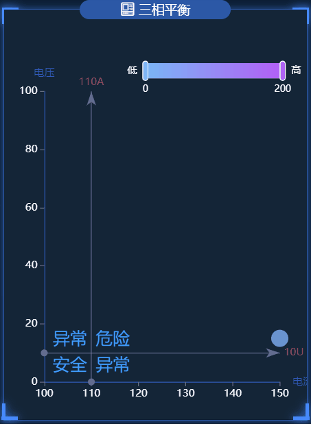
散点图
三相平衡
在这个图表中,大家可以学会visualMap属性的使用,以及图表内容文字的格式化
.vue文件代码如下:
<template>
  <div class="tPhaseBalance">
    <charts :title="'三相平衡'" :iconClass="'icon-fuhekongzhizhongduan'">
      <template slot="detail">
        <div id="tPhaseBalance" ref="tPhaseBalance"></div>
      </template>
    </charts>
  </div>
</template>
<script>
import { getTPhaseBalance } from "@/api/surgey";
export default {
  name: "tPhaseBalance",
  data() {
    return {
      chartInstance: null,
      allData: null, //从服务器中获取的所有的数据
      myColor: [
        "rgb(248,180,72)",
        "rgb(86,208,227)",
        "rgb(245,116,116)",
        "rgb(16,137,231)",
      ],
    };
  },
  mounted() {
    this.initChart();
    this.getData();
    this.timer = setInterval(() => {
      this.getData();
    }, 60000);
  },
  methods: {
    // 初始化图表
    initChart() {
      this.chartInstance = this.$echarts.init(
        this.$refs.tPhaseBalance,
        "saibei"
      );
      const initOption = {};
      this.chartInstance.setOption(initOption);
      // 让图表跟随屏幕自动的去适应
      window.addEventListener("resize", () => {
        this.chartInstance.resize();
      });
    },
    // 从服务器获取数据
    async getData() {
      let res = await getTPhaseBalance({});
      if (res.code === 200) {
        this.allData = res.data;
        this.updateChart();
      } else {
        this.$message({
          message: res.msg,
          type: "warning",
        });
      }
    },
    //更新数据
    updateChart() {
      var arr = [];
      for (var i = 0; i < this.allData.length; i++) {
        var arrItem = {};
        arrItem.name = this.allData[i].devname;
        arrItem.sales = this.allData[i].unbalancefi;
        arrItem.services = this.allData[i].unbalancefu;
        arr.push(arrItem);
      }
      var arrItem = {};
      arrItem.name = " ";
      arrItem.sales = 150;
      arrItem.services = 15;
      arr.push(arrItem);
      var sourceData = arr;
      var seriesData = sourceData.map(function (item, index, array) {
        return {
          name: item["name"],
          value: [item["sales"], item["services"]],
        };
      });
      var computeServicesAvgLine = function () {
        let sum = 0;
        sourceData.forEach(function (item) {
          sum += item["services"];
        });
        // return sum / sourceData.length;
        return 10;
      };
      var computeSalesAvgLine = function () {
        let sum = 0;
        sourceData.forEach(function (item) {
          sum += item["sales"];
        });
        // return sum / sourceData.length;
        return 110;
      };
      var avg = {
        servicesAvgLine: computeServicesAvgLine(),
        salesAvgLine: computeSalesAvgLine(),
      };
      var option = {
        grid: {
          left: "5%",
          top: "20%",
          right: "9%",
          bottom: "5%",
          containLabel: true,
        },
        tooltip: {
          trigger: "item",
          axisPointer: {
            show: true,
            type: "cross",
            lineStyle: {
              type: "dashed",
              width: 1,
            },
          },
          backgroundColor: "rgba(0,0,0,.4)",
          borderColor: "rgba(0,0,0,.4)",
          textStyle: {
            color: "#fff",
          },
          formatter: function (obj) {
            if (obj.componentType == "series") {
              return (
                '<div style="border-bottom: 1px solid rgba(255,255,255,.3); font-size: 18px;padding-bottom: 7px;margin-bottom: 7px">' +
                obj.name +
                "</div>" +
                "<span>" +
                "电流不平衡" +
                "</span>" +
                " : " +
                obj.data.value[0] +
                "%" +
                "<br/>" +
                "<span>" +
                "电压不平衡" +
                "</span>" +
                " : " +
                obj.data.value[1] +
                "%"
              );
            }
          },
        },
        xAxis: {
          name: "电流",
          type: "value",
          scale: true, //脱离 0 值比例
          axisLabel: {
            color: "#fff",
            formatter: "{value}",
          },
          //分割线不显示
          splitLine: {
            show: false,
          },
          // x轴的轴线的样式
          axisLine: {
            show: true,
            lineStyle: {
              color: "#3259B8",
            },
          },
          //刻度的显示
          axisTick: {
            show: true,
          },
        },
        yAxis: {
          name: "电压",
          type: "value",
          scale: true,
          axisLabel: {
            color: "#fff",
            formatter: "{value}",
          },
          splitLine: {
            show: false,
          },
          axisLine: {
            show: true,
            lineStyle: {
              color: "#3259B8",
            },
          },
          //刻度的显示
          axisTick: {
            show: true,
          },
        },
        toolbox: {
          show: false,
          feature: {
            dataZoom: {},
          },
        },
        visualMap: {
          /*min: 0,
                    max: 800,*/
          /*dimension: 0,*/
          show: true, //默认为true,控制长条的显示与隐藏
          padding: [50, 20],
          //选择框是水平的还是数值的
          orient: "horizontal",
          left: "35%",
          top: "2%",
          text: ["高", "低"], //两端的文字
          calculable: true, //是否显示拖拽的文本
          itemWidth: 18, //长条的宽度
          itemHeight: 160, //长条的高度
          textStyle: {
            color: "#fff",
            height: 56,
            fontSize: 11,
            lineHeight: 60,
          },
          //在选中范围中的视觉元素
          inRange: {
            color: ["#7AB7F7", "#b45ef7"],
          },
        },
        series: [
          {
            type: "scatter",
            data: seriesData,
            symbolSize: 20,
            markLine: {
              //鼠标移动到图形上时的显示内容
              label: {
                show: true,
                formatter: function (params) {
                  if (params.dataIndex == 0) {
                    return params.value + "A";
                  } else if (params.dataIndex == 1) {
                    return params.value + "U";
                  }
                  return params.value;
                },
              },
              //线条的样式
              lineStyle: {
                color: "#626c91",
                type: "solid",
                width: 1,
              },
              //线条高亮时的样式
              emphasis: {
                lineStyle: {
                  color: "#fff",
                },
              },
              data: [
                {
                  xAxis: avg.salesAvgLine,
                  name: "电流平均线",
                  label: {
                    color: "#b84a58",
                  },
                },
                {
                  yAxis: avg.servicesAvgLine,
                  name: "电压平均线",
                  label: {
                    color: "#b84a58",
                  },
                },
              ],
            },
            markArea: {
              silent: true,
              data: [
                [
                  {
                    name: "异常",
                    itemStyle: {
                      color: "transparent",
                    },
                    label: {
                      show: true,
                      position: "insideTopLeft",
                      fontStyle: "normal",
                      color: "#409EFF",
                      fontSize: 20,
                    },
                    coord: [avg.salesAvgLine, avg.servicesAvgLine],
                  },
                  {
                    coord: [Number.MAX_VALUE, 0],
                  },
                ],
                [
                  {
                    name: "安全",
                    itemStyle: {
                      color: "transparent",
                    },
                    label: {
                      show: true,
                      position: "insideTopRight",
                      fontStyle: "normal",
                      color: "#409EFF",
                      fontSize: 20,
                    },
                    coord: [0, 0],
                  },
                  {
                    coord: [avg.salesAvgLine, avg.servicesAvgLine],
                  },
                ],
                [
                  {
                    name: "危险",
                    itemStyle: {
                      color: "transparent",
                    },
                    label: {
                      show: true,
                      position: "insideBottomLeft",
                      fontStyle: "normal",
                      color: "#409EFF",
                      fontSize: 20,
                    },
                    coord: [avg.salesAvgLine, avg.servicesAvgLine],
                  },
                  {
                    coord: [Number.MAX_VALUE, Number.MAX_VALUE],
                  },
                ],
                [
                  {
                    name: "异常",
                    itemStyle: {
                      color: "transparent",
                    },
                    label: {
                      show: true,
                      position: "insideBottomRight",
                      fontStyle: "normal",
                      color: "#409EFF",
                      fontSize: 20,
                    },
                    coord: [0, Number.MAX_VALUE],
                  },
                  {
                    coord: [avg.salesAvgLine, avg.servicesAvgLine],
                  },
                ],
              ],
            },
            label: {
              show: true,
              position: "bottom",
              formatter: function (params) {
                return params.name;
              },
            },
          },
        ],
      };
      this.chartInstance.setOption(option);
    },
  },
  beforeDestroy() {
    clearInterval(this.timer);
  },
};
</script>
<style lang="less" scoped>
#tPhaseBalance {
  width: 100%;
  height: 100%;
}
</style>
到此这篇关于echarts几个公司内部数据可视化图表必收藏的文章就介绍到这了,更多相关echarts可视化图表内容请搜索我们以前的文章或继续浏览下面的相关文章希望大家以后多多支持我们!
相关推荐
-

Echarts横向堆叠柱状图和markLine实例详解
目录 1.Echarts 横向堆叠柱状图 + markLine 效果图 代码如下: 2.Echarts 横向堆叠柱状图 + markLine 效果图 代码如下 总结 1.Echarts 横向堆叠柱状图 + markLine 效果图 根据月份计算百分比展示markLine 思路: 根据月份计算百分比展示markLine,例如3月就是25%,这里的图表是数值,所以markLine要展示百分比需要进行一下计算,思路是在series里添加一个专门为了markLine处理的(这里是双柱子所以要采用这种方法
-
echarts饼图指示器文字颜色设置不同实例详解
目录 echarts饼图label文字颜色 问题 解决方法 饼图位置 总结 学习记录,平时开发时遇到过的问题 echarts饼图label文字颜色 需求: 绘制一份环形饼状图,并且有指示器文本标签(文字的颜色需要和各部分相同) 数据: pieData: [ { name: '犯人', value: 30 }, { name: '官差', value: 35 }, { name: '平民', value: 35 }, ], // 颜色 colorList: ['#EA7267', '#F0D84B
-
基于Echarts实现饼图效果
本文实例为大家分享了Echarts实现饼图效果的具体代码,供大家参考,具体内容如下 1 显示数值效果 series 下的label 饼图的文字显示2 半径 圆环 radius3 南丁格尔图 roseType: 'radius' 数值越大半径越大4 选中效果 selectedMode 注意点: 1 不需要设置 x轴和y轴 2 饼图的所需要的数据 是个数组 数组里面放对象 对象则必须包含name和value, <!DOCTYPE html> <html lang="en"
-
关于微信小程序使用echarts/数据刷新重新渲染/图层遮挡问题
1.微信小程序使用echarts,首先下载echarts并导入小程序项目中,因小程序后期上线对文件大小有要求,所以建议进行定制下载导入可减少文件大小占比,也可以下载以前旧版本文件比较小的应付使用 下载echarts: https://echarts.apache.org/zh/download.html 定制下载:https://echarts.apache.org/zh/builder.html 旧版本查看:https://archive.apache.org/dist/echarts/ 下载
-
echarts如何实现动态曲线图(多条曲线)
目录 echarts动态曲线图(多条曲线) HTML部分 CSS部分 JS部分 echarts动态曲线图(多条曲线) ECharts是一个由百度开发的开源数据可视化工具,能够提供直观,生动,可交互,可高度个性化定制的数据可视化图表. 本项目基于echarts 2.0版本和jquery-3.4.0版本,可实现点击“开始”按钮,会显示两条动态曲线:点击“停止”按钮,曲线清空 项目效果如下图所示: 废话不多说,直接上代码 HTML部分 <div id="current_A" style
-
echarts几个公司内部数据可视化图表必收藏
目录 折线图 日负荷折线图 最大需求表 柱状图 日电量柱状图 分时电量 功率因数 三相温度 水球图 年月日负荷率图 散点图 三相平衡 最近公司有一个需求,要做一个数据可视化的页面,所有的图表都在下面,做这些都是本人自己写的,全部都是真是的项目中的代码,包含有柱状图.折线图.水球图以及散点图,这里直接打出来给大家练手,希望大家多多支持,如果这篇文章对您有用的话,记得收藏 数据: 链接: https://pan.baidu.com/s/1BSjLZkZ7dbsdiwPt4uPqOg 提取码: u1k
-
使用antv替代Echarts实现数据可视化图表详解
目录 前言 面积图 常用参数文档 图表 度量 scale 提示 tooltip 坐标系 axis chart.line(options) chart.area(options) geom.position() geom.color() geom.shape() 柱状图 数据标签 label chart.coordinate() chart.interval(options) 地图 地图容器配置项 map 地图等级 viewLevel 小结 前言 技术永无止尽,多看看不同风景 周一,还在愉快的为移
-
pyecharts绘制各种数据可视化图表案例附效果+代码
目录 1.pyecharts绘制饼图(显示百分比) 2.pyecharts绘制柱状图 3.pyecharts绘制折线图 4.pyecharts绘制柱形折线组合图 5.pyecharts绘制散点图 6.pyecharts绘制玫瑰图 7.pyecharts绘制词云图 8.pyecharts绘制雷达图 9.pyecharts绘制散点图 10.pyecharts绘制嵌套饼图 11.pyecharts绘制中国地图 12.pyecharts绘制世界地图 1.pyecharts绘制饼图(显示百分比) # 导入
-
Vue使用Echarts实现数据可视化的方法详解
目录 一,Echarts 1.1 获取ECharts 1.2 引入 ECharts 二,Vue使用Echarts 2.1 Vue环境 2.2 main.js引入Echarts 2.3 使用模板 2.4实例 2.4.1柱状图(折线图变换) 2.4.2极坐标柱状图标签 总结 一,Echarts 一个基于 JavaScript 的开源可视化图表库 Echarts官网 https://echarts.apache.org/zh/index.html 1.1 获取ECharts (1)从 npm 获取(项
-
Python数据可视化Pyecharts库的使用教程
目录 一.Pyecharts 概述 1.1 Pyecharts 特性 1.2 Pyecharts 入门案例 二.Pyecharts 配置项 2.1 全局配置项 2.2 系列配置项 三.Pyecharts 的总结 一.Pyecharts 概述 Pyechart 是一个用于生成 Echarts 图表(Echarts 是基于 Javascript 的开源可视化图表库)的 Python 第三方库. 1.1 Pyecharts 特性 根据官方文档的介绍,Pyecharts 的特性如下: 1.简洁的 API
-
Python数据可视化Pyecharts制作Heatmap热力图
目录 HeatMap:热力图 1.基本设置 2.热力图数据项 Demo 举例 1.基础热力图 本文介绍基于 Python3 的 Pyecharts 制作 Heatmap(热力图 时需要使用的设置参数和常用模板案例,可根据实际情况对案例中的内容进行调整即可. 使用 Pyecharts 进行数据可视化时可提供直观.交互丰富.可高度个性化定制的数据可视化图表.案例中的代码内容基于 Pyecharts 1.x 版本 . HeatMap:热力图 1.基本设置 class HeatMap( # 初始化配置项
-
详解Vue2+Echarts实现多种图表数据可视化Dashboard(附源码)
数据可视化 将数据通过图表的形式展现出来将大大的提升可读性和阅读效率 本例包含柱状图.折线图.散点图.热力图.复杂柱状图.预览面板等 技术栈 vue2.x vuex 存储公共变量,如色值等 vue-router 路由 element-ui 饿了么基于vue2开发组件库,本例使用了其中的datePicker echarts 一款丰富的图表库 webpack.ES6.Babel.Stylus... 项目截图 开发 组件化 本项目完全采用组件化的思想进行开发.使用vue-router作为路由,每个页面
-
vue基于Echarts的拖拽数据可视化功能实现
背景 我司产品提出了一个需求,做一个数据基于Echars的可拖拽缩放的数据可视化,上网百度了一番,结果出现了两种结局,一种花钱买成熟产品(公司不出钱),一种没有成熟代码,只能自己写了,故事即将开始,敬请期待....... 不,还是先上一张效果图吧,请看...... 前期知识点 1. offset(偏移量) 定义:当前元素在屏幕上占用的空间,如下图: 其中: offsetHeight: 该元素在垂直方向上的占用的空间,单位为px,不包括margin. offsetWidth:该元素在水平方向上的
-
基于vue+echarts数据可视化大屏展示的实现
获取 ECharts 的路径有以下几种,请根据您的情况进行选择: 1) 最直接的方法是在 ECharts 的官方网站中挑选适合您的版本进行下载,不同的打包下载应用于不同的开发者功能与体积的需求,或者您也可以直接下载完整版本:开发环境建议下载源代码版本,包含了常见的错误提示和警告. 2) 也可以在 ECharts 的 GitHub 上下载最新的 release 版本,解压出来的文件夹里的 dist 目录里可以找到最新版本的 echarts 库. 3) 或者通过 npm 获取 echarts,npm
-
Python echarts实现数据可视化实例详解
目录 1.概述 2.安装 3.数据可视化代码 3.1柱状图 3.2折线图 3.3饼图 总结 1.概述 pyecharts 是百度开源的,适用于数据可视化的工具,配置灵活,展示图表相对美观,顺滑. 2.安装 python3环境下的安装: pip3 install pyecharts 3.数据可视化代码 3.1 柱状图 from pyecharts import options as opts from pyecharts.charts import Bar from pyecharts.faker