android基本控件ToggleButton&Switch使用指南
ToggleButton(开关按钮)和Switch(开关)讲解:
一、核心属性讲解:
(1)ToggleButton
textOn:按钮被选中的时候文字显示
textOff:按钮没有被选中的时候文字显示
ToggleButton的状态只能是选中和未选中,并且需要为不同的状态设置不同的显示文本。
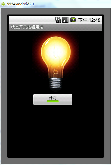
以下案例为ToggleButton的用法
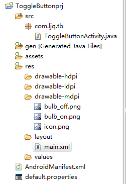
目录结构
main.xml布局文件
<?xml version="1.0" encoding="utf-8"?>
<LinearLayout xmlns:android="http://schemas.android.com/apk/res/android"
  android:orientation="vertical"
  android:layout_width="fill_parent"
  android:layout_height="fill_parent">
  <ImageView android:id="@+id/imageView"
    android:layout_width="wrap_content"
    android:layout_height="wrap_content"
    android:src="@drawable/bulb_off"
    android:layout_gravity="center_horizontal" />
  <ToggleButton android:id="@+id/toggleButton"
    android:layout_width="140dip"
    android:layout_height="wrap_content"
    android:textOn="开灯"
    android:textOff="关灯"
    android:layout_gravity="center_horizontal" />
</LinearLayout>
ToggleButtonActivity类
package com.ljq.tb;

import android.app.Activity;
import android.os.Bundle;
import android.widget.CompoundButton;
import android.widget.ImageView;
import android.widget.ToggleButton;
import android.widget.CompoundButton.OnCheckedChangeListener;

public class ToggleButtonActivity extends Activity {
  private ImageView imageView=null;
  private ToggleButton toggleButton=null;

  @Override
  public void onCreate(Bundle savedInstanceState) {
    super.onCreate(savedInstanceState);
    setContentView(R.layout.main);

    imageView=(ImageView) findViewById(R.id.imageView);
    toggleButton=(ToggleButton)findViewById(R.id.toggleButton);
    toggleButton.setOnCheckedChangeListener(new OnCheckedChangeListener(){

      public void onCheckedChanged(CompoundButton buttonView,
          boolean isChecked) {
        toggleButton.setChecked(isChecked);
        imageView.setImageResource(isChecked?R.drawable.bulb_on:R.drawable.bulb_off);
      }

    });
  }
}
运行效果:
(2)switch:
showText:设置textOn/off的时候文字是否显示
android:showText:设置on/off的时候是否显示文字,boolean
android:splitTrack:是否设置一个间隙,让滑块与底部图片分隔,boolean
android:switchMinWidth:设置开关的最小宽度
android:switchPadding:设置滑块内文字的间隔
android:textOff:按钮没有被选中时显示的文字
android:textOn:按钮被选中时显示的文字
android:textStyle:文字风格,粗体,斜体写划线那些
android:track:底部的图片
android:thumb:滑块的图片
可以自己动手试一试每一个属性
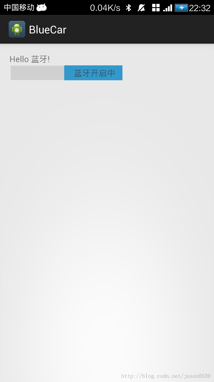
在做一个蓝牙开关时候,用到了switch,记一下用法,其实跟Button是几乎一样的.
布局中:
<Switch
    android:id="@+id/open"
    android:layout_width="wrap_content"
    android:layout_height="wrap_content"
    android:textOff="蓝牙关闭中"
    android:textOn="蓝牙开启中" />
java代码中
open.setOnCheckedChangeListener(new OnCheckedChangeListener() {

      @Override
      public void onCheckedChanged(CompoundButton buttonView,
          boolean isChecked) {
        // TODO Auto-generated method stub
        if (isChecked) {
          mBluetoothAdapter.enable();//打开蓝牙
        } else {
          mBluetoothAdapter.disable();// 关闭蓝牙
        }
      }
    });
就是这样了,一看就明白了.
相关推荐
-

Android使用gallery和imageSwitch制作可左右循环滑动的图片浏览器
效果图: 为了使图片浏览器左右无限循环滑动 我们要自定义gallery的adapter 如果要想自定义adapter首先要了解这几个方法 @Override public int getCount() { // TODO Auto-generated method stub return 0; } @Override public Object getItem(int position) { // TODO Auto-generated method stub return null; } @O
-
Android控件ImageSwitcher实现左右图片切换功能
ImageSwitcher类是ViewSwitcher类的子类,它实现的效果是在完成ImageView的切换并且带有动画效果.要使用这个类需要以下两个步骤: 1)为ImageSwitcher类提供一个ViewFactory,该ViewFactory生成的View组件必须是ImageView. 2)需要切换的时候,只需要嗲用ImageSwitcher的setImageDrawable().setImageResource().setImageURL()方法即可实现切换. activity_main
-
Android开发之ViewSwitcher用法实例
本文实例讲述了Android开发之ViewSwitcher用法.分享给大家供大家参考,具体如下: android.widget.ViewSwitcher是ViewAnimator的子类,用于在两个View之间切换,但每次只能显示一个View. ViewSwitcher的addView函数的代码如下: /** * {@inheritDoc} * * @throws IllegalStateException if this switcher already contains two childre
-
Android中使用GridView和ImageViewSwitcher实现电子相册简单功能实例
我们在手机上查看相册时,首先看到的是网格状的图片展示界面,然后我们选择想要欣赏的照片点击进入,这样就可以全屏观看该照片,并且可以通过左右滑动来切换照片.如下图的显示效果: 实现Activity之间的跳转以及照片标记位置的传递需要用到intent,并分别使用putExtra以及getExtra,传入和获取照片的标记位置. (关于intent,后期会有专门博文介绍具体使用,请大家持续关注哦) 下面我们开始功能的实现: 第一步:Layout中建立首页GridView布局grid_layout.xml文
-
Android UI控件Switch的使用方法
在Android中偶尔会用到开关,Switch就是一个简单易使用的不错的控件. 首先,在布局中添加上Switch控件: <Switch android:id="@+id/s_v" android:layout_width="wrap_content" android:layout_height="wrap_content" android:switchMinWidth="20dp" android:textOn=&quo
-
很赞的引导界面效果Android控件ImageSwitcher实现
本文实例为大家分享了Android控件ImageSwitcher实现引导界面的代码,供大家参考,具体内容如下 效果图: 布局代码: <?xml version="1.0" encoding="UTF-8"?> <FrameLayout xmlns:android="http://schemas.android.com/apk/res/android" android:layout_width="fill_parent&
-
android开发教程之switch控件使用示例
复制代码 代码如下: <Switchandroid:id="@+id/open"android:layout_width="wrap_content"android:layout_height="wrap_content"android:textOff="蓝牙关闭中"android:textOn="蓝牙开启中" /> 复制代码 代码如下: open.setOnCheckedChangeListe
-
Android入门之Gallery+ImageSwitcher用法实例解析
继上一篇介绍了如何使用Gallery控件之后,本文就来讲一下Gallery 与ImageSwitcher的结合使用.本文所述实例代码将实现一个简单的浏览图片的功能. 先贴出程序运行截图如下: 除了Gallery可以拖拉切换图片,我在ImageSwitcher控件加入了setOnTouchListener事件实现,使得ImageSwitcher也可以在拖拉中切换图片.本例子依然使用JAVA的反射机制来自动读取资源中的图片. main.xml的源码如下: <?xml version="1.0&
-
Android基于ImageSwitcher实现图片切换功能
左右切换图片控件大家都用ViewPager, ViewFipper比较多吧,我之前也用ViewPager实现了,使用ViewPager实现左右循环滑动图片,有兴趣的可以去看下,今天介绍的是基于ImageSwitcher实现的左右切换图片,先上截图吧 好了,接下来来看代码吧,第一张图是一个GridView,点击item跳转到第二个界面,第一个界面可以忽略,主要是讲解ImageSwitcher的左右却换图片,先看布局文件 <?xml version="1.0" encoding=&q
-
Android UI设计系列之自定义SwitchButton开关实现类似IOS中UISwitch的动画效果(2)
做IOS开发的都知道,IOS提供了一个具有动态开关效果的UISwitch组件,这个组件很好用效果相对来说也很绚丽,当我们去点击开关的时候有动画效果,但遗憾的是Android上并没有给我们提供类似的组件(听说在Android4.0的版本上提供了具有动态效果的开关组件,不过我还没有去看文档),如果我们想实现类似的效果那该怎么办了呢?看来又得去自定义了. 公司的产品最近一直在做升级,主要做的就是把界面做的更绚丽更美观给用户更好的体验(唉,顾客是上帝......),其中的设置功能中就有开关按钮,原来的开