WPF实现在控件上显示Loading等待动画的方法详解
WPF 如何在控件上显示 Loading 等待动画
- 框架使用
.NET40; Visual Studio 2022;- 使用方式需引入命名空间后设置控件的附加属性
wd:Loading.IsShow="true",即可显示默认等待动画效果如下:
- 如需自定义
Loading一定要 先设置wd:Loading.Child在设置IsShow="true"。 - 显示不同
Loading内容需wd:Loading.Child ={x:Static wd:NormalLoading.Default}进行复赋值显示NormalLoading效果如下:

实现代码
也可以自定义 Loading 动画如下:
1、自定义控件 CustomLoading 。
public class CustomLoading : Control
    {
        public static CustomLoading Default = new CustomLoading();
        static CustomLoading()
        {
            DefaultStyleKeyProperty.OverrideMetadata(typeof(CustomLoading),
                new FrameworkPropertyMetadata(typeof(CustomLoading)));
        }
    }
2、编写 CustomLoading.xaml 代码如下。
<Style TargetType="{x:Type controls:CustomLoading}">
        <Setter Property="Width" Value="40" />
        <Setter Property="Height" Value="40" />
        <Setter Property="Template">
            <Setter.Value>
                <ControlTemplate TargetType="{x:Type controls:CustomLoading}">
                   <!--此处编写自定义的动画逻辑-->
                </ControlTemplate>
            </Setter.Value>
        </Setter>
    </Style>
1)创建装饰 AdornerContainer 代码如下:
using System.Windows;
using System.Windows.Documents;
using System.Windows.Media;

namespace WPFDevelopers.Utilities
{
    public class AdornerContainer : Adorner
    {
        private UIElement _child;
        public AdornerContainer(UIElement adornedElement) : base(adornedElement)
        {
        }
        public UIElement Child
        {
            get => _child;
            set
            {
                if (value == null)
                {
                    RemoveVisualChild(_child);
                    _child = value;
                    return;
                }
                AddVisualChild(value);
                _child = value;
            }
        }
        protected override int VisualChildrenCount
        {
            get
            {
                return _child != null ? 1 : 0;
            }
        }

        protected override Size ArrangeOverride(Size finalSize)
        {
            _child?.Arrange(new Rect(finalSize));
            return finalSize;
        }

        protected override Visual GetVisualChild(int index)
        {
            if (index == 0 && _child != null) return _child;
            return base.GetVisualChild(index);
        }
    }
}
2)创建蒙板控件 MaskControl 代码如下:
using System.Windows;
using System.Windows.Controls;
using System.Windows.Media;

namespace WPFDevelopers.Controls
{
    public class MaskControl : ContentControl
    {
        private readonly Visual visual;
        public static readonly DependencyProperty CornerRadiusProperty =
          DependencyProperty.Register("CornerRadius", typeof(CornerRadius), typeof(MaskControl),
              new PropertyMetadata(new CornerRadius(0)));
        public MaskControl(Visual _visual)
        {
            visual = _visual;
        }
        public CornerRadius CornerRadius
        {
            get => (CornerRadius)GetValue(CornerRadiusProperty);
            set => SetValue(CornerRadiusProperty, value);
        }
    }
}
3)创建 Loading 继承 BaseControl 增加附加属性 IsShow 代码如下:
True则动态添加装饰器AdornerContainer并将MaskControl添加到AdornerContainer.Child中。False则移除装饰器。
using System.Runtime.CompilerServices;
using System.Windows;
using System.Windows.Controls;
using System.Windows.Documents;
using System.Windows.Markup;
using System.Windows.Media;
using WPFDevelopers.Helpers;
using WPFDevelopers.Utilities;

namespace WPFDevelopers.Controls
{
    public class Loading : BaseControl
    {
        public static readonly DependencyProperty IsShowProperty =
           DependencyProperty.RegisterAttached("IsShow", typeof(bool), typeof(Loading),
               new PropertyMetadata(false, OnIsLoadingChanged));
        private const short SIZE = 25;
        private const double MINSIZE = 40;
        private static FrameworkElement oldFrameworkElement;
        private static void OnIsLoadingChanged(DependencyObject d, DependencyPropertyChangedEventArgs e)
        {
            if (e.NewValue is bool isMask && d is FrameworkElement parent)
            {
                if (isMask)
                {
                    if (!parent.IsLoaded)
                        parent.Loaded += Parent_Loaded;
                    else
                        CreateMask(parent);
                }
                else
                {
                    parent.Loaded -= Parent_Loaded;
                    CreateMask(parent, true);
                }
            }
        }
        private static void Parent_Loaded(object sender, RoutedEventArgs e)
        {
            if (sender is UIElement element)
                CreateMask(element);
        }
        static void CreateMask(UIElement uIElement, bool isRemove = false)
        {
            var layer = AdornerLayer.GetAdornerLayer(uIElement);
            if (layer == null) return;
            if (isRemove && uIElement != null)
            {
                var adorners = layer.GetAdorners(uIElement);
                if (adorners != null)
                {
                    foreach (var item in adorners)
                    {
                        if (item is AdornerContainer container)
                        {
                            var isAddChild = (bool)Loading.GetIsAddChild(uIElement);
                            if (!isAddChild)
                                Loading.SetChild(uIElement, null);
                            container.Child = null;
                            layer.Remove(container);
                        }
                    }
                }
                return;
            }
            var adornerContainer = new AdornerContainer(uIElement);
            var value = Loading.GetChild(uIElement);
            if (value == null)
            {
                var isLoading = GetIsShow(uIElement);
                if (isLoading)
                {
                    var w = (double)uIElement.GetValue(ActualWidthProperty);
                    var h = (double)uIElement.GetValue(ActualHeightProperty);
                    var defaultLoading = new DefaultLoading();
                    if (w < MINSIZE || h < MINSIZE)
                    {
                        defaultLoading.Width = SIZE;
                        defaultLoading.Height = SIZE;
                        defaultLoading.StrokeArray = new DoubleCollection { 10, 100 };
                    }
                    SetChild(uIElement, defaultLoading);
                    value = Loading.GetChild(uIElement);
                }
                if (value != null)
                    adornerContainer.Child = new MaskControl(uIElement) { Content = value, Background = ControlsHelper.Brush };
            }
            else
            {
                var normalLoading = (FrameworkElement)value;
                var frameworkElement = (FrameworkElement)uIElement;
                Loading.SetIsAddChild(uIElement, true);

                if (oldFrameworkElement != null)
                    value = oldFrameworkElement;
                else
                {
                    string xaml = XamlWriter.Save(normalLoading);
                    oldFrameworkElement = (FrameworkElement) XamlReader.Parse(xaml);
                }

                var _size = frameworkElement.ActualHeight < frameworkElement.ActualWidth ? frameworkElement.ActualHeight : frameworkElement.ActualWidth;
                if(_size < MINSIZE)
                {
                    normalLoading.Width = SIZE;
                    normalLoading.Height = SIZE;
                    value = normalLoading;
                }

                adornerContainer.Child = new MaskControl(uIElement) { Content = value, Background = ControlsHelper.Brush };

            }
            layer.Add(adornerContainer);

        }
        public static bool GetIsShow(DependencyObject obj)
        {
            return (bool)obj.GetValue(IsShowProperty);
        }

        public static void SetIsShow(DependencyObject obj, bool value)
        {
            obj.SetValue(IsShowProperty, value);
        }
    }
}
4)创建 DefaultLoading.xaml 代码如下:
<ResourceDictionary xmlns="http://schemas.microsoft.com/winfx/2006/xaml/presentation"
                    xmlns:x="http://schemas.microsoft.com/winfx/2006/xaml"
                    xmlns:controls="clr-namespace:WPFDevelopers.Controls">

    <ResourceDictionary.MergedDictionaries>
        <ResourceDictionary Source="Basic/ControlBasic.xaml"/>
    </ResourceDictionary.MergedDictionaries>

    <Style TargetType="{x:Type controls:DefaultLoading}">
        <Setter Property="Width" Value="40" />
        <Setter Property="Height" Value="40" />
        <Setter Property="Template">
            <Setter.Value>
                <ControlTemplate TargetType="{x:Type controls:DefaultLoading}">
                    <Viewbox Width="{TemplateBinding Width}"
                             Height="{TemplateBinding Height}">
                        <controls:SmallPanel>
                            <controls:SmallPanel.Resources>
                                <Storyboard x:Key="StarStoryboard" RepeatBehavior="Forever">
                                    <DoubleAnimation
                                                Storyboard.TargetName="PART_Ellipse"
                                                Storyboard.TargetProperty="(UIElement.RenderTransform).(RotateTransform.Angle)"
                                                To="360"
                                                Duration="0:0:1.0" />
                                </Storyboard>
                            </controls:SmallPanel.Resources>
                            <Ellipse
                                        Width="{TemplateBinding Width}"
                                        Height="{TemplateBinding Height}"
                                        Stroke="{DynamicResource BaseSolidColorBrush}"
                                        StrokeDashArray="100,100"
                                        StrokeThickness="2" />
                            <Ellipse
                                        x:Name="PART_Ellipse"
                                        Width="{TemplateBinding Width}"
                                        Height="{TemplateBinding Height}"
                                        Stretch="Uniform"
                                        RenderTransformOrigin=".5,.5"
                                        Stroke="{DynamicResource PrimaryPressedSolidColorBrush}"
                                        StrokeDashArray="{TemplateBinding StrokeArray}"
                                        StrokeThickness="2">
                                <Ellipse.RenderTransform>
                                    <RotateTransform Angle="0" />
                                </Ellipse.RenderTransform>
                                <Ellipse.Triggers>
                                    <EventTrigger RoutedEvent="Loaded">
                                        <BeginStoryboard Storyboard="{StaticResource StarStoryboard}" />
                                    </EventTrigger>
                                </Ellipse.Triggers>
                            </Ellipse>
                        </controls:SmallPanel>
                    </Viewbox>
                </ControlTemplate>
            </Setter.Value>
        </Setter>
    </Style>
</ResourceDictionary>
5)创建 LoadingExample.xaml 实例代码如下:
<UserControl x:Class="WPFDevelopers.Samples.ExampleViews.LoadingExample"
             xmlns="http://schemas.microsoft.com/winfx/2006/xaml/presentation"
             xmlns:x="http://schemas.microsoft.com/winfx/2006/xaml"
             xmlns:mc="http://schemas.openxmlformats.org/markup-compatibility/2006"
             xmlns:d="http://schemas.microsoft.com/expression/blend/2008"
             xmlns:wd="https://github.com/WPFDevelopersOrg/WPFDevelopers"

             xmlns:local="clr-namespace:WPFDevelopers.Samples.ExampleViews"
             mc:Ignorable="d"
             d:DesignHeight="450" d:DesignWidth="800">
        <Grid Margin="10">
            <StackPanel Grid.Column="1">
                <CheckBox Name="MyCheckBox" Content="启动 Loading 动画"
                          VerticalAlignment="Center"
                          HorizontalAlignment="Center"/>
                <UniformGrid Margin="10" Rows="2" Columns="3">
                    <Border Background="Red"
                wd:Loading.IsShow="{Binding ElementName=MyCheckBox,Path=IsChecked}">
                        <TextBlock Text="Mask 0"
                       VerticalAlignment="Center"
                       HorizontalAlignment="Center"/>
                    </Border>
                    <Image Source="pack://application:,,,/WPFDevelopers.Samples;component/Images/Breathe/0.jpg"
                   wd:Loading.IsShow="{Binding ElementName=MyCheckBox,Path=IsChecked}"
                           wd:Loading.Child="{x:Static wd:NormalLoading.Default}"/>
                    <Button Content="Mask 1" wd:Loading.IsShow="{Binding ElementName=MyCheckBox,Path=IsChecked}" Height="28"
                    VerticalAlignment="Top" HorizontalAlignment="Center"/>
                    <Button Content="Mask 2" wd:Loading.IsShow="{Binding ElementName=MyCheckBox,Path=IsChecked}"
                    VerticalAlignment="Top" HorizontalAlignment="Center" Margin="0,10"/>
                    <Button Content="提交" wd:Loading.IsShow="{Binding ElementName=MyCheckBox,Path=IsChecked}"
                    VerticalAlignment="Top" HorizontalAlignment="Center" Margin="0,10"
                    Style="{StaticResource PrimaryButton}"/>
                </UniformGrid>
            </StackPanel>
        </Grid>
</UserControl>
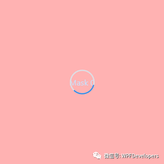
效果图

到此这篇关于WPF实现在控件上显示Loading等待动画的方法详解的文章就介绍到这了,更多相关WPF控件显示Loading等待动画内容请搜索我们以前的文章或继续浏览下面的相关文章希望大家以后多多支持我们!
相关推荐
-

超炫酷的WPF实现Loading控件效果
Win8系统的Loading效果还是很不错的,网上也有人用CSS3等技术实现,研究了一下,并打算用WPF自定义一个Loading控件实现类似的效果,并可以让用户对Loading的颗粒(Particle)背景颜色进行自定义,话不多说,直接上代码: 1.用VS2012新建一个WPF的用户控件库项目WpfControlLibraryDemo,VS自动生成如下结构: 2.删除UserControl1.xaml,并新建一个Loading的CustomControl(不是UserControl),如下图所示
-
WPF实现好看的Loading动画的示例代码
实现思路 框架使用大于等于.NET40: Visual Studio 2022; 项目使用 MIT 开源许可协议: 老板觉得公司系统等待动画转圈太简单,所以需要做一个稍微好看点的,就有这篇等待RingLoading动画 最外层使用Viewbox为父控件内部嵌套创建三组 Grid -> Ellipse . Border分别给它们指定不同的Angle从左侧开始 -135 225 54,做永久 Angle 动画: PART_Ring1.RotateTransform.Angle从From -135 到
-
WPF实现在控件上显示Loading等待动画的方法详解
WPF 如何在控件上显示 Loading 等待动画 框架使用.NET40: Visual Studio 2022; 使用方式需引入命名空间后设置控件的附加属性 wd:Loading.IsShow="true",即可显示默认等待动画效果如下: 如需自定义 Loading 一定要 先设置 wd:Loading.Child 在设置 IsShow="true" . 显示不同 Loading 内容需 wd:Loading.Child ={x:Static wd:NormalL
-
详解WPF如何在基础控件上显示Loading等待动画
WPF 如何在基础控件上显示 Loading 等待动画 框架使用.NET4 至 .NET6: Visual Studio 2022; 使用方式需引入命名空间后设置控件的附加属性 wd:Loading.IsShow="true",即可显示默认等待动画效果如下: 如需自定义 Loading 一定要 先设置 wd:Loading.Child 在设置 IsShow="true" . 显示不同 Loading 内容需 wd:Loading.Child ={x:Static w
-
在GridControl控件上绑定图片的几种操作方式详解
我们知道,基于DevExpress的开发Winform的项目界面的时候,GridControl控件是经常用来绑定数据的,一般以常规的字符内容为主,有时候也会有图片的显示需要,那么如果显示图片,我们应该如何实现呢?本篇随笔介绍基于原生GridControl控件的图片绑定显示操作和基于我封装的分页控件(封装GridControl的分页控件)两种图片绑定显示的操作. 1.基于原生的GridControl控件图片绑定 绑定图片,一般我们可以在单元格里面绑定byte[]类型或者Image类型,那么控件就会
-
PyQt5事件处理之定时在控件上显示信息的代码
有时候为了体现延时效果,或者是多事件处理,需要在窗口的文本编辑框或者表格等控件中,延迟几秒或每隔几秒显示输出一段数据,又或者可以说是每隔几秒执行下一行代码!要实现这种效果,关键的两个方法就是time.sleep()与processEvents(),具体看如下代码: from PyQt5 import QtCore, QtGui, QtWidgets import sys from PyQt5.QtWidgets import * import time class Ui_MainWindow(o
-
Javascript摸拟自由落体与上抛运动原理与实现方法详解
本文实例讲述了Javascript摸拟自由落体与上抛运动原理与实现方法.分享给大家供大家参考,具体如下: JavaScript 代码 //**************************************** //名称:Javascript摸拟自由落体与上抛运动! //作者:Gloot //邮箱:glootz@gmail.com // QQ:345268267 //网站:http://www.cnblogs.com/editor/ //操作:在页面不同地方点几下 //*********
-
深入分析WPF客户端读取高清图片卡以及缩略图的解决方法详解
在Ftp上传上,有人上传了高清图片,每张图片大约2M.如果使用传统的BitmapImage类,然后绑定 Source 属性的方法,有些电脑在首次会比较卡,一张电脑10秒,4张大约会卡40秒. 所以我先异步的下载图片,得到downloadFileStream对象,然后绑定到BitmapImage类上.例如:System.Windows.Controls.Image photo = new Image{ Width = 100, Height = 100, Margin = new
-
读写XML文件的内容并将其显示在ListView控件上的方法
XML文件由内容和标记组成.通过标记包围内容的方式将大部门内容包含在元素中[1].XML的节点便于程序配置进行灵活的扩展,特别是存在以数组格式的配置信息时,增加行或列只需要修改XML文件而无需修改源代码. 1. XML文件介绍 (1)声明 XML 文档的第一行可以是一个 XML 声明[1]这是文件的可选部分,它将文件识别为 XML 文件,有助于工具和人类识别 XML(不会误认为是 SGML 或其他标记).可以将这个声明简单地写成 <?xml?>,或包含 XML 版本<?xml versi
-
实现onmouseover和onmouseout应用于RadioButtonList或CheckBoxList控件上
一直想实现onmouseover和onmouseout应用于RadioButtonList或CheckBoxList控件上,今晚终于有时间实现它.此功能就是当鼠标经过时RadioButtonList或CheckBoxList每一个Item时,让Item有特效显示,离开时,恢复原样.可以看到效果: RadioButtonList效果: CheckBoxList效果: 这资实现数据,Insus.NET准备了五行(Five Phases) 创建一个对象[Five Phases]:FivePhases.
-
WPF的ListView控件自定义布局用法实例
本文实例讲述了WPF的ListView控件自定义布局用法.分享给大家供大家参考,具体如下: 概要: 以源码的形式贴出,免得忘记后,再到网上查资料.在VS2008+SP1环境下调试通过 引用的GrayscaleEffect模块,可根据参考资料<Grayscale Effect...>中的位置下载. 正文: 如何布局是在App.xaml中定义源码如下 <Application x:Class="CWebsSynAssistant.App" xmlns="http
-
JavaScript在控件上添加倒计时功能的实现代码
一.概述 在有些 报表 需求中,需要为控件添加倒计时功能,限制到某一个时间点后能进行一项操作或不能进行某项操作,比如查询,导出功能等等,又需要人性化地显示还有多少时间,即倒计时功能,比如下图中我们限制这个报表在每天10点后才能查询 当倒计时结束的时候,查询功能可用 这种功能如何实现的呢 二.实现思路 主要原理是利用控件的setEnable(true)/setEnable(false)来进行设置控件的可用与不可用状态,在获取时间的过程中,需要利用到JS中的获取时间,利用JS的定时器函数setInt