Vue使用driver.js做引导页
目录
- 简介及使用教程
- 特点:
- 安装
- 使用
- 引导页效果
轻量级、无依赖的原生 JavaScript 引擎,可将用户的注意力集中在整个页面上;这是一个功能强大且高度可定制的基于原生JavaScript开发的新用户引导库。
简介及使用教程
Driver.js是一个功能强大且高度可定制的基于原生JavaScript开发的新用户引导库。它没有依赖项,支持所有主要浏览器。
特点:
- 简单:简单易用,完全没有外部依赖
- 高度可定制:有一个强大的api,可以用于你希望突出显示任何内容
- 高亮显示:页面功能介绍上的任意元素(字面上的任意)
- 功能介绍:为你的web应用程序创建强大的功能介绍
- 焦点移位器:为用户友好添加焦点移位器
- 用户友好:通过键盘行为控制一切
- 一致行为:所有浏览器(包括著名的IE)都可以使用
- MIT声明:免费用于个人和商业用途。
安装
Npm
npm i driver.js
Yarn
yarn add driver.js
浏览器
<script src="https://unpkg.com/driver.js/dist/driver.min.js"></script>
<link rel="stylesheet" href="https://unpkg.com/driver.js/dist/driver.min.css">

<!-- 或者 -->
<link rel="stylesheet" href="/dist/driver.min.css">
<script src="/dist/driver.min.js"></script>
使用
引入
import Driver from 'driver.js';
import 'driver.js/dist/driver.min.css';
简单示例
const driver = new Driver();
driver.highlight('#create-post');

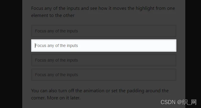
交互时高亮元素
const focusDriver = new Driver();

// Highlight the section on focus
document.getElementById('creation-input')
  .addEventListener('focus', (e) => {
    focusDriver.focus('#creation-input');
  });
带弹窗
const driver = new Driver();
driver.highlight({
  element: '#some-element',
  popover: {
    title: 'Title for the Popover',
    description: 'Description for it',
  }
});

弹窗支持定义位置、HTML内容等
创建功能介绍
const driver = new Driver();
// Define the steps for introduction
driver.defineSteps([
  {
    element: '#first-element-introduction',
    popover: {
      className: 'first-step-popover-class',
      title: 'Title on Popover',
      description: 'Body of the popover',
      position: 'left'
    }
  },
  {
    element: '#second-element-introduction',
    popover: {
      title: 'Title on Popover',
      description: 'Body of the popover',
      position: 'top'
    }
  },
  {
    element: '#third-element-introduction',
    popover: {
      title: 'Title on Popover',
      description: 'Body of the popover',
      position: 'right'
    }
  },
]);
// Start the introduction
driver.start();

弹出框定位
您还可以将弹出框的位置更改为
left, left-center, left-bottom, top, top-center, top-right, right, right-center,right-bottom或bottom, bottom-center, bottom-right, mid-center。
const driver = new Driver();
driver.highlight({
  element: '#some-element',
  popover: {
    title: 'Title for the Popover',
    description: 'Description for it',
    // position can be left, left-center, left-bottom, top,
    // top-center, top-right, right, right-center, right-bottom,
    // bottom, bottom-center, bottom-right, mid-center
    position: 'left',
  }
});
如果不指定位置或者指定为 be auto,它会自动为popover找到合适的位置并显示出来

选项
Driver 选项
const driver = new Driver({
  className: 'scoped-class', //包裹driver.js弹窗的类名 className to wrap driver.js popover
  animate: true,  // 高亮元素改变时是否显示动画 Animate while changing highlighted element
  opacity: 0.75,  //背景透明度(0 表示只有弹窗并且没有遮罩) Background opacity (0 means only popovers and without overlay)
  padding: 10,   //  元素与边缘的距离 Distance of element from around the edges
  allowClose: true, // 是否允许点击遮罩时关闭 Whether clicking on overlay should close or not
  overlayClickNext: false, //是否允许点击遮罩时移到到下一步 Should it move to next step on overlay click
  doneBtnText: 'Done', // 最终按钮上的文本 Text on the final button
  closeBtnText: 'Close', // 当前步骤关闭按钮上的文本 Text on the close button for this step
  nextBtnText: 'Next', //当前步骤下一步按钮上的文本 Next button text for this step
  prevBtnText: 'Previous', // 当前步骤上一步按钮上的文本 Previous button text for this step
  showButtons: false, //是否在底部显示控制按钮 Do not show control buttons in footer
  keyboardControl: true, // 是否允许通告键盘控制(escape关闭,箭头键用于移动)Allow controlling through keyboard (escape to close, arrow keys to move)
  scrollIntoViewOptions: {}, //  `scrollIntoView()` 方法的选项 We use `scrollIntoView()` when possible, pass here the options for it if you want any
  onHighlightStarted: (Element) {}, // 元素开将要高亮时调用Called when element is about to be highlighted
  onHighlighted: (Element) {}, // 元素开完全高亮时调用Called when element is fully highlighted
  onDeselected: (Element) {}, // 取消选择时调用 Called when element has been deselected
  onReset: (Element) {},        // 遮罩将要关闭时调用 Called when overlay is about to be cleared
  onNext: (Element) => {},      // 任何步骤中移到到下一步时调用Called when moving to next step on any step
  onPrevious: (Element) => {},  // 任何步骤中移到到上一步时调用Called when moving to next step on any step
});
step 选项
const stepDefinition = {
  element : '#some-item' ,         // 查询要突出显示的选择器字符串或节点
  stageBackground : '#ffffff' ,    // 这将覆盖驱动程序中设置的
  popover : {                     // 不会有 popover如果为空或未给定
    className : 'popover-class' ,  // 除了驱动程序选项中的一般 className 之外,还要包装此特定步骤 popover 的 className
    title : 'Title' ,              // 弹出框上的标题
    description : 'Description' , // 弹出框的主体
    showButtons : false ,          // 不要在页脚中显示控制按钮
    doneBtnText : 'Done' ,         // 最后一个按钮上的文本
    closeBtnText : 'Close' ,       // 关闭按钮上的文本
    nextBtnText : 'Next' ,         // 下一个按钮文本
    prevBtnText : 'Previous' ,     // 上一个按钮文本
  } ,
  onNext : ( )  =>  { } ,              // 从当前步骤移动到下一步时调用
  onPrevious :( )  =>  { } ,          // 从当前步骤移动到上一步时调用
} ;
API方法
const driver = new Driver(driverOptions);

const isActivated = driver.isActivated; // 检查driver是否激活Checks if the driver is active or not
driver.moveNext();     // 移动到步骤列表中的下一步 Moves to next step in the steps list
driver.movePrevious(); // 移动到步骤列表中的上一步 Moves to previous step in the steps list
driver.start(stepNumber = 0);  // 从指定的步骤开始 Starts driving through the defined steps
driver.highlight(string|stepDefinition); // 高亮通过查询选择器指定的或步骤定义的元素 highlights the element using query selector or the step definition
driver.reset(); // 重置遮罩并且清屏Resets the overlay and clears the screen
driver.hasHighlightedElement(); //检查是否有高亮元素 Checks if there is any highlighted element
driver.hasNextStep(); // 检查是否有可移动到的下一步元素 Checks if there is next step to move to
driver.hasPreviousStep(); // 检查是否有可移动到的上一步元素。Checks if there is previous step to move to

driver.preventMove();// 阻止当前移动。如果要执行某些异步任务并手动移动到下一步,则在“onNext”或“onPrevious”中很有用 Prevents the current move. Useful in `onNext` or `onPrevious` if you want to
// perform some asynchronous task and manually move to next step

const activeElement = driver.getHighlightedElement();// 获取屏幕上当前高亮元素 Gets the currently highlighted element on screen
const lastActiveElement = driver.getLastHighlightedElement();
activeElement.getCalculatedPosition(); // 获取活动元素的屏幕坐标Gets screen co-ordinates of the active element
activeElement.hidePopover();  // 隐藏弹窗Hide the popover
activeElement.showPopover();  // 显示弹窗Show the popover

activeElement.getNode();  // 获取此元素后面的DOM元素Gets the DOM Element behind this element
你可以使用各种各样的选项来实现你想要的一切。You can use a variety of options to achieve whatever you may want.
引导页效果
Driver.js -Demo是一个指南性质的库
访问GitHub
通用引导页
新建主页面文件
layout
<template>
  <div :class="classObj" class="app-wrapper">
    <div v-if="device==='mobile'&&sidebar.opened" class="drawer-bg" @click="handleClickOutside" />
    <sidebar class="sidebar-container" />
    <div :class="{hasTagsView:needTagsView}" class="main-container">
      <div :class="{'fixed-header':fixedHeader}">
        <navbar />
        <tags-view v-if="needTagsView" />
      </div>
      <app-main />
      <right-panel v-if="showSettings">
        <settings />
      </right-panel>
    </div>
  </div>
</template>

<script>
import RightPanel from '@/components/RightPanel'
import { AppMain, Navbar, Settings, Sidebar, TagsView } from './components'
import ResizeMixin from './mixin/ResizeHandler'
import { mapState } from 'vuex'
import Driver from 'driver.js' // import driver.js
import 'driver.js/dist/driver.min.css' // import driver.js css
import steps from './steps'

export default {
  name: 'Layout',
  components: {
    AppMain,
    Navbar,
    RightPanel,
    Settings,
    Sidebar,
    TagsView
  },
  mixins: [ResizeMixin],
  data() {
    return {
      driver: null
    }
  },
  computed: {
    ...mapState({
      sidebar: state => state.app.sidebar,
      device: state => state.app.device,
      showSettings: state => state.settings.showSettings,
      needTagsView: state => state.settings.tagsView,
      fixedHeader: state => state.settings.fixedHeader
    }),
    classObj() {
      return {
        hideSidebar: !this.sidebar.opened,
        openSidebar: this.sidebar.opened,
        withoutAnimation: this.sidebar.withoutAnimation,
        mobile: this.device === 'mobile'
      }
    }
  },
  mounted() {
    this.driver = new Driver({
      opacity: 0.1,
      animate: true,
      doneBtnText: '我知道了',
      closeBtnText: '跳过', //  关闭按钮文案
      nextBtnText: '下一步', // 下一步的按钮文案
      prevBtnText: '上一步', // 上一步的按钮文案
      keyboardControl: true // 允许通过键盘控制(退出关闭,箭头键移动)
    })
    console.log(this.driver)
    this.firstLogin()
  },
  methods: {
    handleClickOutside() {
      this.$store.dispatch('app/closeSideBar', { withoutAnimation: false })
    },
    // 用户是否首次登录
    firstLogin() {
      const firstDate = localStorage.getItem('firstDate')
      // 获取当前时间(年月日)
      const now = new Date().toLocaleDateString()
      // 转换成时间戳
      const time = Date.parse(new Date(now))
      if (localStorage.getItem('firstDate')) {
        console.log('页面被刷新')
        if (time > firstDate) {
          localStorage.setItem('firstDate', JSON.stringify(time))
        }
      } else {
        this.guide()
        localStorage.setItem('firstDate', JSON.stringify(time))
        console.log('首次被加载')
      }
    },
    // 页面引导
    guide() {
      this.driver.defineSteps(steps)
      this.driver.start()
    }
  }
}
</script>

<style lang="scss" scoped>
  @import "~@/styles/mixin.scss";
  @import "~@/styles/variables.scss";

  .app-wrapper {
    @include clearfix;
    position: relative;
    height: 100%;
    width: 100%;

    &.mobile.openSidebar {
      position: fixed;
      top: 0;
    }
  }

  .drawer-bg {
    background: #000;
    opacity: 0.3;
    width: 100%;
    top: 0;
    height: 100%;
    position: absolute;
    z-index: 999;
  }

  .fixed-header {
    position: fixed;
    top: 0;
    right: 0;
    z-index: 9;
    width: calc(100% - #{$sideBarWidth});
    transition: width 0.28s;
  }

  .hideSidebar .fixed-header {
    width: calc(100% - 54px)
  }

  .mobile .fixed-header {
    width: 100%;
  }
</style>
新建
steps.js文件
// 定义介绍的步骤
const steps = [
  {
    element: '#hamburger-container',
    stageBackground: '#fff',
    popover: {
      title: '侧边栏按钮',
      description: '打开或者关闭侧边栏',
      position: 'bottom'
    }
  },
  {
    element: '#sidebar-container',
    popover: {
      title: '侧边栏',
      description: '侧边栏及路由',
      position: 'right-center'
    }
  },
  {
    element: '#breadcrumb-container',
    popover: {
      title: '面包屑导航',
      description: '指示当前页的位置',
      position: 'bottom'
    }
  },
  {
    element: '#header-search',
    popover: {
      title: '页面搜索',
      description: '页面搜索,快速导航',
      position: 'left'
    }
  },
  {
    element: '#screenfull',
    popover: {
      title: '满屏',
      description: '将页面设置为全屏',
      position: 'left'
    }
  },
  {
    element: '#size-select',
    popover: {
      title: '开关的大小',
      description: '系统切换大小',
      position: 'left'
    }
  },
  {
    element: '#lang-select',
    popover: {
      title: '国际化',
      description: '中英文切换',
      position: 'left'
    },
    padding: 0
  },
  {
    element: '#personal_settings',
    popover: {
      title: '个人中心',
      description: '个人账号设置及操作',
      position: 'left'
    },
    padding: 0
  },
  {
    element: '#tags-view-container',
    popover: {
      title: '标签视图',
      description: '您访问的页面的历史',
      position: 'bottom-center'
    },
    padding: 0
  },
  {
    element: '#theme_settings',
    popover: {
      title: '主题设置',
      description: '设置自己喜欢的主题',
      position: 'right-center'
    },
    padding: 0
  },
  {
    element: '#app_main',
    stageBackground: '#fff',
    popover: {
      className: 'app-container',
      title: '主体内容区',
      // description: '主体内容的一系列操作',
      position: 'top-center'
    },
    padding: -30
  }
]

export default steps
到此这篇关于Vue使用driver.js做引导页的文章就介绍到这了,更多相关Vue driver.js引导页内容请搜索我们以前的文章或继续浏览下面的相关文章希望大家以后多多支持我们!
相关推荐
-

Driver.js前端引导页组件的具体使用
目录 一.介绍 二.官方地址 三.使用方法 四.效果演示 五.使用感受 一.介绍 Driver.jsPowerful, highly customizable vanilla JavaScript engine to drive the user’s focus across the pageNo external dependencies, supports all major browsers and highly customizable Driver.js 是一个轻量级(~ 4kb gz
-
Vue使用driver.js做引导页
目录 简介及使用教程 特点: 安装 使用 引导页效果 轻量级.无依赖的原生 JavaScript 引擎,可将用户的注意力集中在整个页面上:这是一个功能强大且高度可定制的基于原生JavaScript开发的新用户引导库. 简介及使用教程 Driver.js是一个功能强大且高度可定制的基于原生JavaScript开发的新用户引导库.它没有依赖项,支持所有主要浏览器. 特点: 简单:简单易用,完全没有外部依赖 高度可定制:有一个强大的api,可以用于你希望突出显示任何内容 高亮显示:页面功能介绍上的任意
-
用原生js做单页应用
最近在公司接到一个需求,里面有一个三级跳转.类似于选择地址的时候,选择的顺序是:省份->市->区.如果分三个页面跳转,那么体验非常不好,如果引入其他框架做成单页应用,又比较麻烦.所以可以用js把这一块做成单页应用的样子... 主要思路 通过改变url的hash值,跳到相应模块.先把默认模块显示出来,其他模块隐藏,分别给三个模块定义三个hash值,点击默认模块的选项的时候,改变hash值,同时在window上监听hashchange事件,并作相应模块跳转逻辑处理.这样即可模拟浏览器的前进后退,而
-
vue3项目新用户引导组件driver.js示例详解
好用的用户引导插件有 intro.js 和 driver.js 两个,对比了一下,最终还是使用了driver.js主要有以下原因: 用法简单 可以商用 总要选一个吧 项目使用的是vue3+ts因为多个地方需要使用引导,就直接做成组件使用不废话上代码 yarn add driver.js 或者 npm i driver.js 组件代码 <!-- * @Description: 新用户引导组件 * @LastEditTime: 2022-08-19 11:43:25 --> <templat
-
vue如何使用driver.js实现项目功能向导指引
目录 介绍 安装 使用 突出显示单个元素 高亮和弹出窗口 定位弹出窗口 创建功能介绍 异步操作 配置 定义步骤 API方法 实战 效果 介绍 https://github.com/kamranahmedse/driver.js driver.js 是一个轻量级.无依赖的原生JavaScript引擎,在整个页面中驱动用户的注意力,强大的.高度可定制的原生JavaScript引擎,无外部依赖,支持所有主流浏览器. 安装 npm install driver.js 使用 import Driver f
-
vue中使用vue-print.js实现多页打印
本文主要介绍了vue项目中使用print.js打印,解决多页,分页,打印预览样式修改等问题. 引入安装vue-print.js cnpm i vue-printjs --save-dev 解决打印多页只出现一页问题 由于打印插件存在问题,如果打印文件超出一页,只显示一页,所以我们需要修改print.js源文件,所以只能手动下载vue-print.js到本地,做一些修改,然后引入到项目中,不能使用npm安装 下载 print.js https://github.com/zxc19890923/pr
-
基于vue的fullpage.js单页滚动插件
基于vue的fullpage.js使用方法,供大家参考,具体内容如下 功能概述 可实现移动端的单页滚动效果,支持横向滚动和纵向滚动 兼容性 目前还未进行大规模兼容性测试.有bug请提问至issues 安装 npm install vue-fullpage --save commonjs import VueFullpage from 'vue-fullpage' Vue.use(VueFullpage) 或 var vueFullpage = require('vue-fullpage') Vu
-
Vue.js做select下拉列表的实例(ul-li标签仿select标签)
目标:用ul-li标签结合Vue.js知识做一个模仿select标签的下拉选项列表. 知识点: 组件的写法及运用 组件之间的数据传递(props的运用) 组件之间的数据传递($emit的运用) 动态数据的绑定(v-bind) 自定义事件通信 效果图: 1.未做任何操作前,下拉列表为隐藏状态 2.点击输入框显示下拉列表 3. 点击列表项,输入框值跟随改变 PS: 为了演示data1, data2两组数据的绑定,实例中创建了两个列表 html代码: <!DOCTYPE html> <html
-
vue.js实现标签页切换效果
第二个实例是关于标签页切换的,先看一下效果: 这也是一个很常见的交互效果,以往正常的javascript写法是给各个按钮绑定事件来切换不同的层,当然也可以用纯css写,给上面的三个切换的层分别添加一个单选按钮的兄弟节点,再用绝对定位把单选按钮定位在三个button上面,这样就可以用:checked伪类来单选按钮的兄弟元素,即对应的不同的层,我简单的写了一下DOM结构,大概就是这样: 那么用vue.js实现上述的效果,其实也有两种途径,一种使用vue-router,vue-router是vue.j
-
vue-cli 3.0 自定义vue.config.js文件,多页构建的方法
使用自己基于vue-cli 2.X改造的前端多页脚手架有近1年多时间了,一直没机会升级3.0版本 开始零零碎碎开始写一些功能,顺便分享一下 const path = require('path') const glob = require('glob') /** 获取多页的入口脚本和模板 */ const getPages = (() => { const [ globPathHtml, globPathJs, pages, tempSet ] = [ ['./src/modules/**/in