Bootstrap表单控件学习使用
Bootstrap表单控件的学习使用,供大家参考,具体内容如下
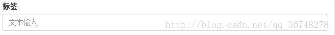
输入框(Input)
最常见的表单文本字段是输入框 input。用户可以在其中输入大多数必要的表单数据。
Bootstrap 提供了对所有原生的 HTML5 的 input 类型的支持,包括:text、password、datetime、datetime-local、date、month、time、week、number、email、url、search、tel 和 color。
<form role="form">
 <div class="form-group">
  <label for="name">标签</label>
  <input type="text" class="form-control" id="name" placeholder="文本输入">
 </div>
</form>
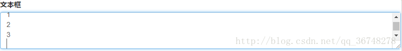
文本框(Textarea)
当您需要进行多行输入的时,则可以使用文本框 textarea。
必要时可以改变 rows 属性(较少的行 = 较小的盒子,较多的行 = 较大的盒子)。(超过这个值就会产生滚动条)
<form role="form">
 <div class="form-group">
  <label for="name">文本框</label>
  <textarea class="form-control" id="name" rows="3"></textarea>
 </div>
</form>
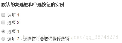
复选框(Checkbox)和单选框(Radio)
(1)复选框和单选按钮用于让用户从一系列预设置的选项中进行选择。
(2)当创建表单时,如果您想让用户从列表中选择若干个选项时,请使用 checkbox。如果您限制用户只能选择一个选项,请使用 radio。
(3)对一系列复选框和单选框使用 .checkbox-inline 或 .radio-inline class,控制它们显示在同一行上。
<label for="name">默认的复选框和单选按钮的实例</label>
<div class="checkbox">
 <label>
  <input type="checkbox" value="">选项1
 </label>
</div>

<div class="checkbox">
 <label>
  <input type="checkbox" value="">选项2
 </label>
</div>

<div class="checkbox">
 <label>
  <input type="checkbox" value="">选项3
 </label>
</div>

<div class="radio">
 <label>
  <input type="radio" name="optionsRadios" id="optionsRadio1" value="options1" checked>选项1
 </label>
</div>

<div class="radio">
 <label>
  <input type="radio" name="optionsRadios" id="optionsRadio2" value="options2" checked>选项2- 选择它将会取消选择选项 1
 </label>
</div>
<label for="name">内联的复选框和单选按钮的实例</label>
<div>
 <label class="checkbox-inline">
  <input type="checkbox" value="">选项1
 </label>

 <label class="checkbox-inline">
  <input type="checkbox" value="">选项2
 </label>

 <label class="checkbox-inline">
  <input type="checkbox" value="">选项3
 </label>

 <label class="radio-inline">
  <input type="radio" name="optionsRadios" id="optionsRadio1" value="options1" checked>选项1
 </label class="radio-inline">

 <label>
  <input type="radio" name="optionsRadios" id="optionsRadio2" value="options2" checked>选项2
 </label>
</div>

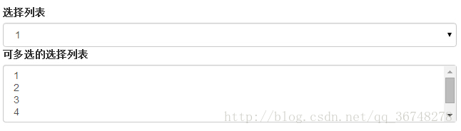
选择框(Select)
(1)当您想让用户从多个选项中进行选择,但是默认情况下只能选择一个选项时,则使用选择框。
(2)使用 <select> 展示列表选项,通常是那些用户很熟悉的选择列表,比如州或者数字。
(3)使用 multiple=”multiple” 允许用户选择多个选项。
<form role="form">
 <div class="form-group>
  <label for="name">选择列表</label>
  <select class="form-control">
   <option>1</option>
   <option>2</option>
   <option>3</option>
   <option>4</option>
   <option>5</option>
  </select>

  <label for="name">可多选的选择列表</label>
  <select class="form-control" multiple>
   <option>1</option>
   <option>2</option>
   <option>3</option>
   <option>4</option>
   <option>5</option>
  </select>
 </div>
</form>
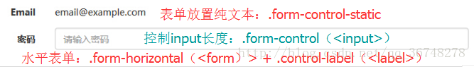
静态控件
需要在一个水平表单内的表单标签后放置纯文本时,请在<p>上使用 class .form-control-static。
<form class="form-horizontal" role="form">
 <div class="form-group">
  <label class="col-sm-2 control-label">Email</label>
  <div class="col-sm-10">
   <p class="form-control-static">email@example.com</p>
  </div>
 </div>

 <div class="form-group">
  <label for="inputPassword" class="col-sm-2 control-label">密码</label>
  <div class="col-sm-10">
   <input type="password" class="form-control" id="inputPassword" placeholder="请输入密码">
  </div>
 </div>
</form>
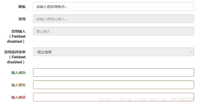
表单控件状态
(1)除了 :focus 状态(即,用户点击 input 或使用 tab 键聚焦到 input 上),Bootstrap 还为禁用的输入框定义了样式,并提供了表单验证的 class。
(2)输入框焦点:当输入框 input 接收到 :focus 时,输入框的轮廓会被移除,同时应用 box-shadow。
(3)禁用的输入框 input:如果您想要禁用一个输入框 input,只需要简单地添加 disabled 属性,这不仅会禁用输入框,还会改变输入框的样式以及当鼠标的指针悬停在元素上时鼠标指针的样式。
(4)禁用的字段集 fieldset:对 <fieldset> 添加 disabled 属性来禁用 <fieldset> 内的所有控件。
(5)验证状态:Bootstrap 包含了错误、警告和成功消息的验证样式。只需要对父元素简单地添加适当的 class(.has-warning、 .has-error 或 .has-success)即可使用验证状态。
<form class="form-horizontal" role="form">
 <div class="form-group">
  <label class="col-sm-2 control-label">聚焦</label>
  <div class="col-sm-10">
   <input class="form-control" id="focusedInput" type="text" value="该输入框获得焦点...">
  </div>
 </div>

 <div class="form-group">
  <label for="inputPassword" class="col-sm-2 control-label">禁用</label>
  <div class="col-sm-10">
   <input class="form-control" id="disabledInput" type="text" placeholder="该输入框禁止输入..." disabled>
  </div>
 </div>

 <fieldset disabled>
  <div class="form-group">
   <label for="disabledTextInput" class="col-sm-2 control-label">禁用输入(Fieldset disabled)</label>
   <div class="col-sm-10">
    <input type="text" id="disabledTextInput" class="form-control" placeholder="禁止输入">
   </div>
  </div>

  <div class="form-group">
   <label for="disabledSelect" class="col-sm-2 control-label">禁用选择菜单(Fieldset disabled)</label>
   <div class="col-sm-10">
    <select id="disabledSelect" class="form-control">
     <option>禁止选择</option>
    </select>
   </div>
  </div>
 </fieldset>

 <div class="form-group has-success">
  <label class="col-sm-2 control-label" for="inputSuccess">输入成功</label>
  <div class="col-sm-10">
   <input type="text" class="form-control" id="inputSuccess">
  </div>
 </div>

 <div class="form-group has-warning">
  <label class="col-sm-2 control-label" for="inputWarning">输入警告</label>
  <div class="col-sm-10">
   <input type="text" class="form-control" id="inputWarning">
  </div>
 </div>

 <div class="form-group has-error">
  <label class="col-sm-2 control-label" for="inputError">输入错误</label>
  <div class="col-sm-10">
   <input type="text" class="form-control" id="inputError">
  </div>
 </div>
</form>
表单控件大小
可以分别使用 class .input-lg 和 .col-lg-* (<input>)来设置表单的高度和宽度。
以上就是本文的全部内容,希望对大家的学习有所帮助,也希望大家多多支持我们。
相关推荐
-

JS组件Form表单验证神器BootstrapValidator
本文为大家分享了JS组件Form表单验证神器BootstrapValidator,供大家参考,具体内容如下 1.初级用法 来看bootstrapvalidator的描述:A jQuery form validator for Bootstrap 3.从描述中我们就可以知道它至少需要jQuery.bootstrap的支持.我们首先引入需要的js组件: <script src="~/Scripts/jquery-1.10.2.js"></script> <sc
-
全面解析Bootstrap表单使用方法(表单控件)
一.输入框input 单行输入框,常见的文本输入框,也就是input的type属性值为text. 在Bootstrap中使用input时也必须添加type类型,如果没有指定type类型,将无法得到正确的样式,因为Bootstrap框架都是通过input[type="?"] (其中?号代表type类型,比如说text类型,对应的是input[type="text"])的形式来定义样式的. 为了让控件在各种表单风格中样式不出错,需要添加类名".form-con
-
Bootstrap中表单控件状态(验证状态)
在制作表单时,难免要做表单验证.同样也需要提供验证状态样式,在Bootstrap框架中同样提供这几种效果. 1..has-warning:警告状态(黄色) 2..has-error:错误状态(红色) 3..has-success:成功状态(绿色) 使用的时候只需要在form-group容器上对应添加状态类名. <form role="form"> <div class="form-group has-success"> <label c
-
基于Bootstrap+jQuery.validate实现Form表单验证
基于Bootstrap jQuery.validate Form表单验证实践项目结构 : github 上源码地址:https://github.com/starzou/front-end-example 1.form 表单代码[html] 复制代码 代码如下: <!DOCTYPE html> <html> <head> <title>Bootstrap Form Template</title>
-
全面解析Bootstrap表单使用方法(表单样式)
一.基础表单 <form > <div class="form-group"> <label>邮箱:</label> <input type="email" class="form-control" placeholder="请输入您的邮箱地址"> </div> <div class="form-group"> <la
-
Bootstrap实现登录校验表单(带验证码)
这个登陆窗口是双登陆窗口的,对IE8及早期版本不支持,可以根据自己的开发语言更换,我这个是asp的,其中的引用文件可以在网络上自行下载,如找不到可以留下邮箱~! 关键代码如下所示: <!DOCTYPE html> <html> <head> <meta http-equiv="Content-Type" content="text/html; charset=utf-8" /> <title>scm登陆界面
-
全面解析Bootstrap表单使用方法(表单按钮)
一.多标签支持 一般制作按钮除了使用<button>标签元素之外,还可以使用<input type="submit">和<a>标签等. 同样,在Bootstrap框架中制作按钮时,除了刚才所说的这些标签元素之外,还可以使用在其他的标签元素上,唯一需要注意的是,要在制作按钮的标签元素上添加类名".btn". <button class="btn btn-default" type="button&
-
全面解析Bootstrap表单使用方法(表单控件状态)
一.焦点状态 焦点状态是通过伪类":focus"来实现.Bootstrap框架中表单控件的焦点状态删除了outline的默认样式,重新添加阴影效果. <form role="form" class="form-horizontal"> <div class="form-group"> <div class="col-xs-6"> <input class="
-
Bootstrap所支持的表单控件实例详解
Bootstrap所支持的表单控件如下所示: Bootstrap 支持最常见的表单控件,主要是 input.textarea.checkbox.radio 和 select. 输入框(Input) 最常见的表单文本字段是输入框 input.用户可以在其中输入大多数必要的表单数据.Bootstrap 提供了对所有原生的 HTML5 的 input 类型的支持,包括:text.password.datetime.datetime-local.date.month.time.week.number.e
-
Bootstrap表单控件使用方法详解
表单作为Bootstrap的核心内容,主要功能是用来与用户做交流的一个网页控件,良好的表单设计能够让网页与用户更好的沟通. <!DOCTYPE html> <html lang="en"> <head> <meta charset="utf-8"> <!-- 使用最新的浏览器内核解析 --> <meta http-equiv="X-UA-Compatible" content=&q